Brand Guidelines
Brand Identity
About Us
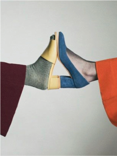
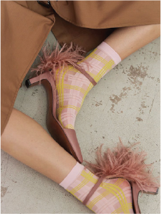
J.Adams is elevated affordable footwear for women who want style that works in real life. Not luxury, not disposable. The sweet spot. The kind of style that looks effortless because the choices were good, not because nothing was chosen.
Quality vegan leather, thoughtful design, honest pricing. A step above fast-fashion without the pretense of high fashion.
Target Audience
Women 25–40. Not impulse buyers — women who want quality that lasts without spending $200. They care about looking put-together but won't sacrifice comfort or budget for a label.
Inspired By
Everlane, J.Crew, Madewell, Sézane, Buck Mason, Rowan, Apiece Apart, Loeffler Randall, Boden, The Tiny Big Sister, Reformation, Dolce Vita
The Shared DNA: Quality over trend, transparency over hype, effortless style that doesn't need a logo to speak.
Taglines
- “Built for Real Life”
- “Made to Move, Designed to Last”
- “Our mission is to create shoes that support the pace, purpose, and presence of modern women.”
Podcast
- Business Behind the Business: The Delulu Founder Show (not live yet)
Color Palette
Main Colors
Black
#111111
Logo, headings
PackagingPANTONE Black 7 C / Black U
Charcoal
#222222
Body text, UI
Ash
#ABABAB
Borders, secondary text
UI Border
#EEEEEE
Card borders, dividers, input fields
Warm Grey
#f3f2f2
Page backgrounds
White
#FFFFFF
Logo, product backgrounds
Neutral Accent Colors
Bone
#FCFAF7
Form fields, warm-tinted whites
Dove
#EDE9E3
PackagingPANTONE Warm Gray 1 C / Warm Gray 1 U
Accent Colors
Typography
Headline Primary
Beaufort Pro Regular · normal
Made to Move, Designed to Last
Headline Secondary
Lindsey Signature · normal
Built for Real Life
Subheading
FreightSans Pro Medium · uppercase · 0.075em
Quality Vegan Leather · Thoughtful Design · Honest Pricing
Body
FreightSans Pro Medium · normal
Our mission is to create shoes that support the pace, purpose, and presence of modern women. Every pair is designed for comfort that lasts and style that works.
Bold / Emphasis
FreightSans Pro Semi · normal
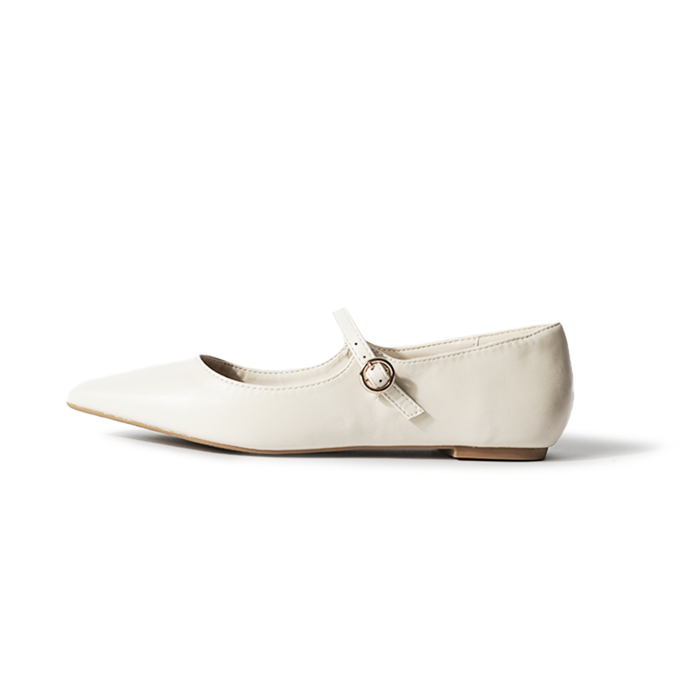
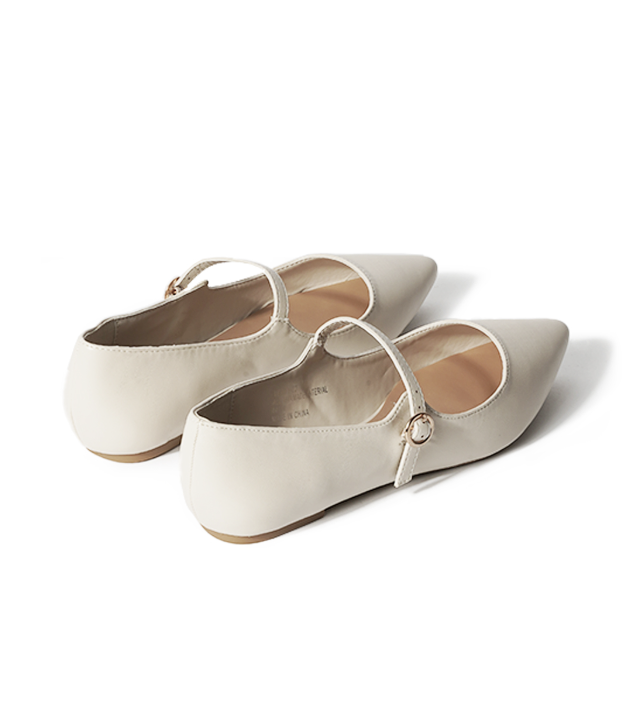
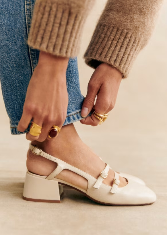
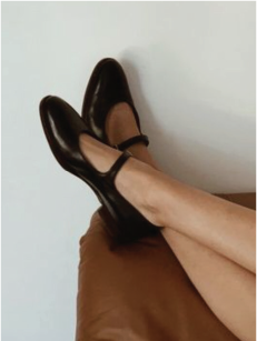
The Shirley — a block heel Mary Jane in wine vegan leather.
Primary Typeface
Beaufort Pro Regular
ABCDEFGHIJKLMNOPQRSTUVWXYZ
abcdefghijklmnopqrstuvwxyz
0123456789!@#$%^&*()
Secondary Typeface
Lindsey Signature Regular
ABCDEFGHIJKLMNOPQRSTUVWXYZ
abcdefghijklmnopqrstuvwxyz
0123456789!@#$%^&*()
Body Typeface
FreightSans Pro Medium
ABCDEFGHIJKLMNOPQRSTUVWXYZ
abcdefghijklmnopqrstuvwxyz
0123456789!@#$%^&*()
Bold Typeface
FreightSans Pro Semibold
ABCDEFGHIJKLMNOPQRSTUVWXYZ
abcdefghijklmnopqrstuvwxyz
0123456789!@#$%^&*()
Logo
On White/Light
Favicon / Icon (w/ Transparent Background)
Favicon / Icon (w/ Black Background)
Primary Logo
Favicon / Icon (w/ Transparent Background)
Favicon / Icon (w/ Black Background)
On Black/Dark
Favicon / Icon (w/ Transparent Background)
Favicon / Icon (w/ White Background)
Primary Logo
Favicon / Icon (w/ Transparent Background)
Favicon / Icon (w/ White Background)
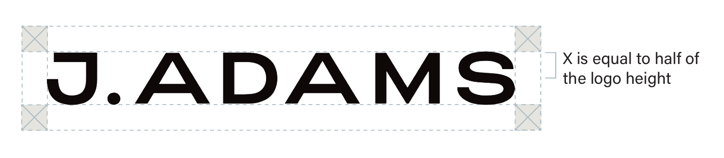
Clear Space
To ensure the legibility of the logo, there must be a minimum amount of clear space around all sides of the logo. The logo’s exclusion zone (marked as “X” in the diagram) is equal to half the height of the logo. Maintain clear space of at least half the logo height when placing the logo within a layout.

Scaling
Do not compress, stretch, or distort the logo.
Color Pairings
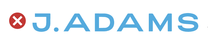
Do not use an off-brand color for the logo. The J.Adams logo should be in black or white on most collateral. For seasonal campaigns, you can change the logo to an accent color to create a more colorful look. When using bright colored backgrounds, the logo should remain white.
Content Pillars
Style Made Real
Outfit pairings, styling tips, “3 ways to wear the Shirley.” Real styling for real life.
Behind the Design
Materials, construction, design decisions. What makes J.Adams different at the $50 price point.
The Woman's Modern Closet
Seasonal trends, styling for special occasions, building a shoe wardrobe for a modern, working-woman's lifestyle.
Real Women, Real Shoes
Customer stories, UGC, reviews, community. The women who actually wear these shoes.
Tone of Voice
Warm. Confident. Grounded.
California-cool meets Parisian je ne sais quoi
Your friend who always looks put-together but will tell you her shoes were $50. She's not trying to impress anyone — she just knows what works.
“The Shirley. A block heel Mary Jane in wine vegan leather. Pairs with everything from wide-leg trousers to a weekend dress.”
“Designed to keep up — cushioned insole, stable block heel, all-day comfort without the break-in period.”
Do
- Conversational but not sloppy
- Matter-of-fact about comfort and quality
- Confident without being loud
- Specific over vague — “vegan leather with a matte finish”
- Real scenarios — “from the office to happy hour”
“Step into style with our AMAZING Shirley heel! This stunning shoe will elevate any outfit and make you feel like a queen!”
“Experience the ultimate in luxury comfort with our revolutionary cushioning technology!”
Don’t
- Never preachy about comfort or sustainability
- No luxury language — “exclusive,” “couture,” “artisan”
- No Gen-Z slang or trend-chasing
- No filler — “elevate your look,” “step into style”
- No exclamation points in product copy
What J.Adams Is Not
Luxury
✓ Don't pretend to be. Own the price point.
Fast Fashion
✓ Don't race to the bottom. Quality matters.
Athleisure
✓ Even sneakers are styled, not sporty.
Trend-Driven
✓ Shoes that work across seasons.
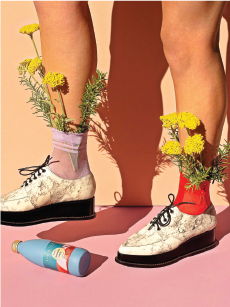
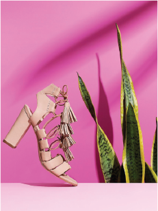
Instagram-Bait
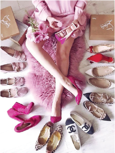
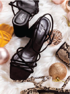
✓ No props, no flat-lays, no aesthetic for its own sake.
Product Shot List
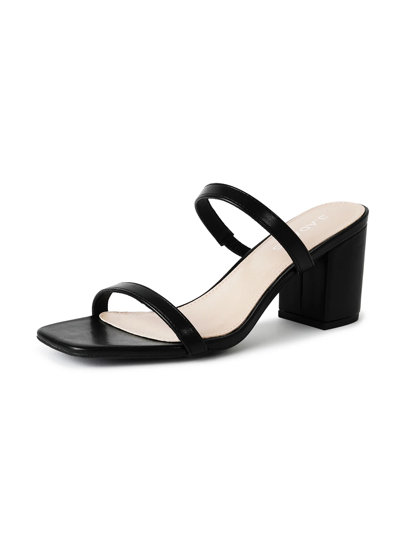
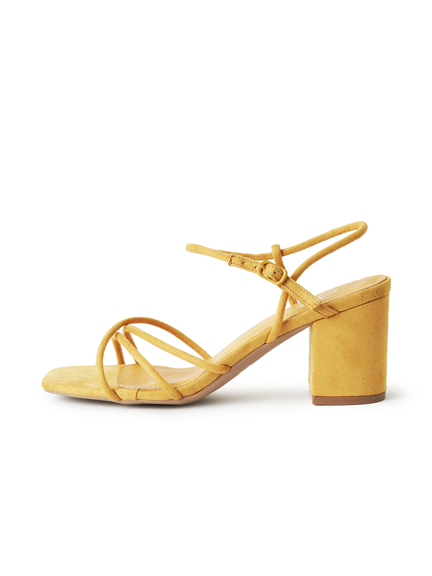
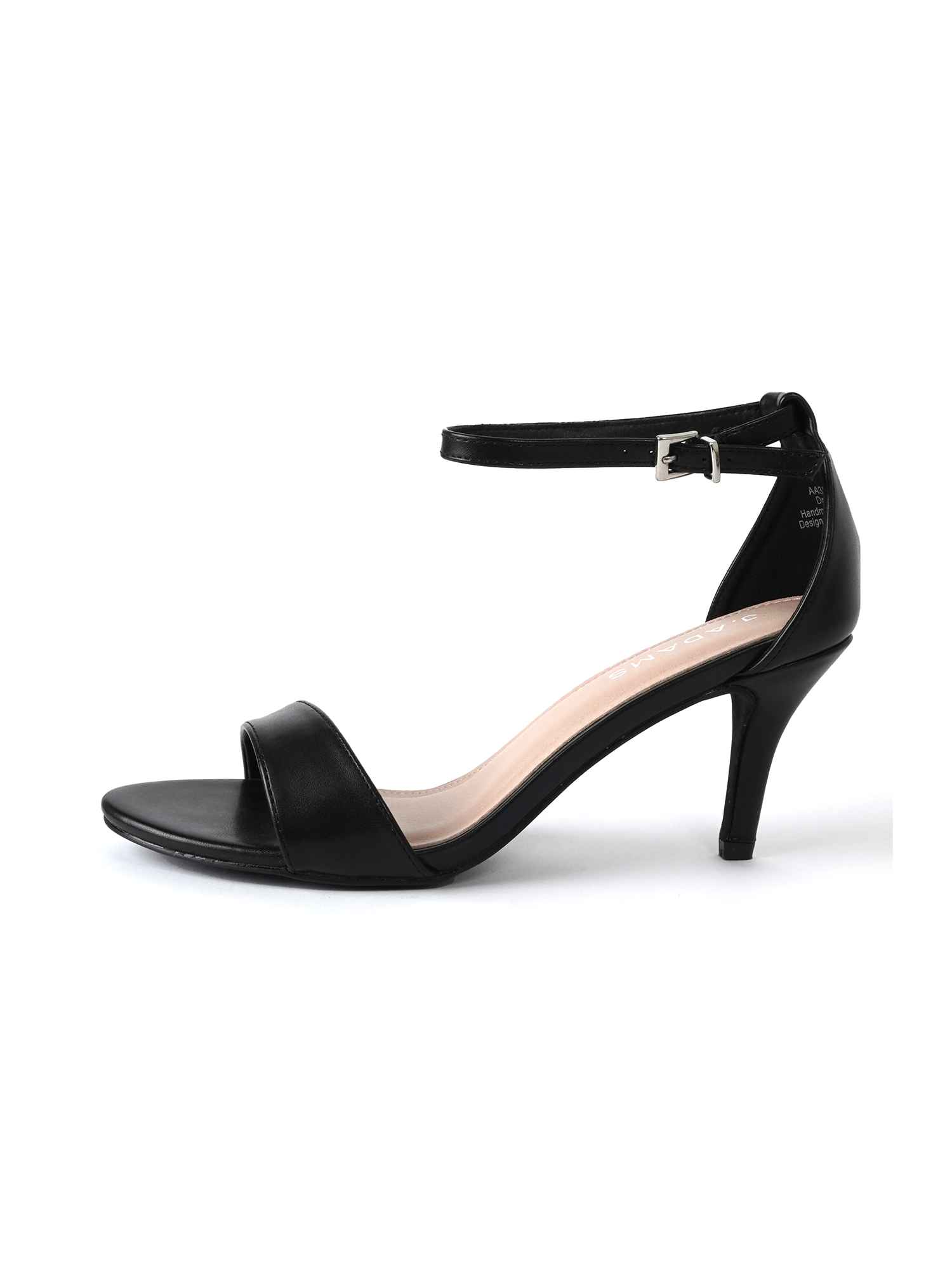
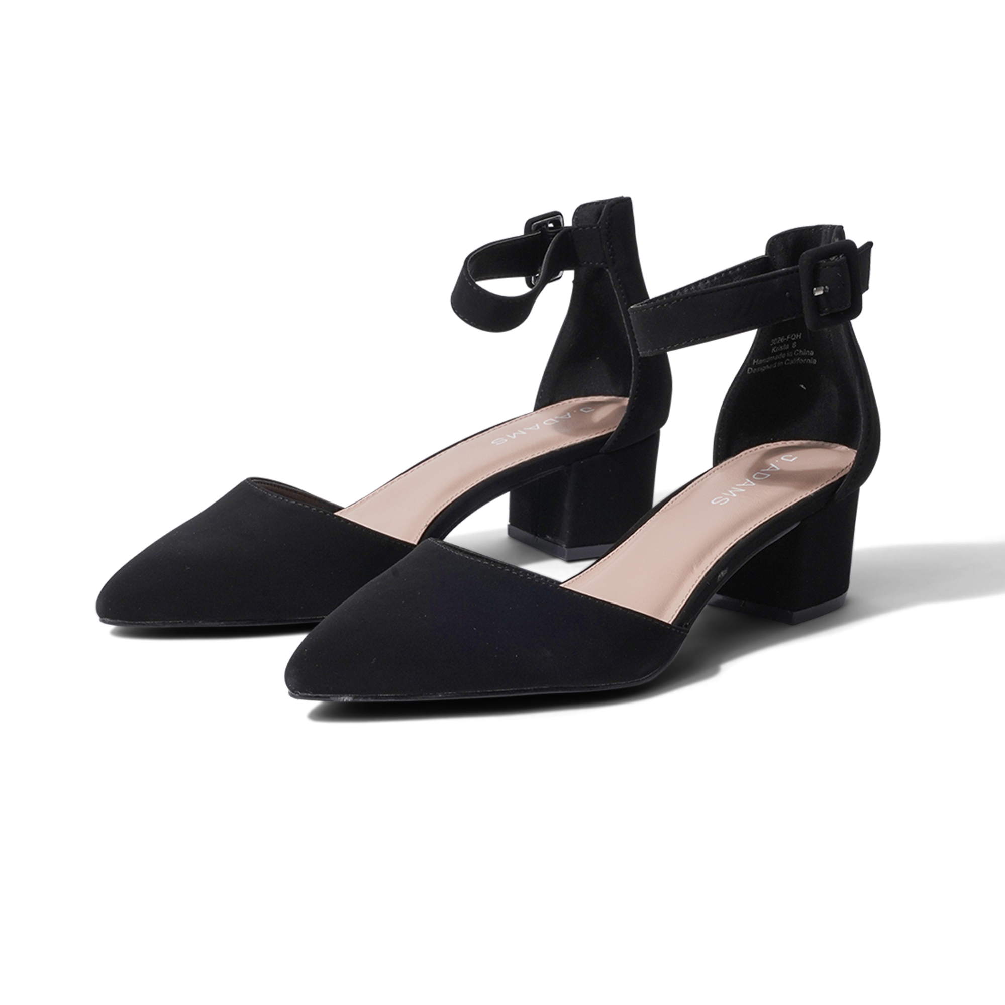
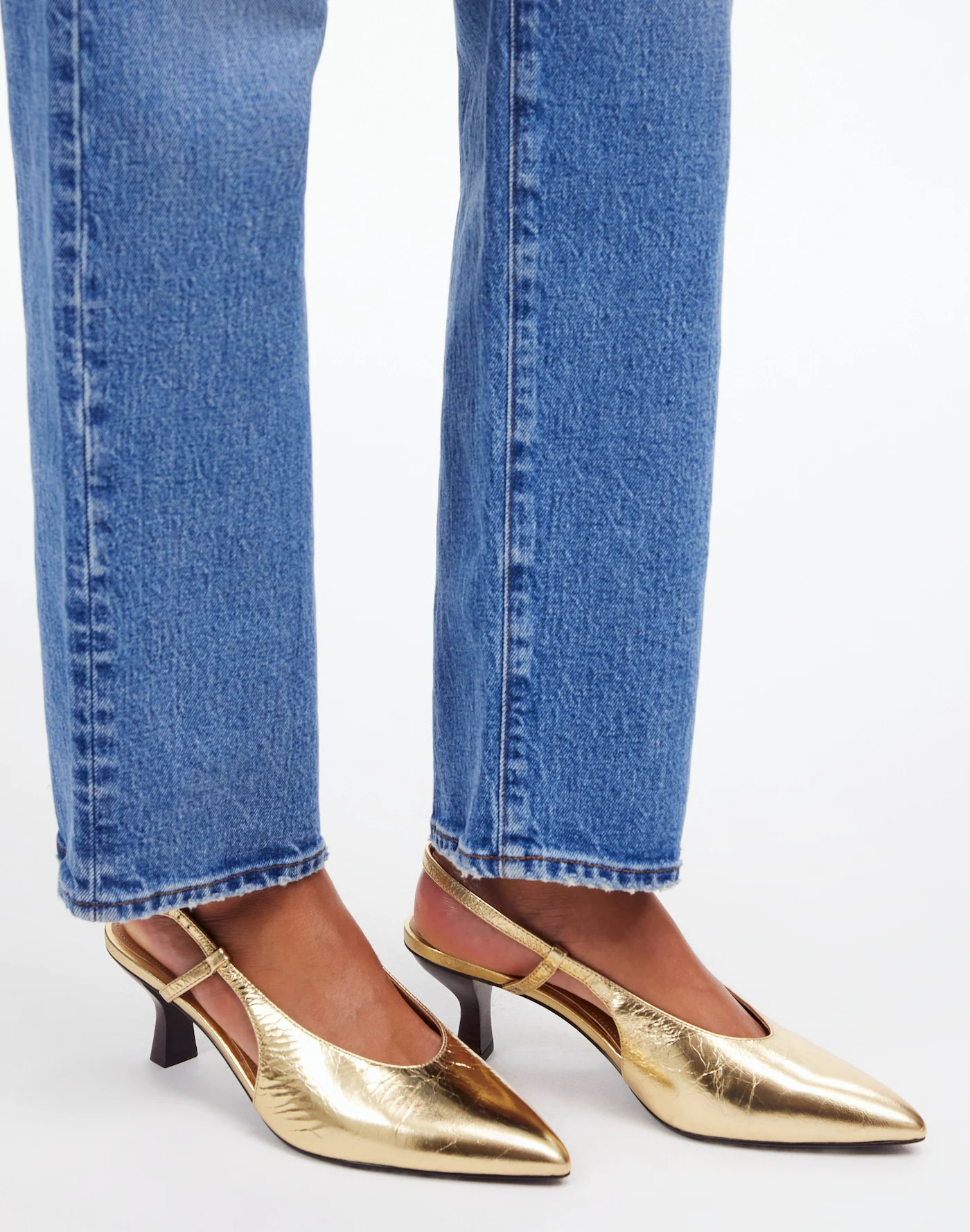
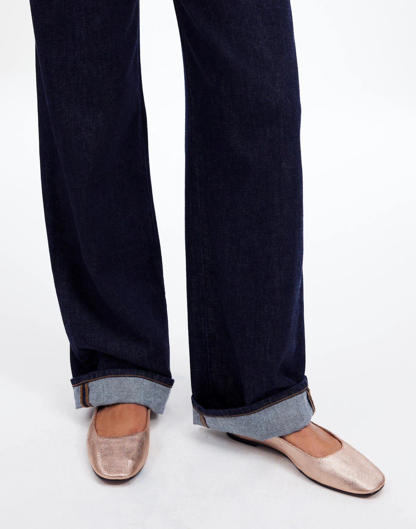
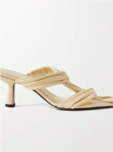
- White seamless backdrop with flash-cast shadow
- Shoot for both 1:1 and 3:4 aspect ratios with enough negative space to crop either way
- Center shoes in frame — not shoes + shadow
- Leave space under shoes for SHEIN cover banners
- Minimal props only — simple stool or neutral-colored chair that lets shoes pop
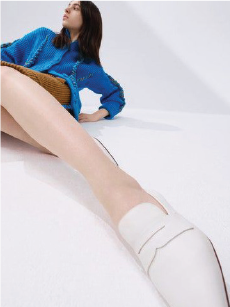
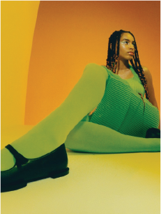
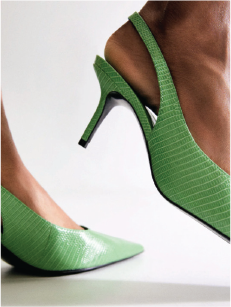
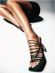
- Focus is always the shoes, not the model — crop out face when possible
- Don’t crop too tightly; leave breathing room around shoes in both ratios
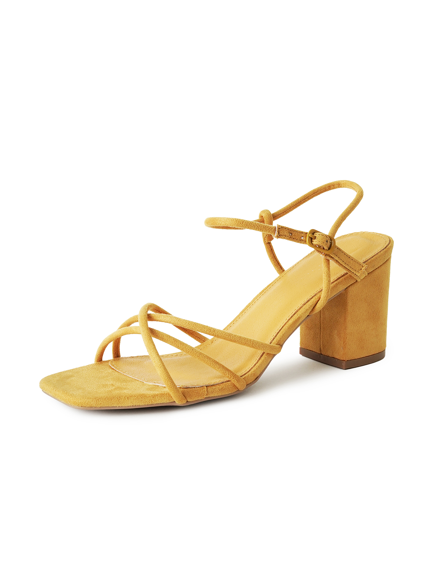
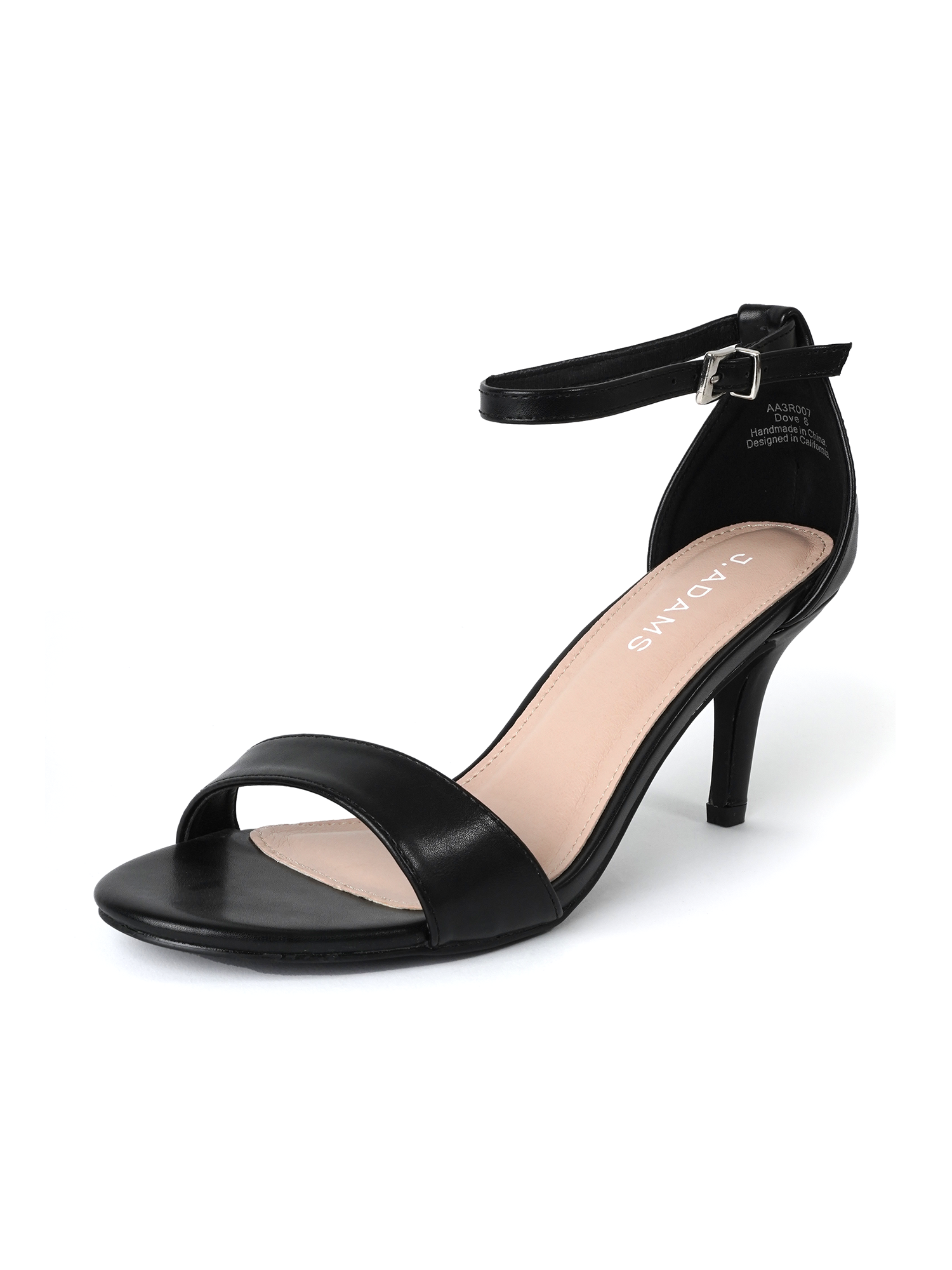
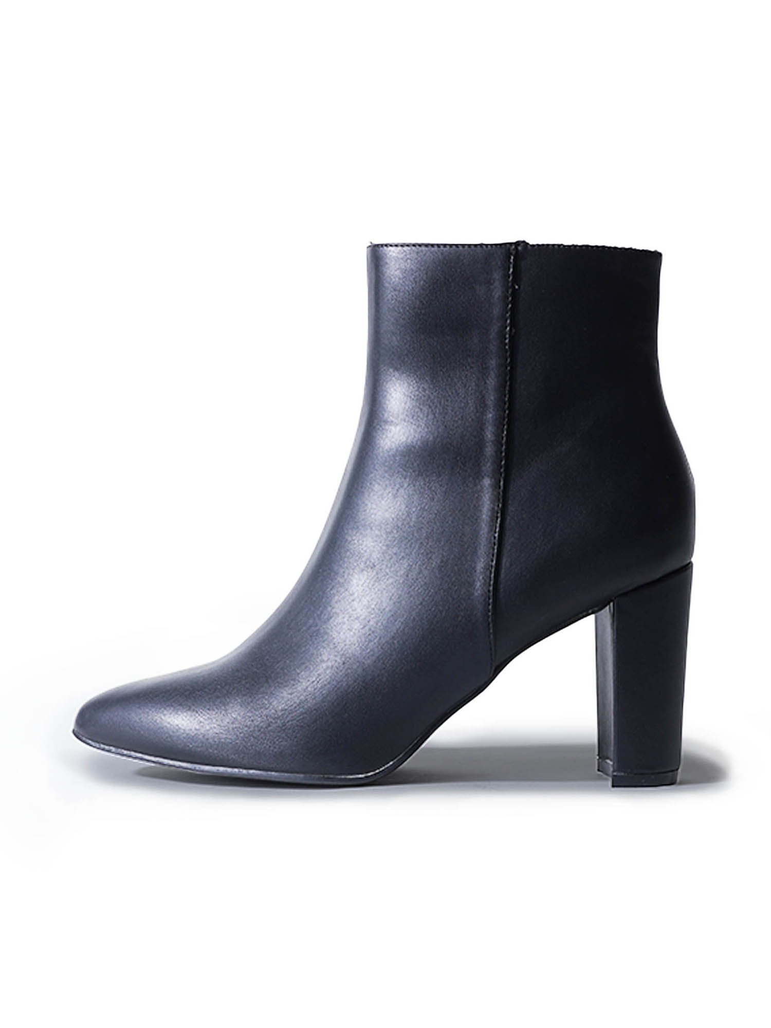
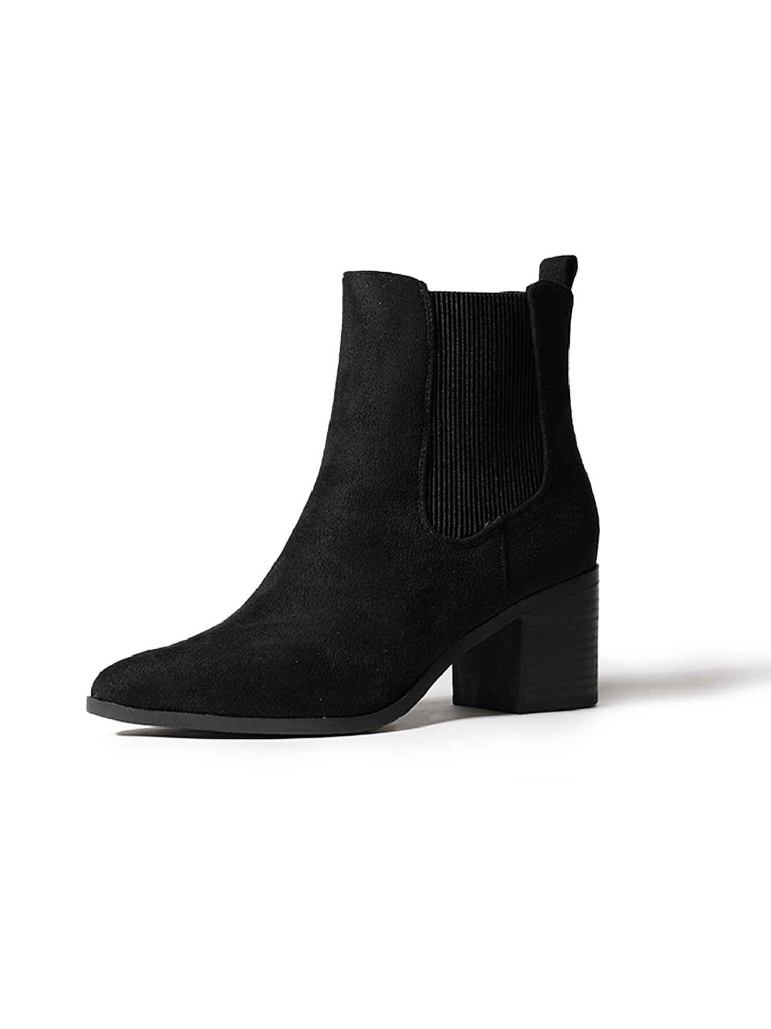
SHOT #1 — Single (wearer’s left) shoe, shot at a slight angle.
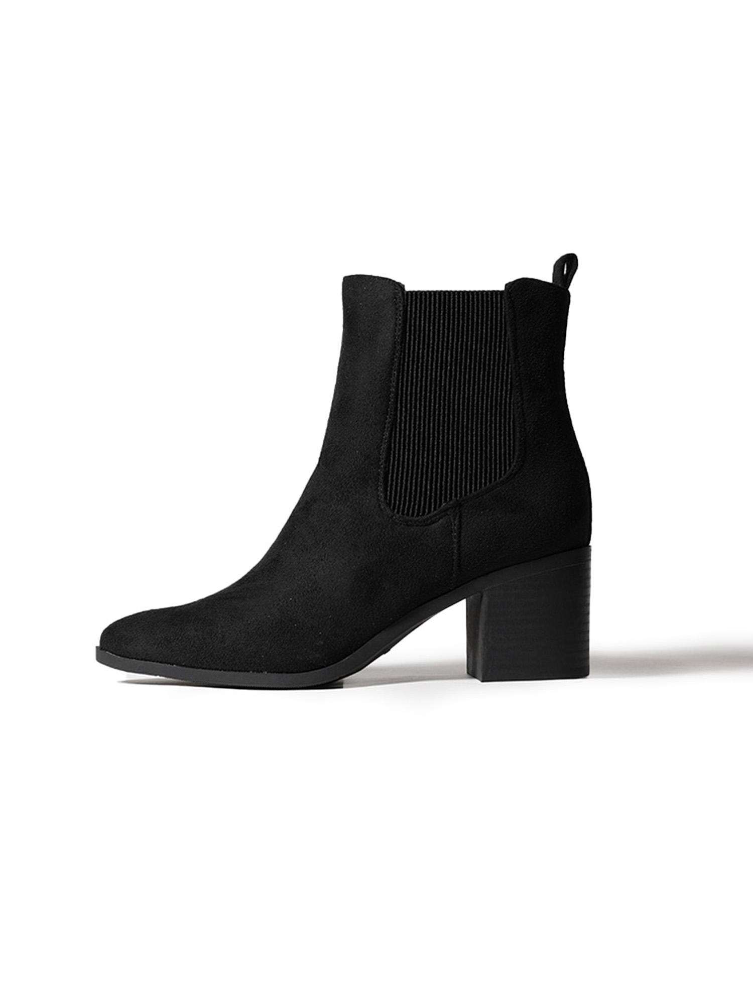
SHOT #2 — Single (wearer’s left) shoe, shot at profile.
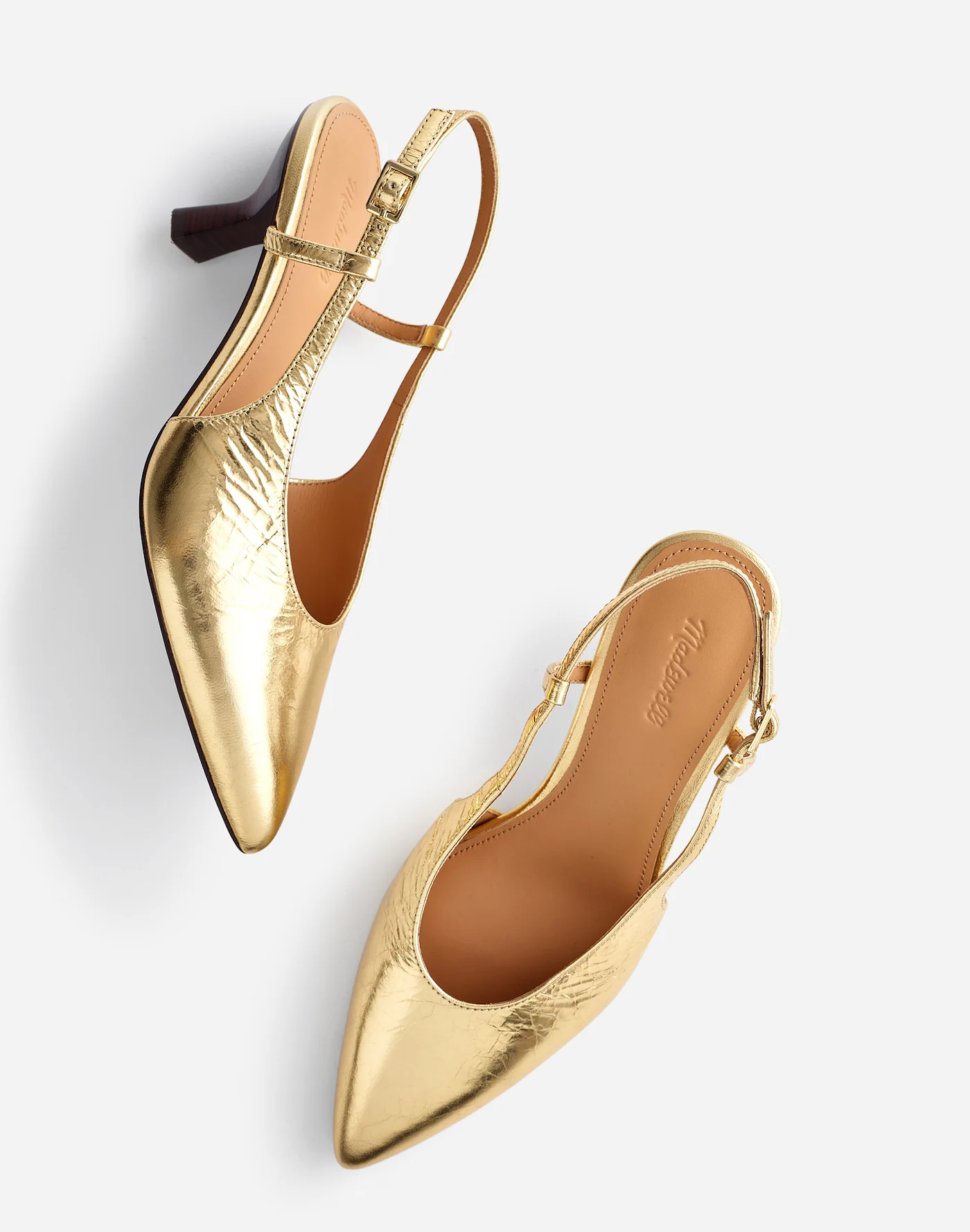
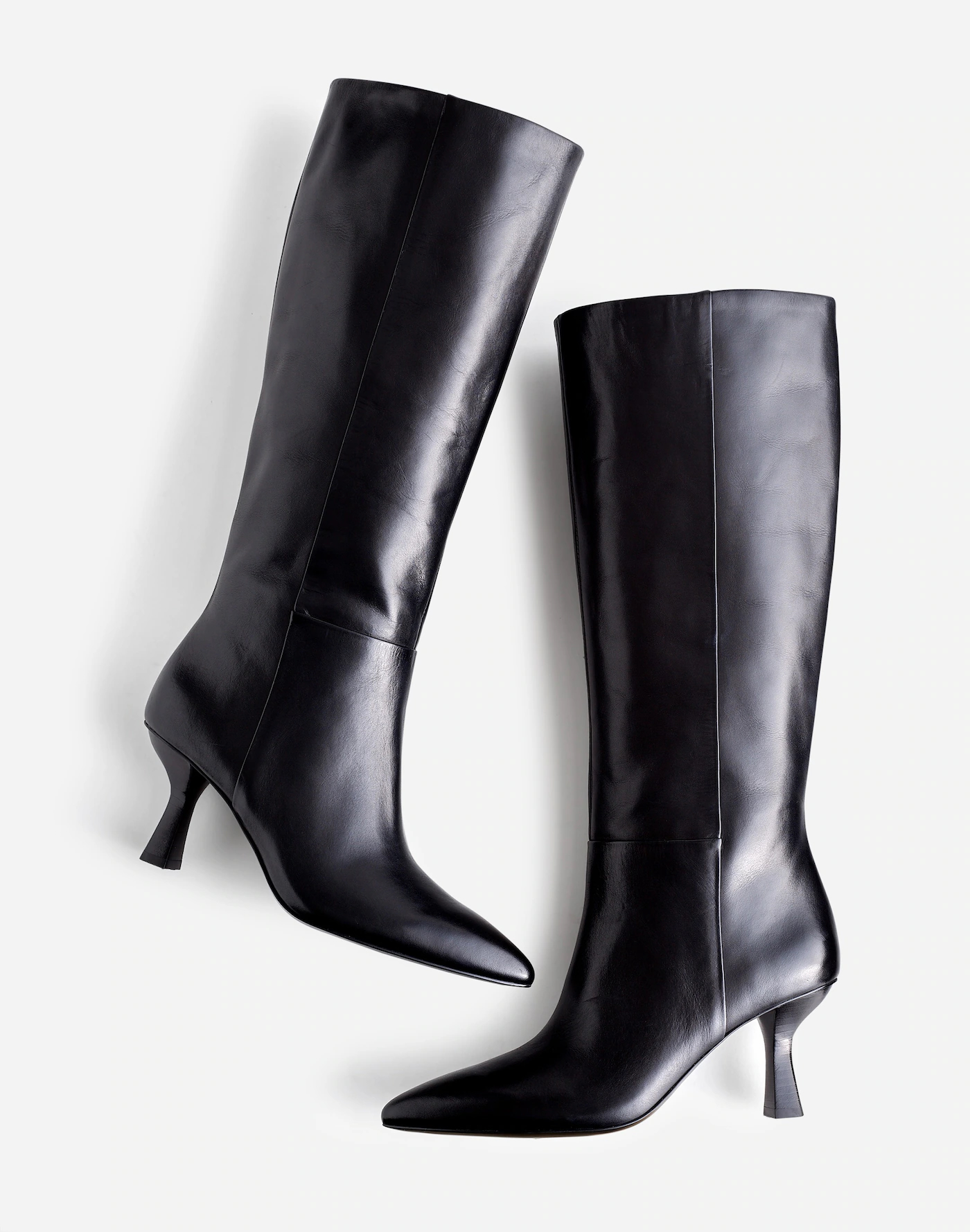
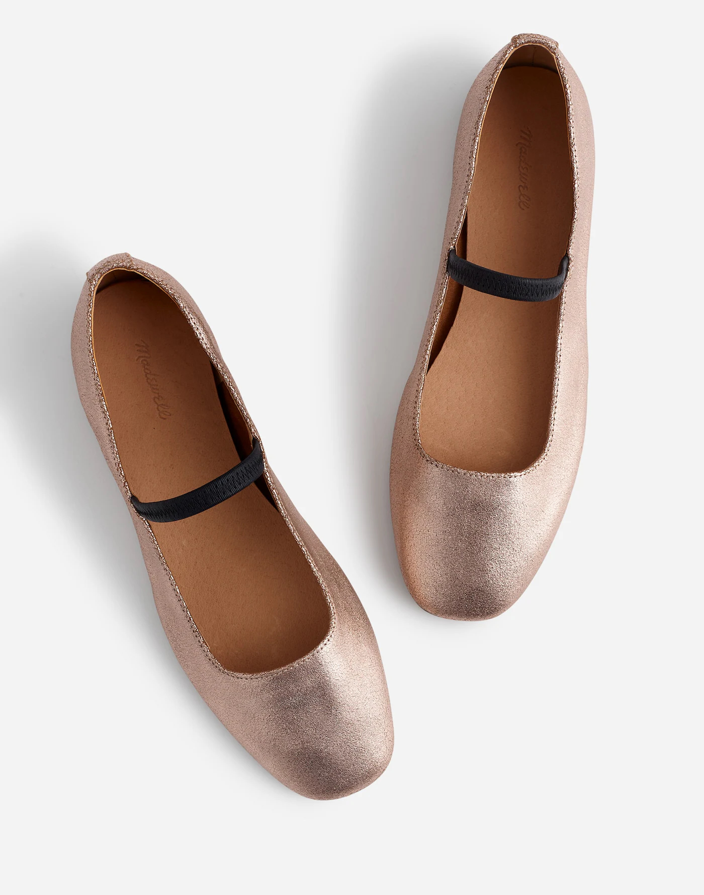
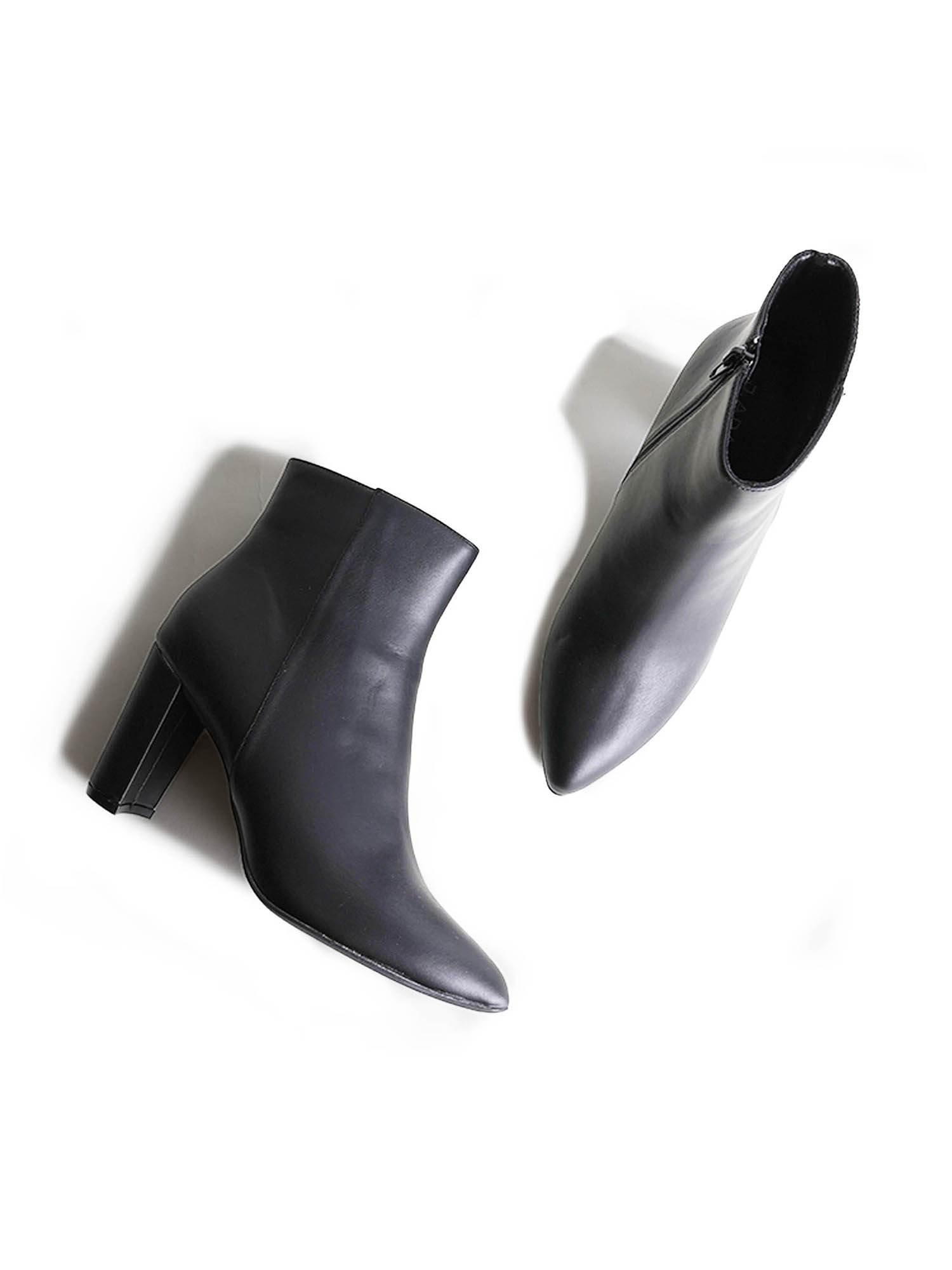
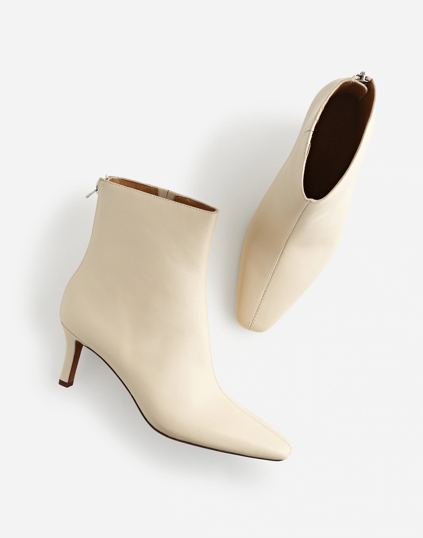
SHOT #3 — Both shoes, shot at an angle, from a bird’s eye view.
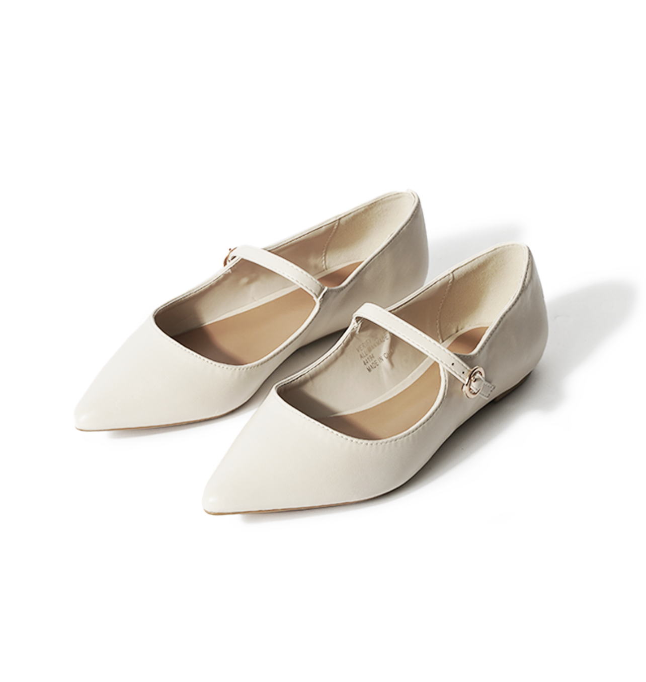
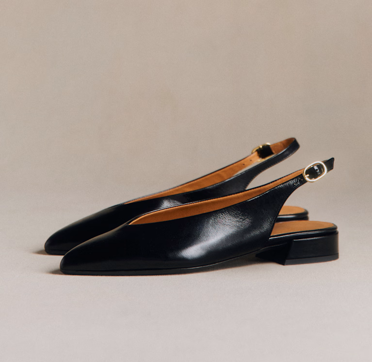
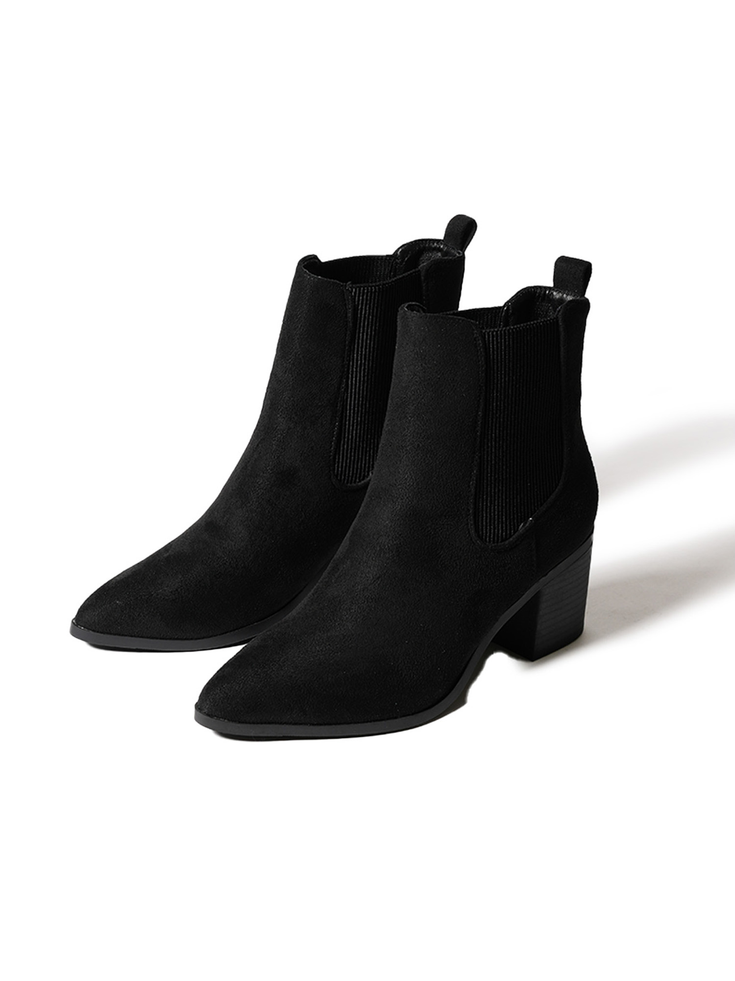
SHOT #4 — Both shoes, shot at an angle.
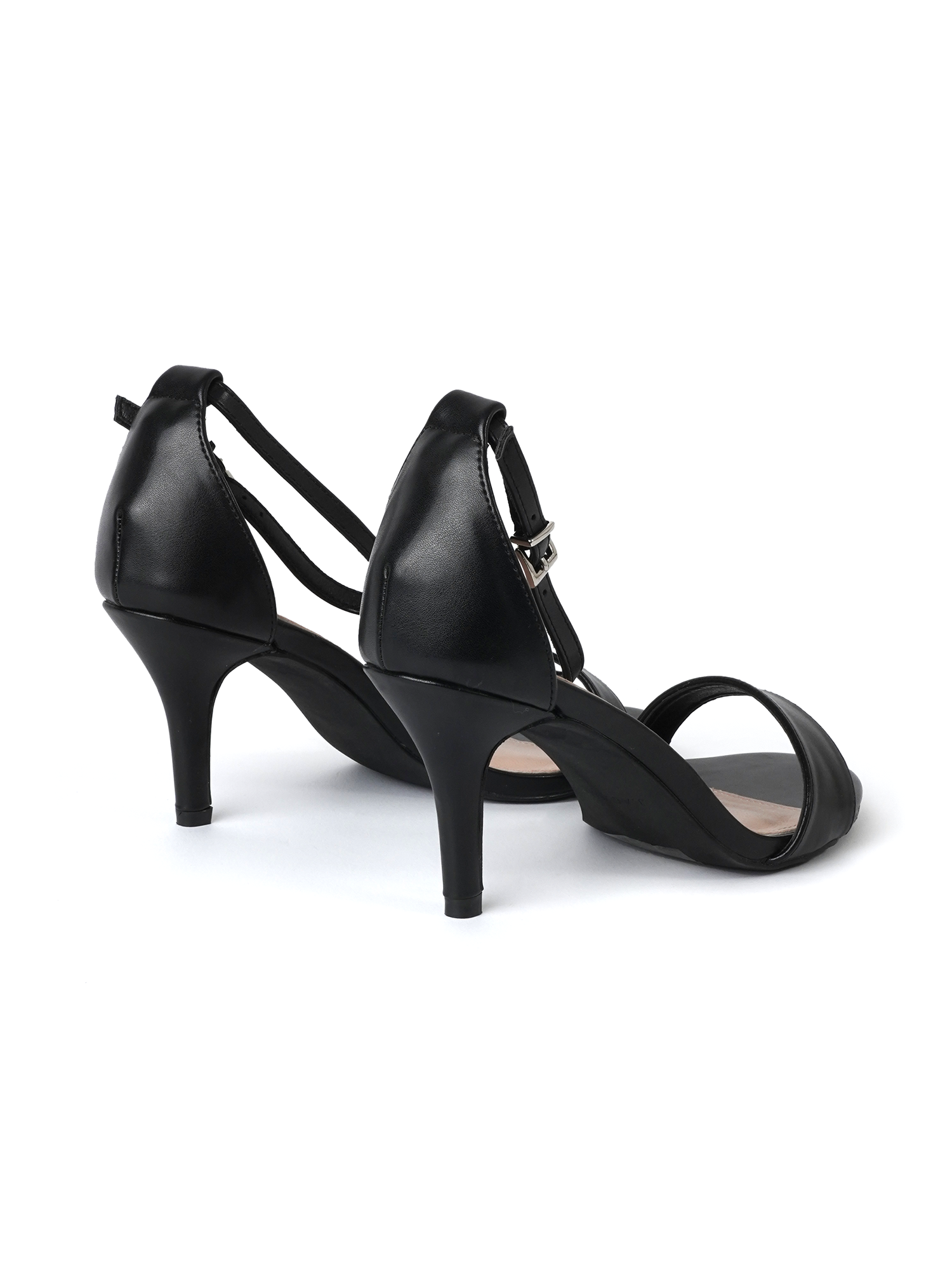
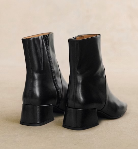
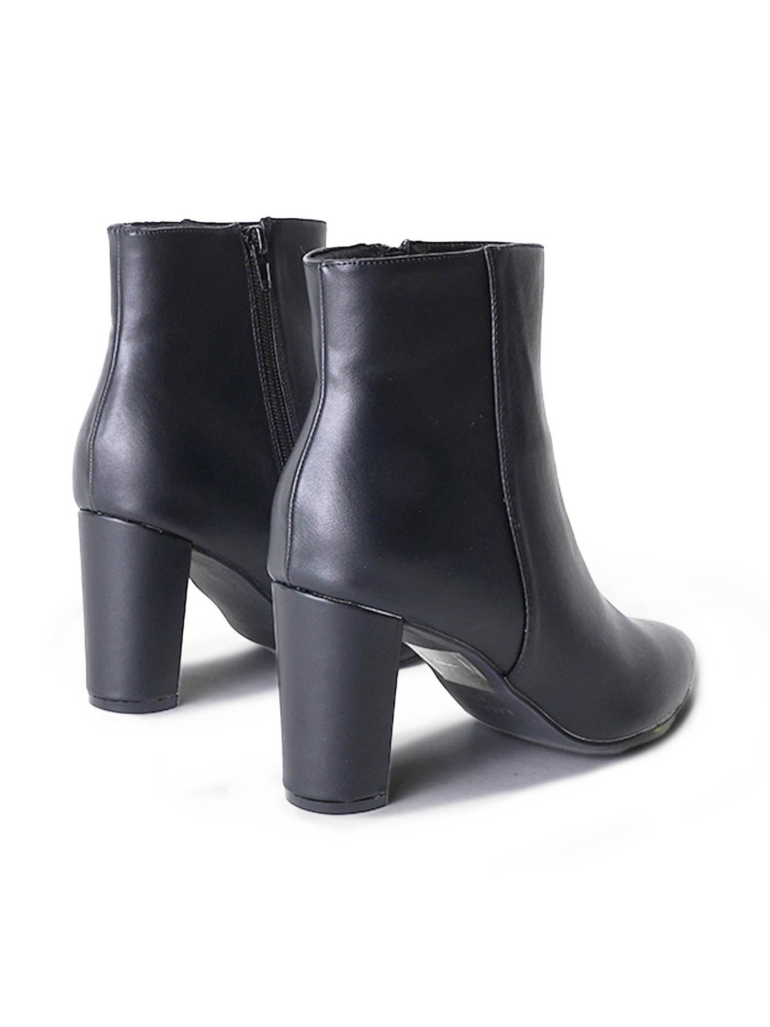
SHOT #5 — Both shoes, shot from behind at eye-level.
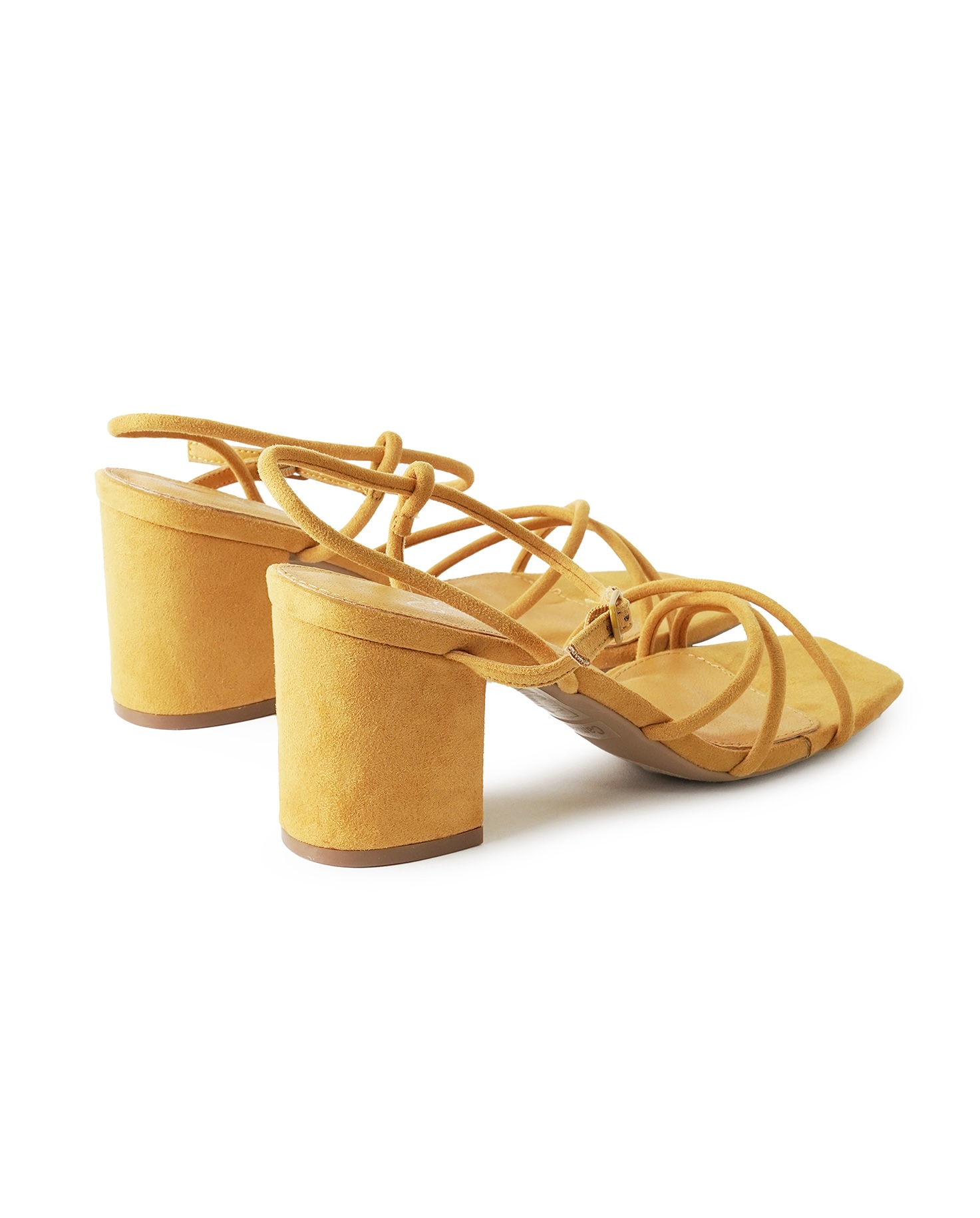
SHOT #6 — Both shoes, styled on a model standing, facing towards the camera.
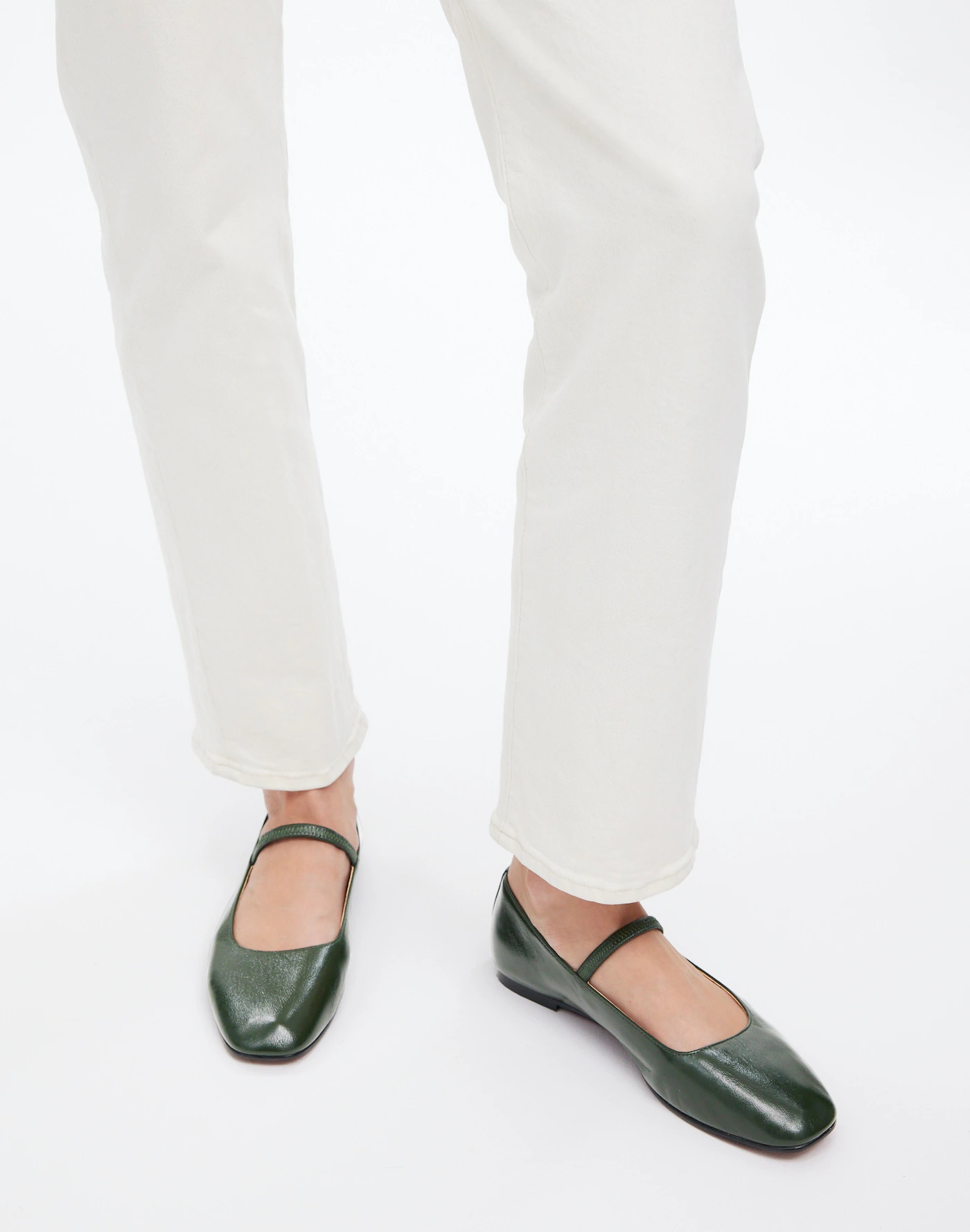
SHOT #7 — Both shoes, styled on a model sitting or standing in a different way.
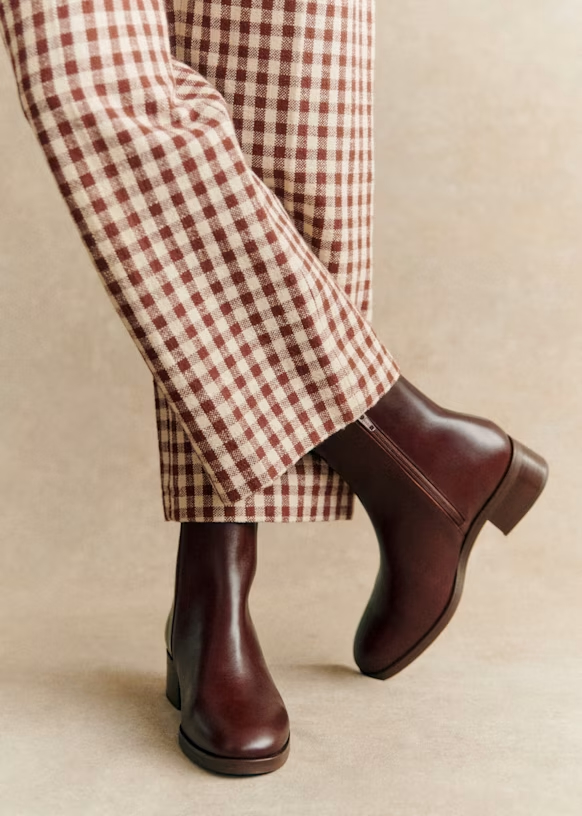
SHOT #8 — Both shoes, styled on a model sitting or standing, shot tighter, with the shoes taking up more space in the frame.
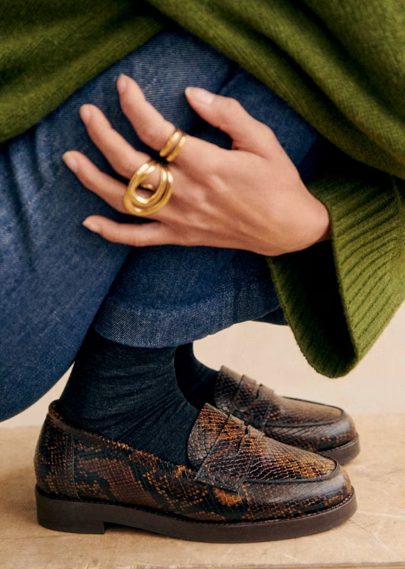
Photo Direction
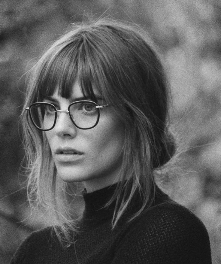
Influencer & People
Guidelines
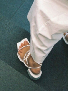
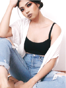
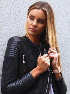
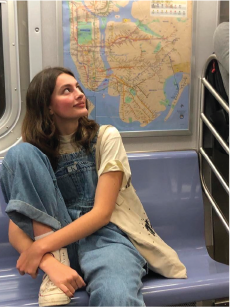
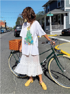
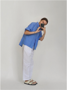
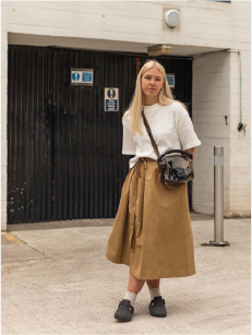
- Taken mostly on phone
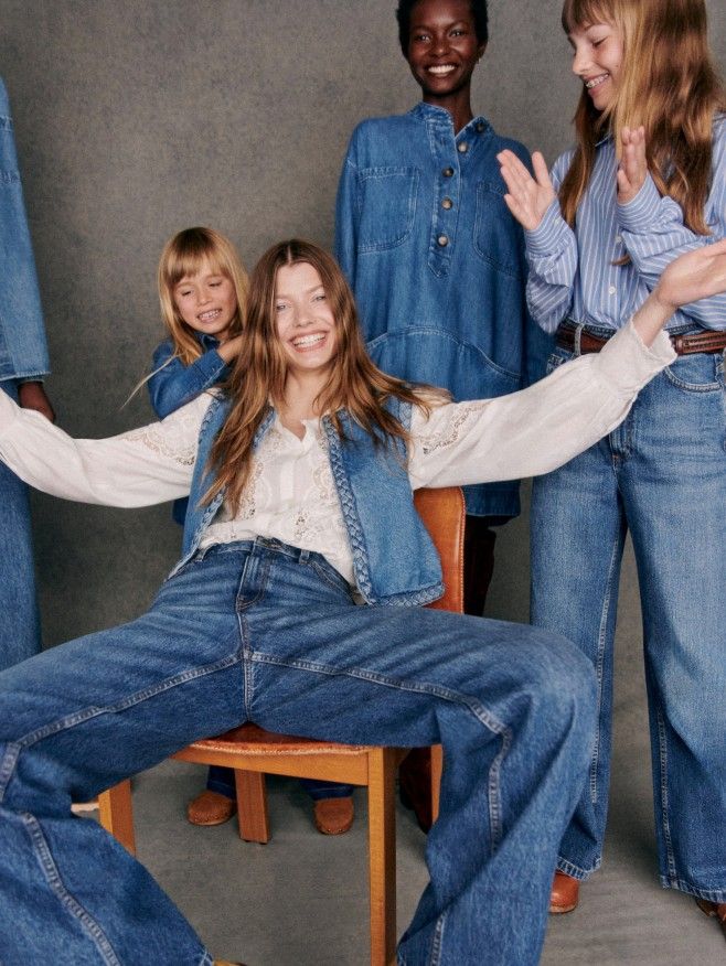
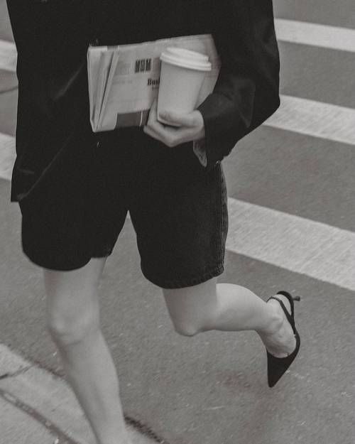
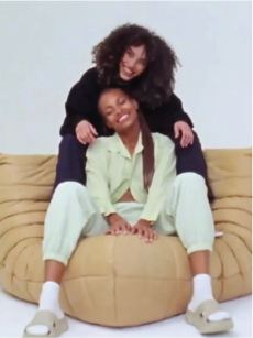
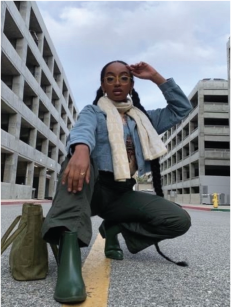
- Natural, outfit-of-the-day feel
- Simple yet witty
- Send shoes to influencers or real people to get shots of them wearing them
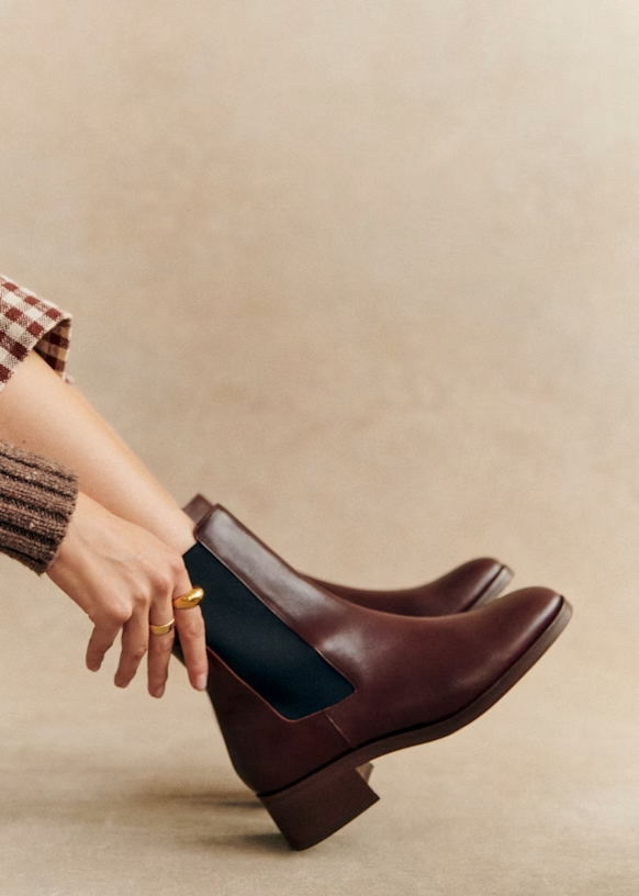
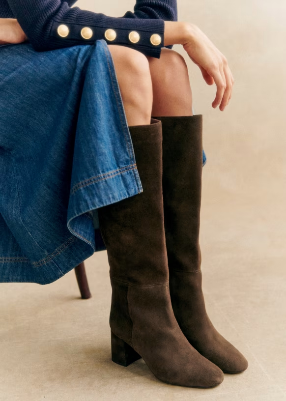
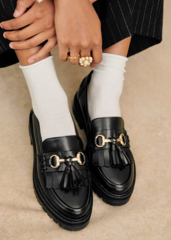
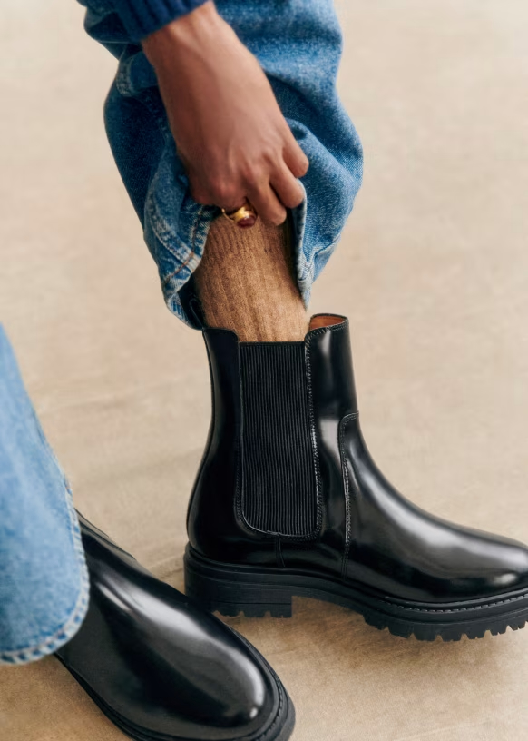
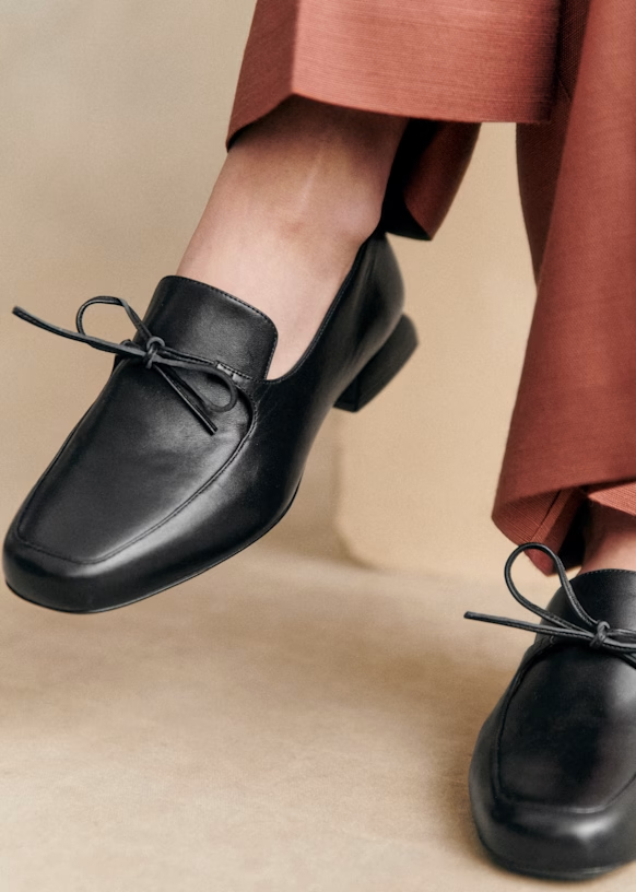
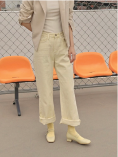
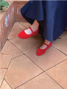
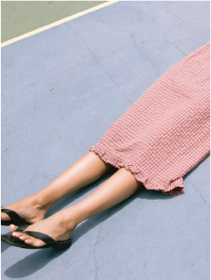
- Focus should always be the shoes — show styling context but keep footwear as the hero
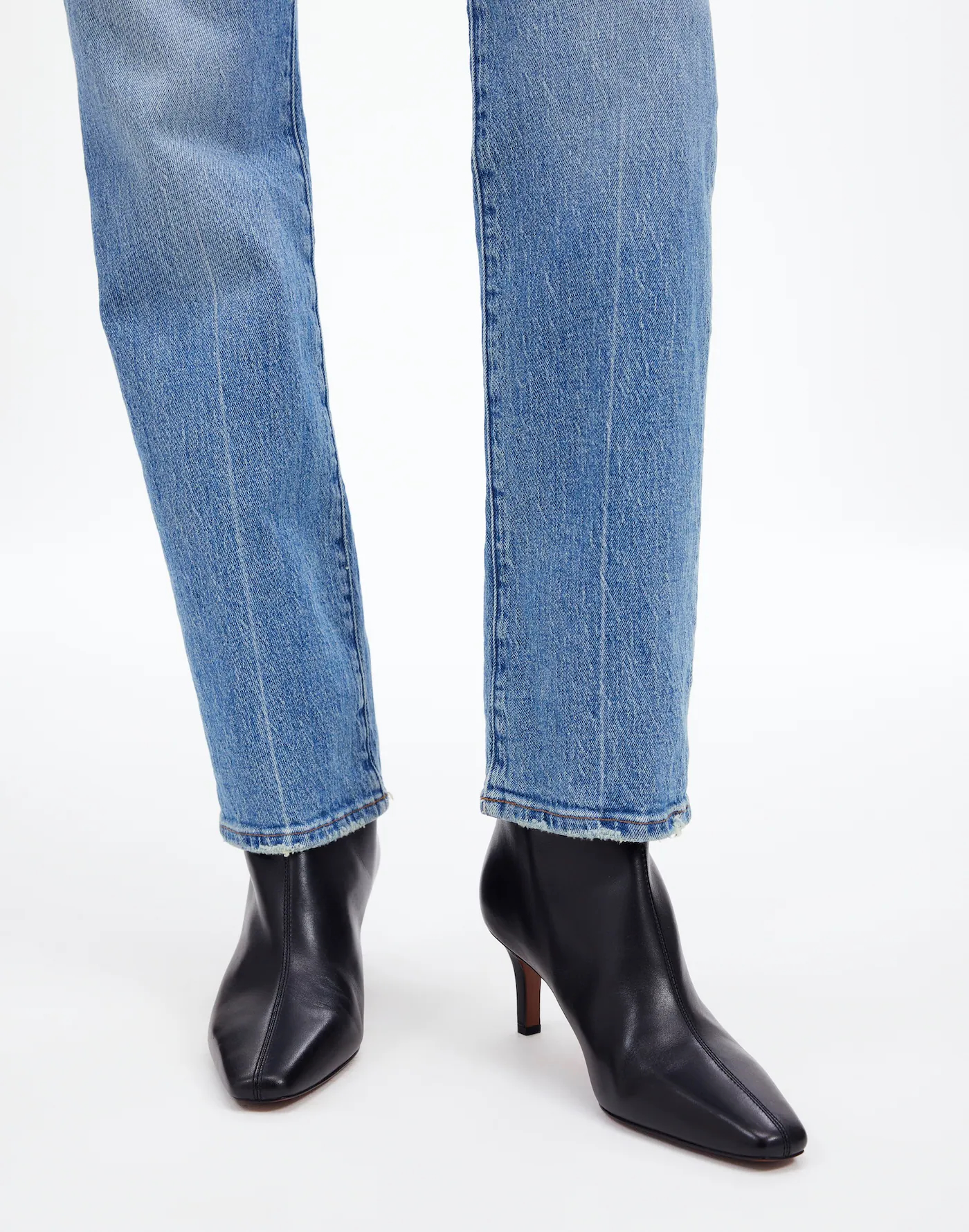
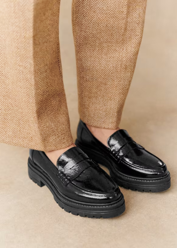
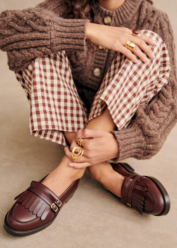
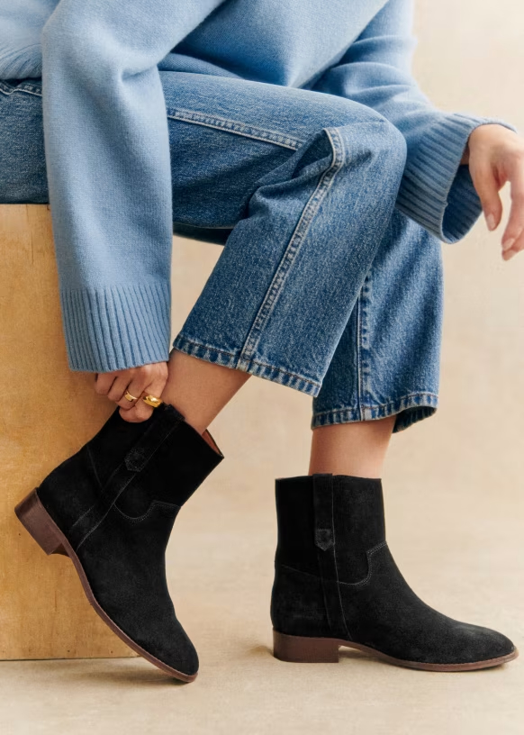
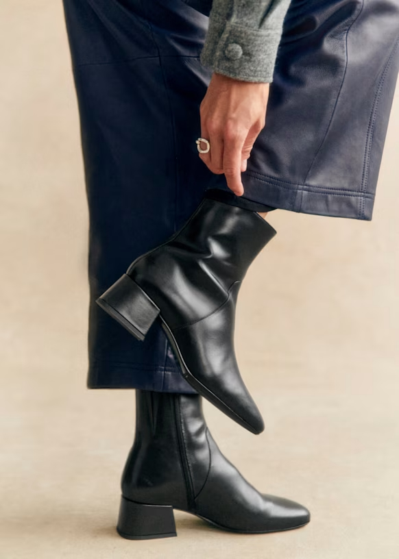
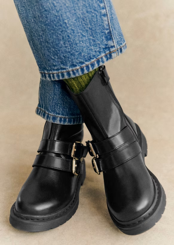
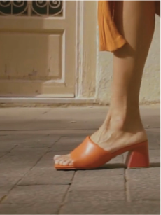
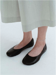
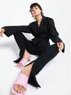
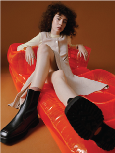
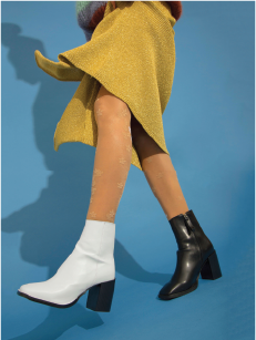
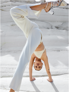
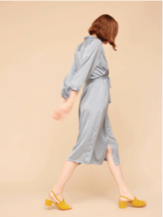
- Framing: legs from knees down (shoe is hero)
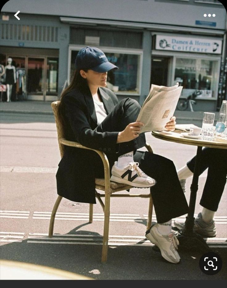
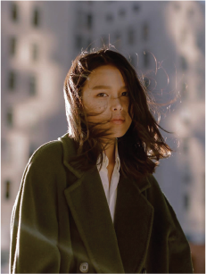
- Golden hour, natural light, warm ambient
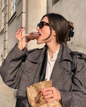
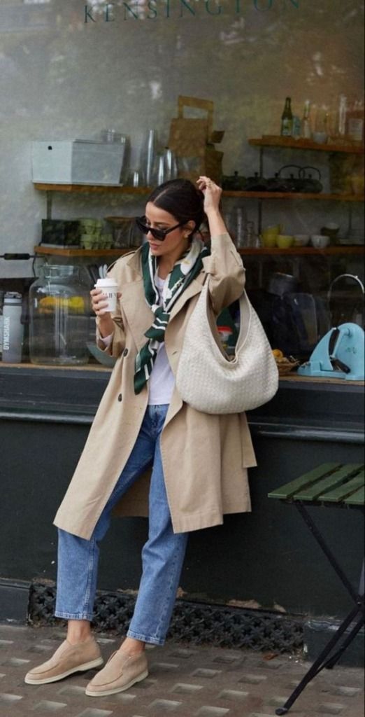
- Real places — café, sidewalk, office, market
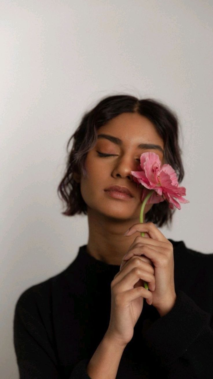
- Mood: effortless, lived-in, real
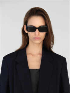
- Models: diverse, real proportions
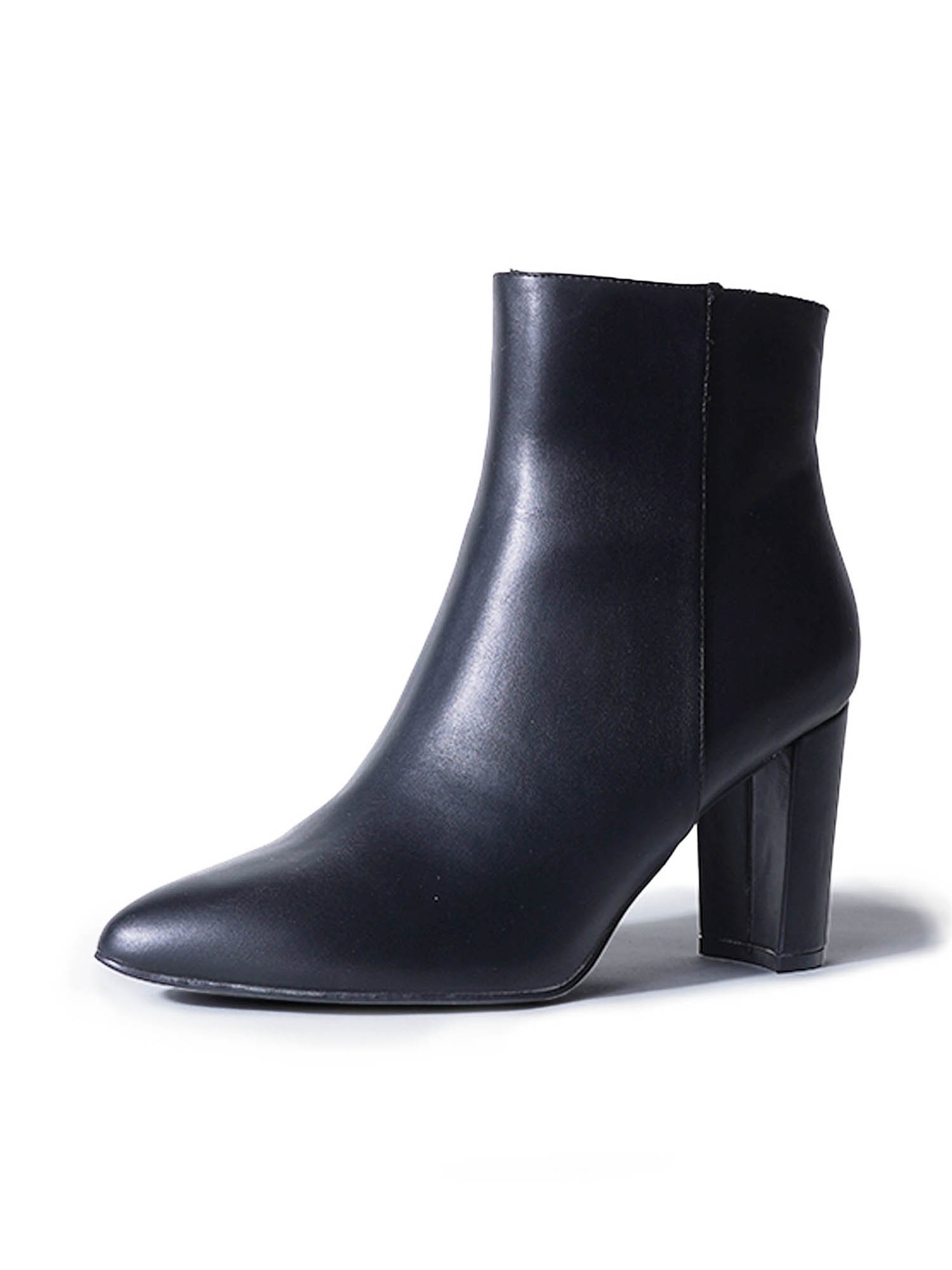
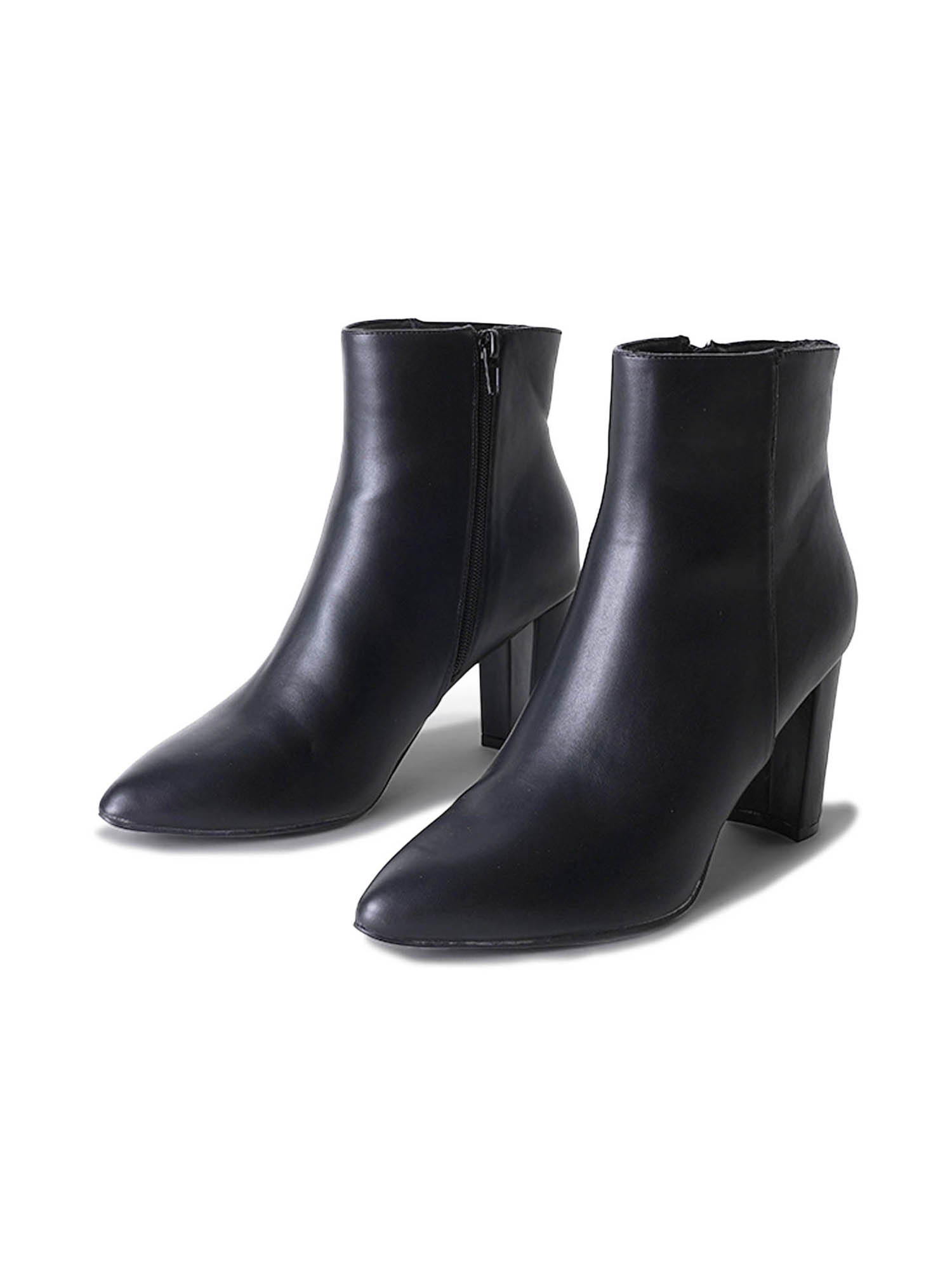
- Boots: outdoor street + standing, no clutter/people
- Other styles: indoor neutral background + seated
Photo Specs
Listings
- Shopify (primary): 3:4, optimal 2048×2730px. Must also work cropped to 1:1 for Amazon. Max 20MB, aim for 100–300KB. Up to 250 media items per product.
- Amazon: 1:1, optimal 2000×2000px, min 1000px for zoom, max 10MB. 7 images visible in gallery (6 + video). Main image: pure white BG, product fills 85%.
- Walmart: 3:4 for fashion/footwear, optimal 1500×2000px, min 1500px longest side, max 5MB. Swatches: 100×100px.
- SHEIN: 3:4 recommended, optimal 2200×2200px (square) or 1340×1785px (portrait), min 900×900px, max 3MB. Swatches: 80×80px. Leave top and bottom 1/16 clear for banners.
- File format: JPEG (preferred) or PNG, sRGB color space
- Color-calibrated (Calibrite ColorChecker reference)
Shopify Site Images
- Hero/background: 2560×1440px (desktop), 800×1200px (mobile), 16:9
- Banner: 2048×1024px standard, up to 2500px wide for full-bleed
- Blog: 1200×800px, 3:2
- Logo (rect): 400×100px, 4:1
- Thumbnails: 600×600px, 1:1 (Retina-ready)
- Optimal file size: 100–500KB. Max 20MB.
Social Media
- Instagram Feed: 1:1, 4:5, or 3:4, optimal 1080×1350px (4:5) or 1080×1440px (3:4), max 30MB (photo) / 4GB (video). Profile grid now displays at 3:4.
- Instagram Stories/Reels: 9:16, 1080×1920px, max 650MB (Reels) / 4GB (Stories). Leave bottom 1/5 clear for captions. Reels up to 3 min.
- TikTok: 9:16, 1080×1920px, max 287MB (iOS) / 72MB (Android) / 500MB (desktop). MP4 preferred (H.264, AAC).
Video Direction
Tone
Do
- Keep the pace grounded, mellow, and slow
- Let moments breathe — hold on a shot a beat longer than you think
- Feel approachable and authentic, like a real person’s day
- Match the calm, confident energy of the brand
Don’t
- Use fast cuts, jump cuts, or high-energy editing
- Make it feel like a high-fashion campaign or runway edit
- Come across as pretentious or trying too hard
- Rush the pacing — if it feels frenetic, slow it down
Music
Do
- Use lo-fi, calming, and relaxed tracks
- Think coffee shop playlist, golden hour vibes
- Acoustic, ambient, or soft instrumental works well
- Let the music sit underneath the visuals, not compete with them
Don’t
- Use rock, pop, rap, EDM, or anything high-energy
- Pick tracks with heavy bass drops or dramatic builds
- Use trending audio just because it’s trending — it has to fit the mood
- Overpower the visuals with loud or distracting music
Color Grading
Do
- Aim for warm, vintage tones — think golden hour, natural warmth
- Lean into ambers, soft browns, and muted warm highlights
- Keep skin tones natural and flattering
- Maintain a cozy, inviting feel throughout
Don’t
- Use cool, overly blue or teal color grading
- Go too desaturated or clinical-looking
- Over-stylize with heavy filters that distort product colors
- Make it look cold — JA should always feel warm
What Ties It Together
Visual Language
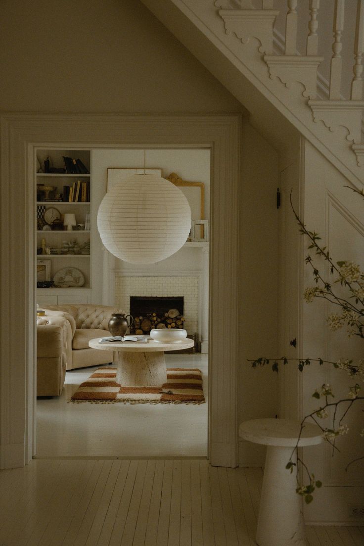
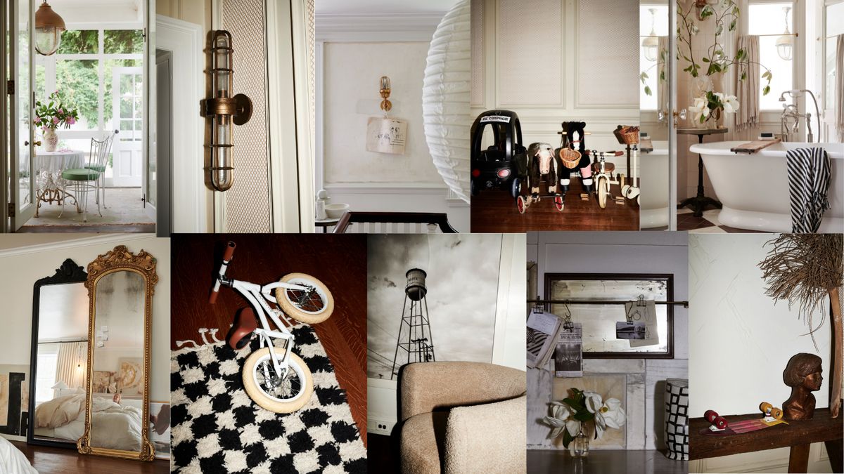
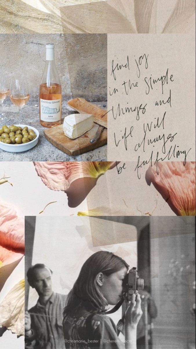
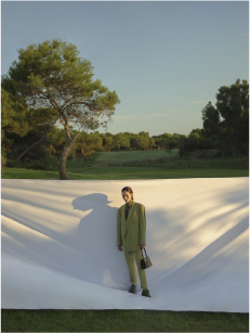
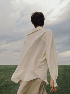
- Warm palette — ambers, cream, terracotta, golden tones
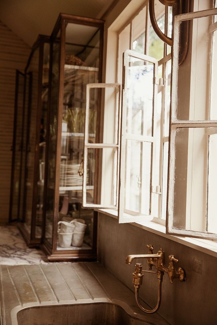
- Natural light — golden hour, window light, soft daylight
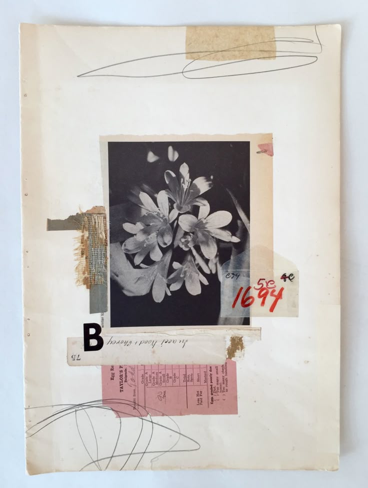
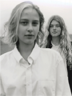
- Film-like quality — slightly desaturated, vintage grain
- Muted, not punchy — even bold colors feel earthy and warm
Pacing & Mood
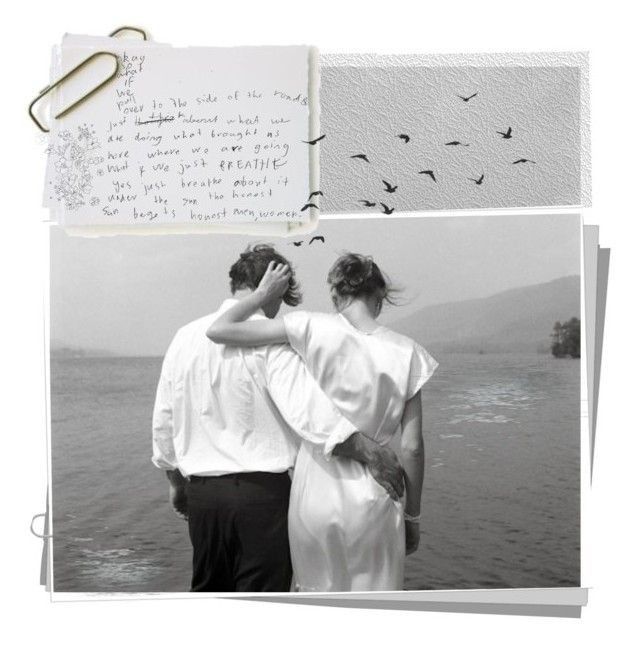
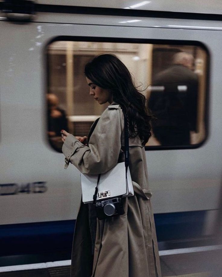
- Slow, contemplative movement — walking, turning, lingering
- Quiet confidence — people existing, not performing
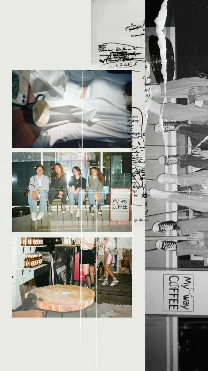
- Real moments — cafés, streets, touching hair, laughing
- Breath in every shot — nothing feels rushed
Setting & Story
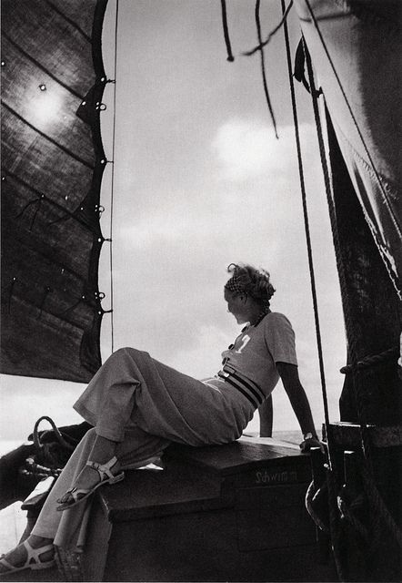
- European/urban lifestyle — Paris, NYC, cafés, bookshops
- Artisan & craftsmanship nods — pottery, textiles, process
- Nature interspersed — golden fields, ocean, fog
- The “beautiful ordinary” — aspirational but attainable
References
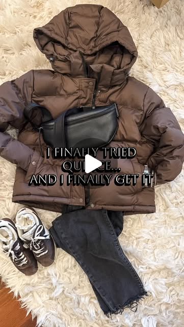
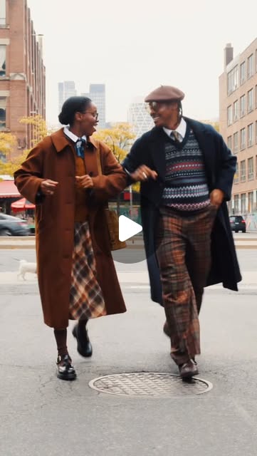
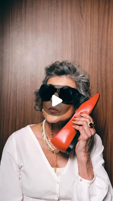
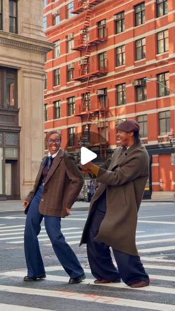
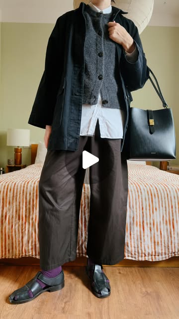
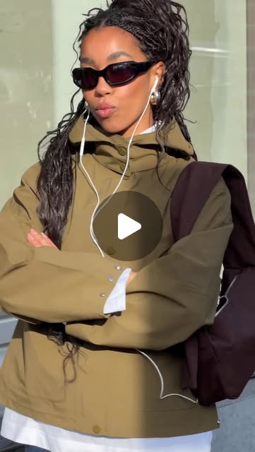
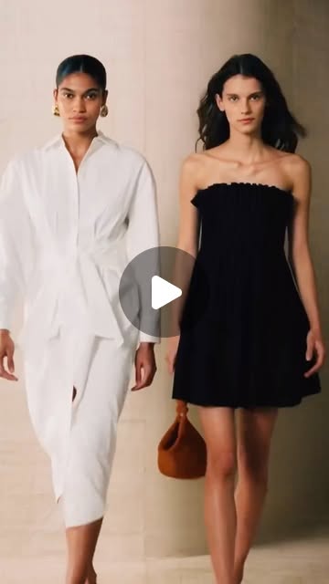
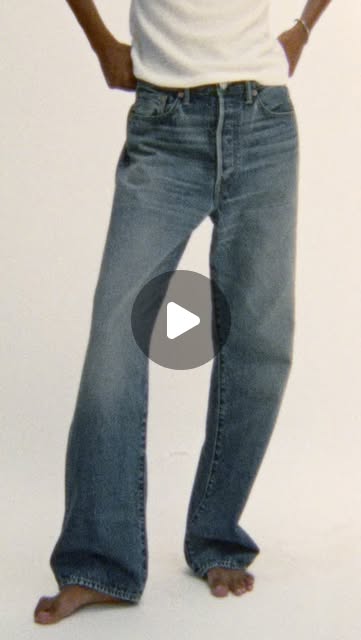
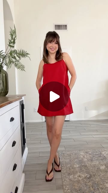
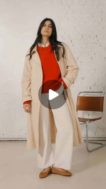
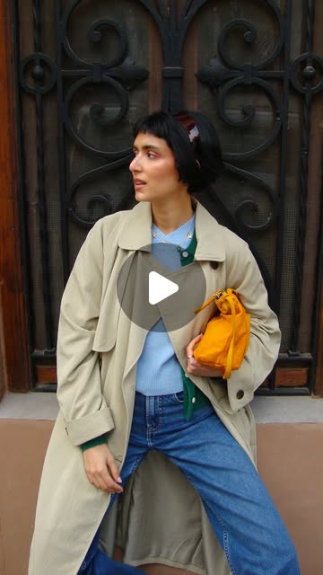
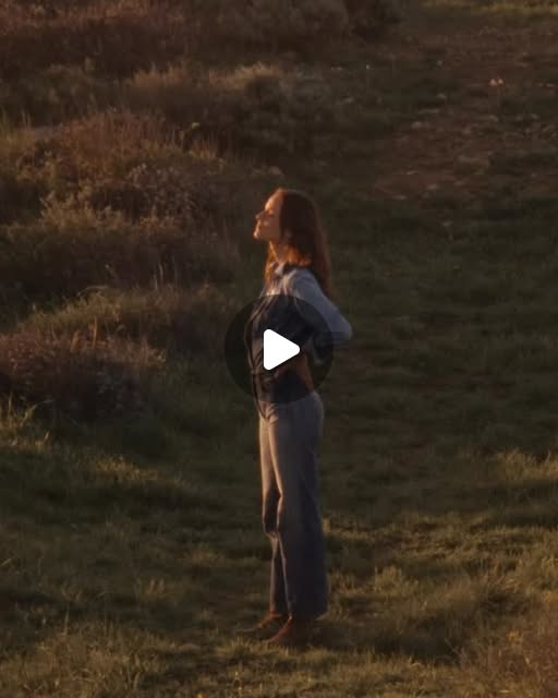
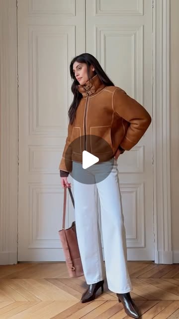
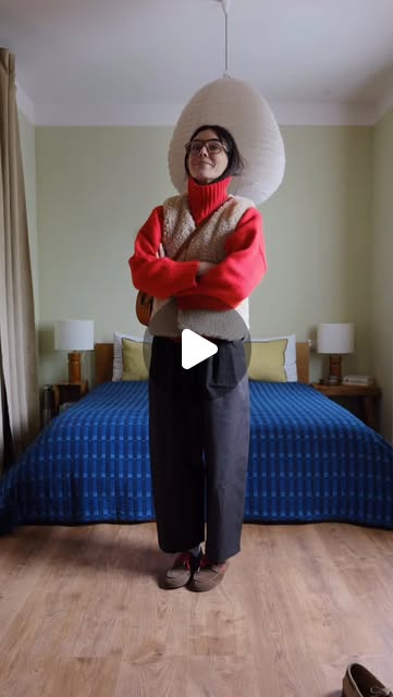
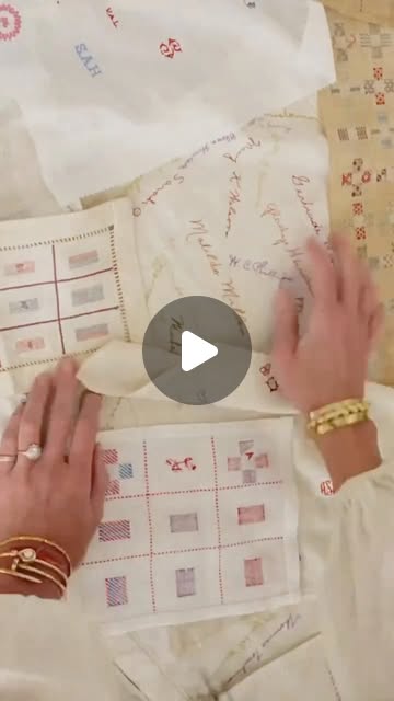
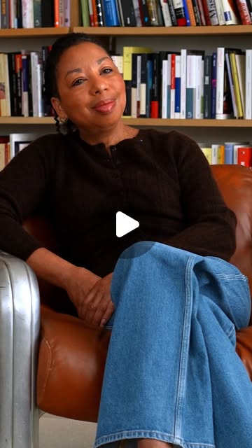
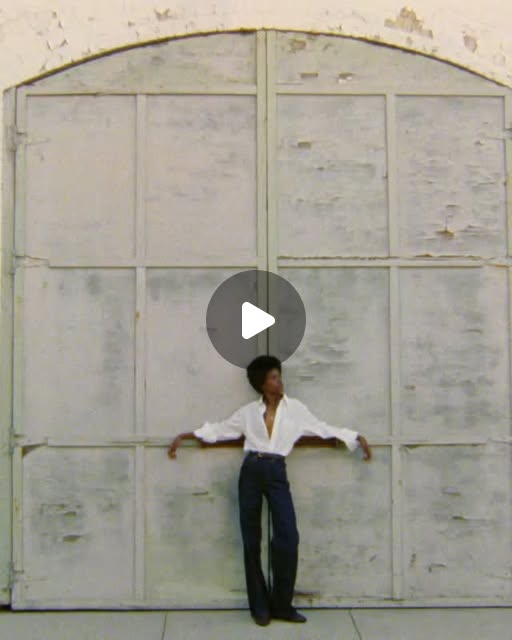
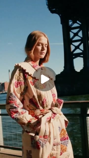
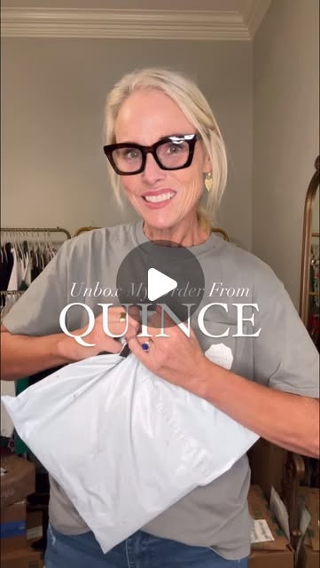
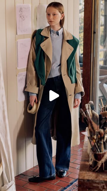
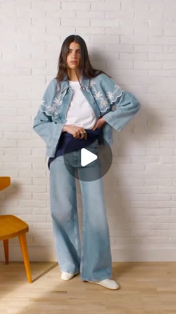
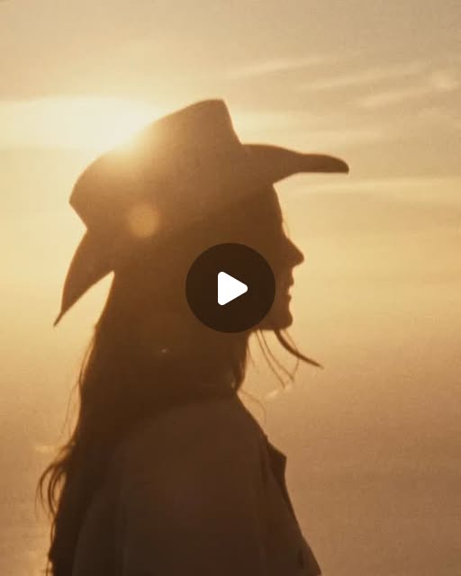
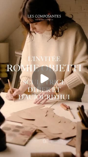
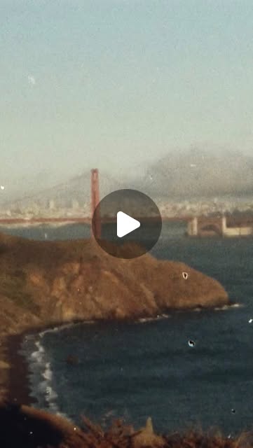
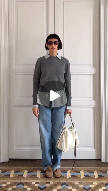
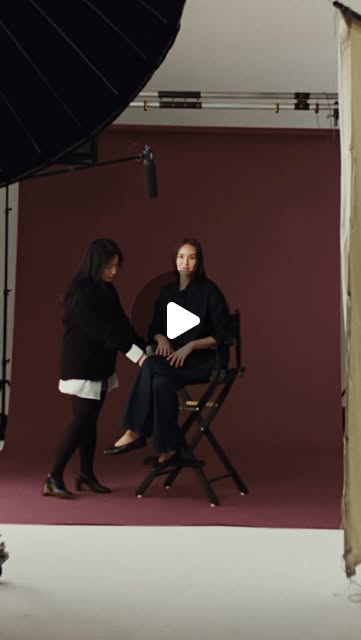
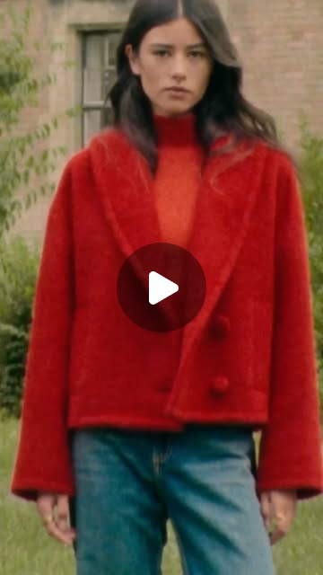
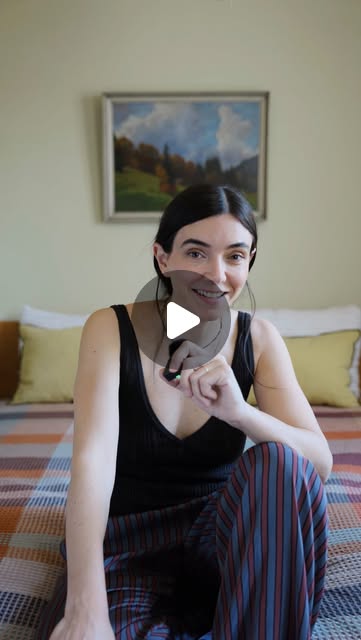
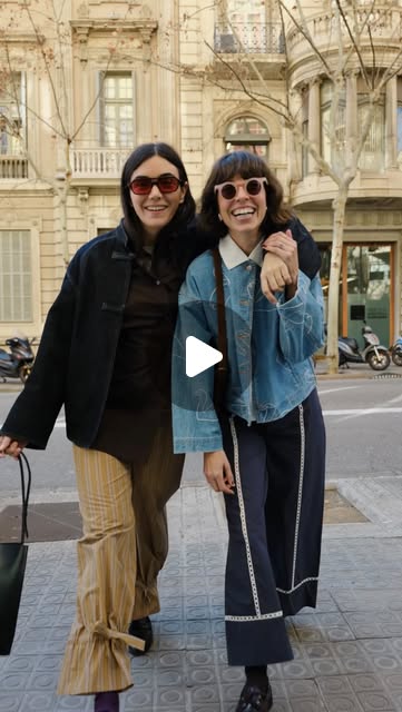
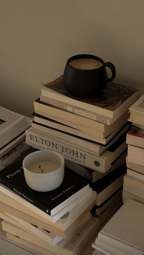
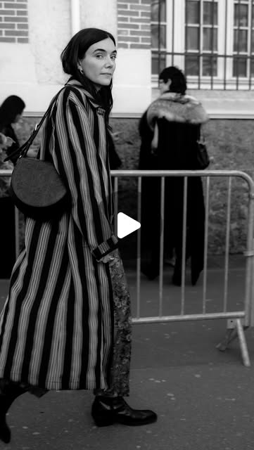
Click any thumbnail to watch the original reel. Sourced from Sézane, Everlane, Bucket List Momma, Clara Ferre, Quince, and Buck Mason.
Video Specs
Listings
- Amazon: 16:9, 1920×1080px (1080p) preferred, min 720p. MP4 (H.264, AAC). Max 5 min, max 500MB. Auto-plays on mute — add captions.
- Shopify: MP4 (H.264), max 1GB, up to 10 min. 16:9 or 9:16 depending on placement. Hosted or YouTube/Vimeo embed.
- Walmart: MP4 (H.264), 16:9, 1080p, 30–120 sec recommended. Max 500MB.
YouTube
- Standard: 16:9, 1920×1080px (1080p) or 3840×2160px (4K). MP4 (H.264, AAC).
- Shorts: 9:16, 1080×1920px, max 60 sec.
- Thumbnail: 1280×720px, max 2MB, JPG/PNG.
Social Media
- Instagram Reels: 9:16, 1080×1920px, max 650MB, up to 3 min. MP4 (H.264, AAC). Leave bottom 1/5 clear for captions.
- Instagram Stories: 9:16, 1080×1920px, max 4GB, up to 60 sec per story.
- TikTok: 9:16, 1080×1920px, MP4 preferred. Max 287MB (iOS) / 72MB (Android) / 500MB (desktop). Up to 10 min.
- Pinterest: 2:3 or 9:16, 1000×1500px, MP4/MOV, max 2GB, 4–15 sec for Idea Pins.
UGC
- Format: 9:16 vertical, 1080×1920px, MP4. Shot on phone is fine — authenticity matters more than polish.
- Style: Unboxing, try-on, styling, “get ready with me,” day-in-my-life with shoes featured naturally.
- Audio: Voiceover or trending audio. Always caption for silent autoplay.
- Length: 15–60 sec for Reels/TikTok, up to 3 min for longer-form.
Packaging & Print
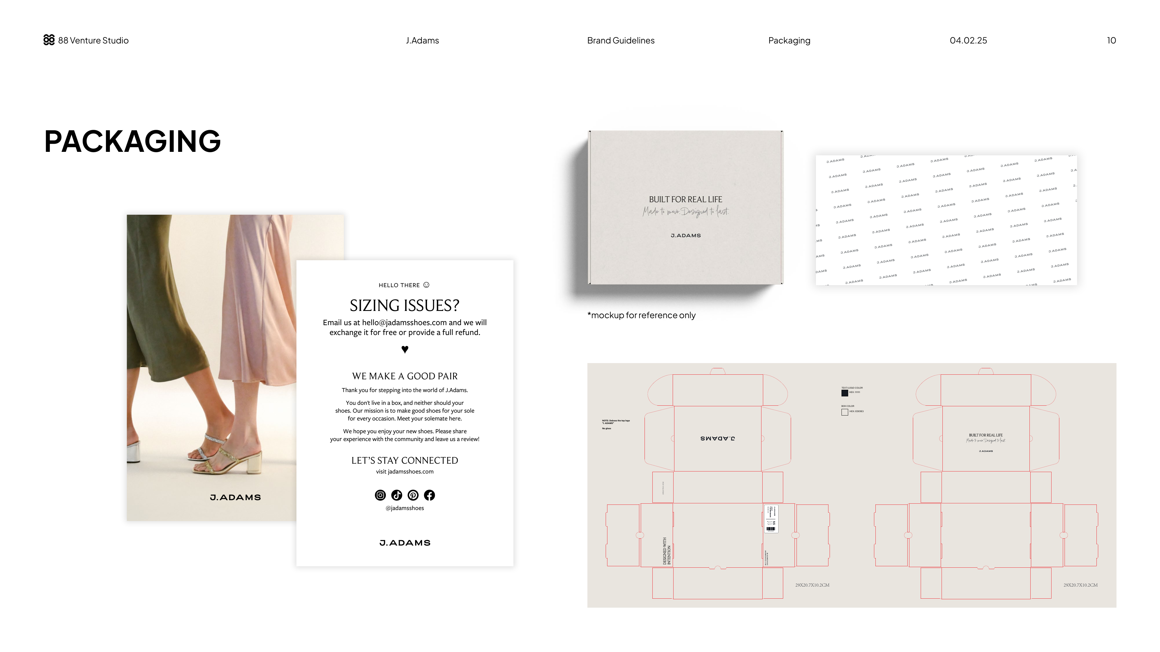
Shoe shopping is always a personal purchase. It reflects the wearer’s style and preferences. Shoes are an extension of themselves, so we want to make sure to package them beautifully and in a way that resonates with our brand identity. Each package is complete with J.Adams branded tissue paper and a product insert.
Includes: shoe box, branded tissue paper, product insert (4×6 in), die-cut layout
Box Colors
Black
#111111
Pantone (coated)PANTONE Black 7 C
Pantone (uncoated)PANTONE Black U
Dove
#EDE9E3
Pantone (coated)PANTONE Warm Gray 1 C
Pantone (uncoated)PANTONE Warm Gray 1 U
Hex is the screen reference; Pantone is what the printer runs. These Pantone values are the nearest match, not literal hex conversions — printed stock reads warmer and softer than the on-screen hex. Approve against a physical Pantone chip or a press proof, never a monitor.
The 2026 shoe box run prints uncoated — use the uncoated values. The coated values remain the reference for boxes already run and for any coated stock. Black changes chip between the two: Black 7 is the lightest of the Black 1-7 family, a warm grey sold as a black, and uncoated stock has no gloss to give it depth, so Black 7 U prints flat and washed. Black U is denser and holds the warm direction next to Warm Gray 1 U. Warm Gray 1 carries across both. Press spec: double-hit the black, and approve against a draw-down on the actual box stock — a Pantone book chip is printed on Pantone’s reference paper, not on box board.
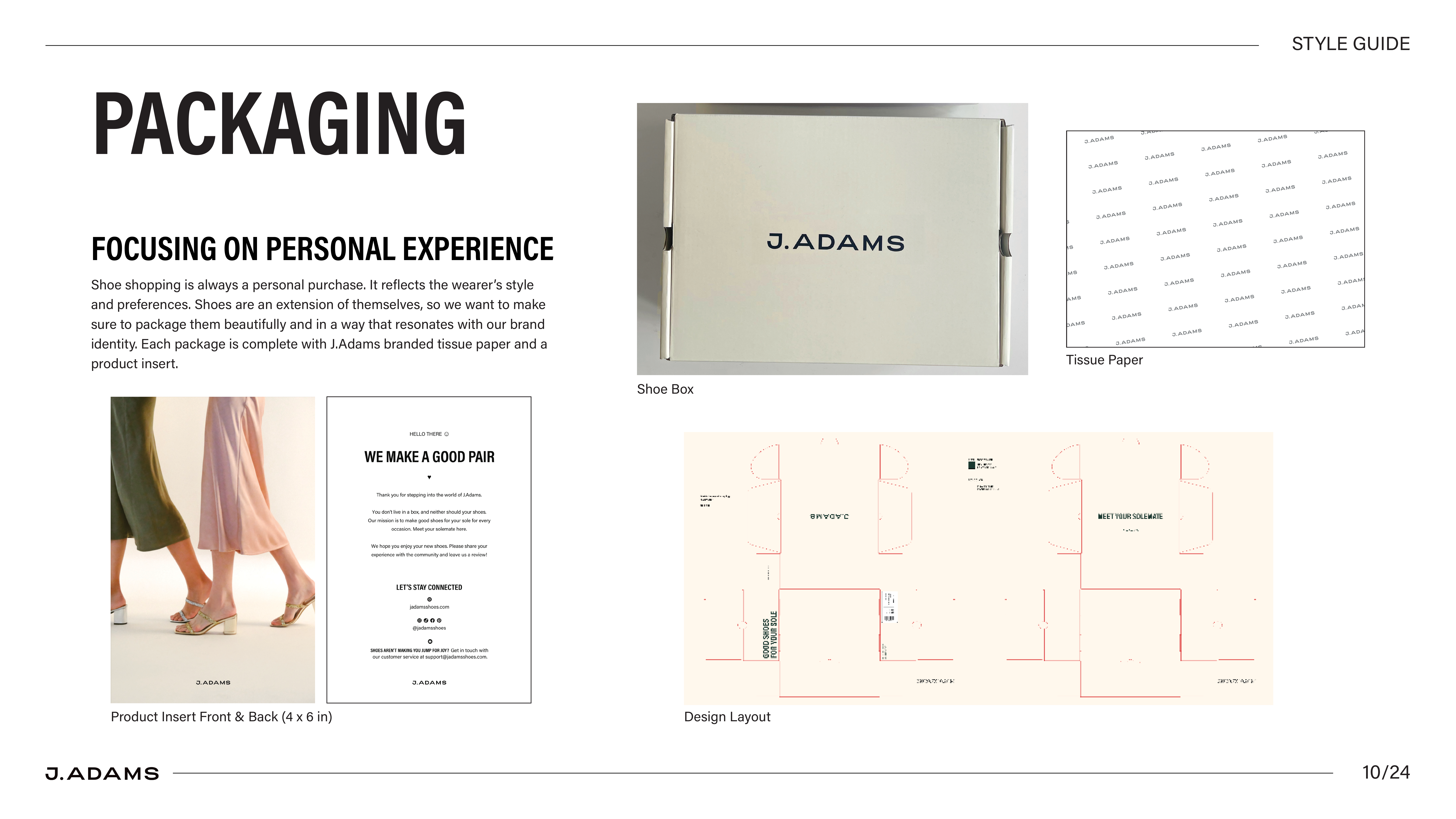
Current Version
Proposed Update (Designed by Jasmine — Kathrine likes the direction, but still using existing materials for now; will need to revisit when time to reorder.)