J.Adams is elevated affordable footwear for women who want style that works in real life. Not luxury, not disposable. The sweet spot. The kind of style that looks effortless because the choices were good, not because nothing was chosen.
Quality vegan leather, thoughtful design, honest pricing. A step above fast-fashion without the pretense of high fashion.
Women 25–40. Not impulse buyers — women who want quality that lasts without spending $200. They care about looking put-together but won't sacrifice comfort or budget for a label.
Everlane, J.Crew, Madewell, Sézane, Buck Mason, Rowan, Apiece Apart, Loeffler Randall, Boden, The Tiny Big Sister, Reformation, Dolce Vita
The Shared DNA: Quality over trend, transparency over hype, effortless style that doesn't need a logo to speak.


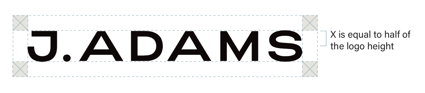
To ensure the legibility of the logo, there must be a minimum amount of clear space around all sides of the logo. The logo’s exclusion zone (marked as “X” in the diagram) is equal to half the height of the logo. Maintain clear space of at least half the logo height when placing the logo within a layout.
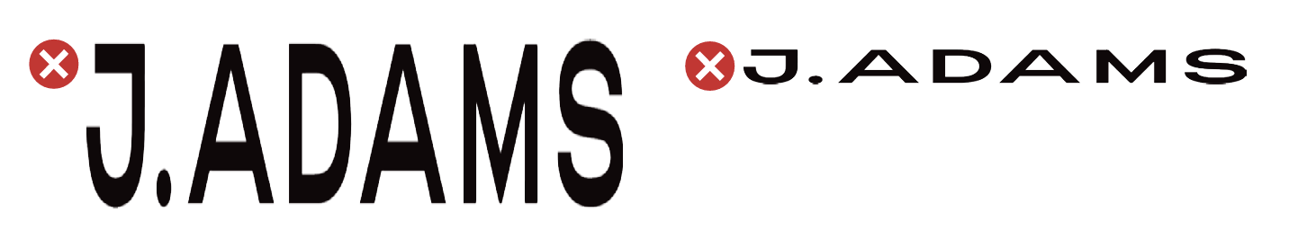
Do not compress, stretch, or distort the logo.
Do not use an off-brand color for the logo. The J.Adams logo should be in black or white on most collateral. For seasonal campaigns, you can change the logo to an accent color to create a more colorful look. When using bright colored backgrounds, the logo should remain white.
Outfit pairings, styling tips, “3 ways to wear the Shirley.” Real styling for real life.
Materials, construction, design decisions. What makes J.Adams different at the $50 price point.
Seasonal trends, styling for special occasions, building a shoe wardrobe for a modern, working-woman's lifestyle.
Customer stories, UGC, reviews, community. The women who actually wear these shoes.
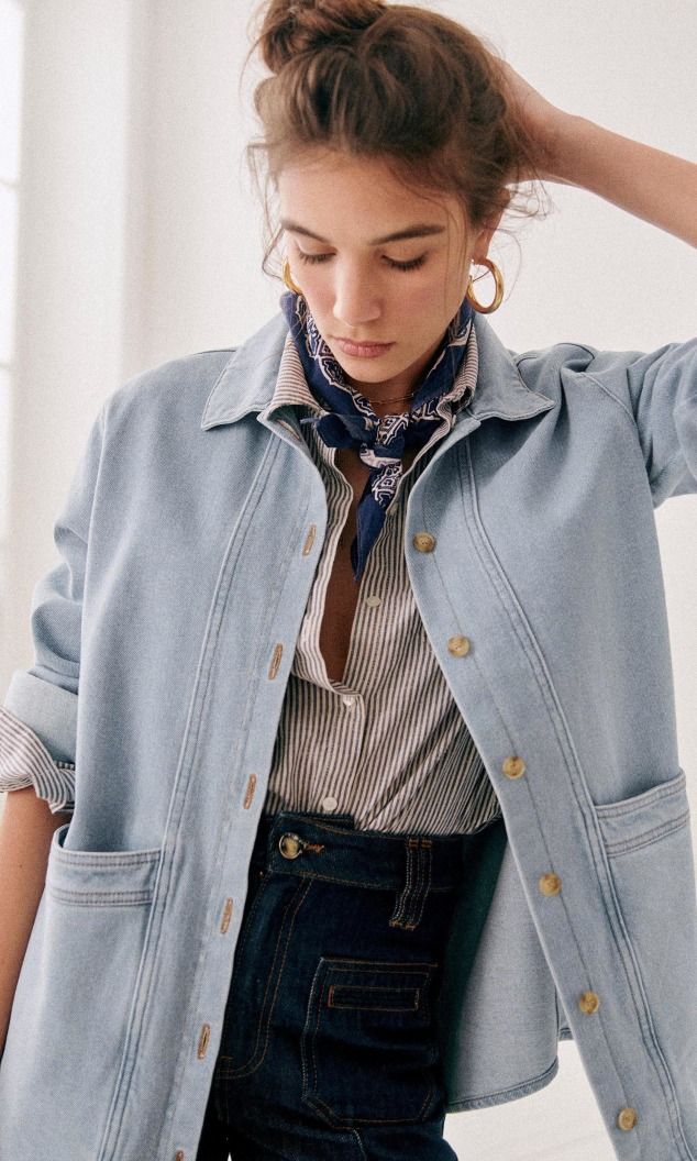
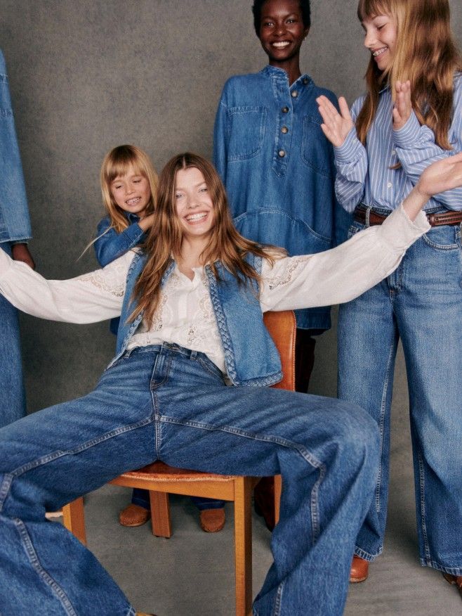
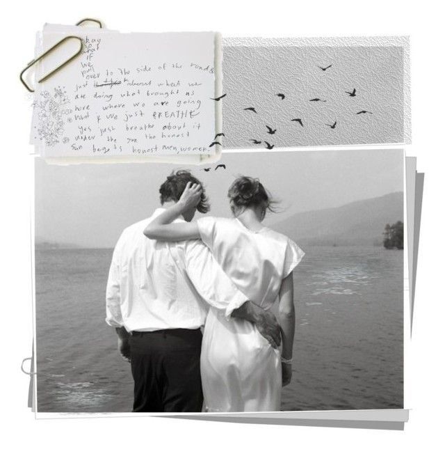
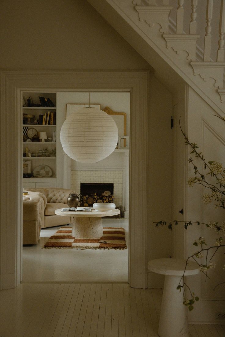
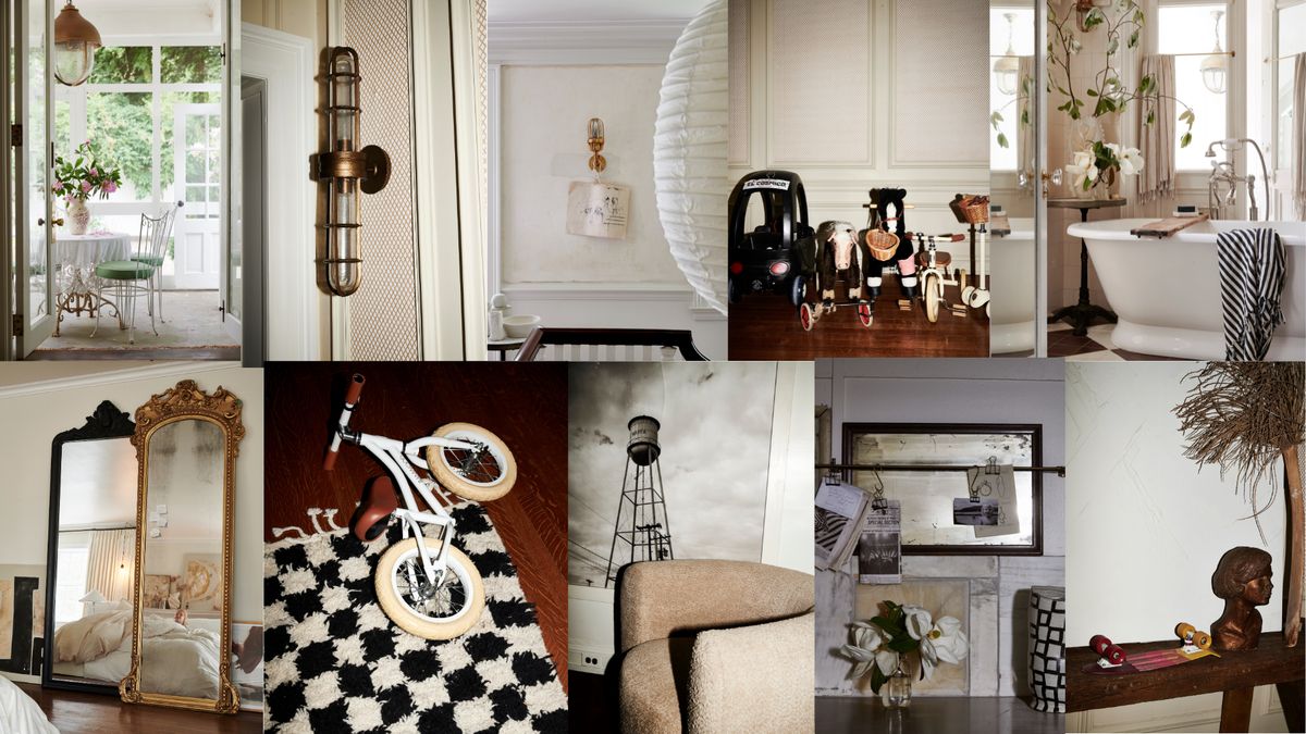
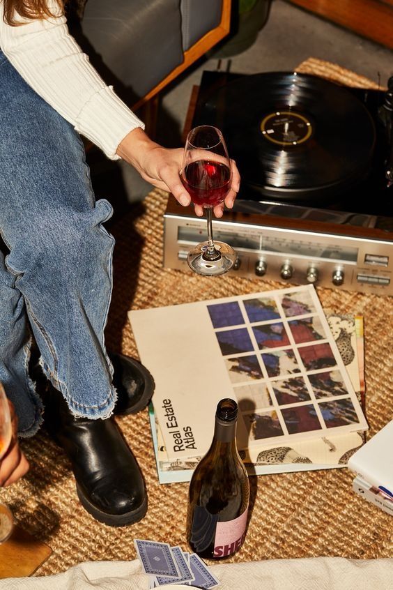
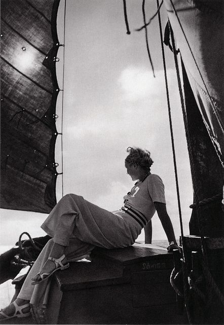
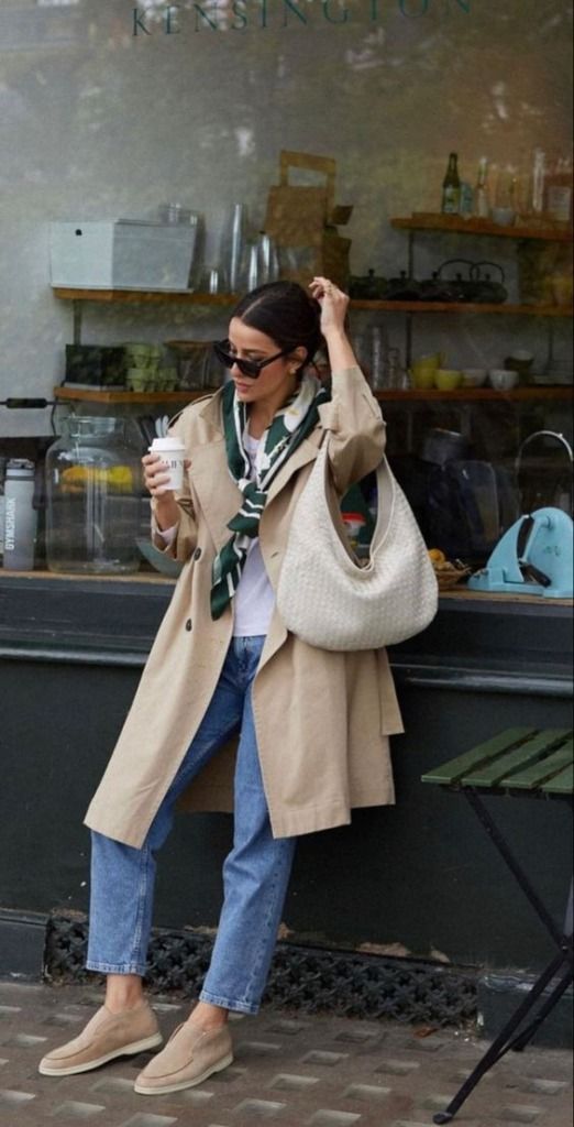
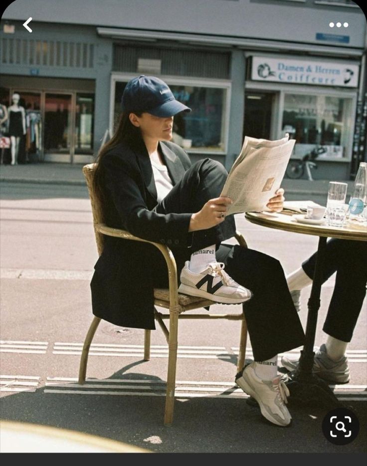
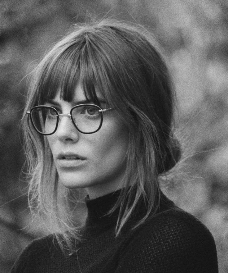
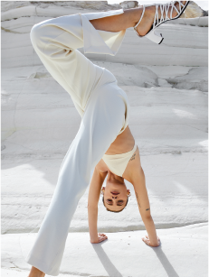
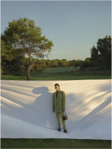
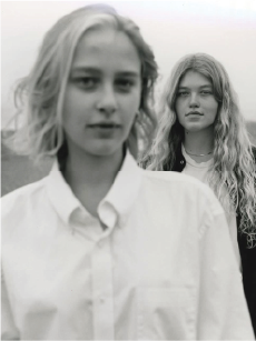
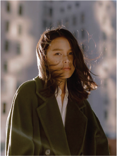
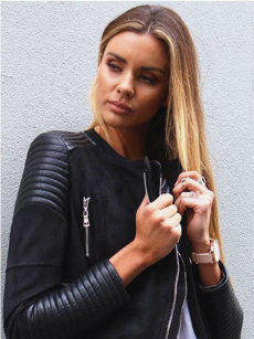
Warm. Confident. Grounded.
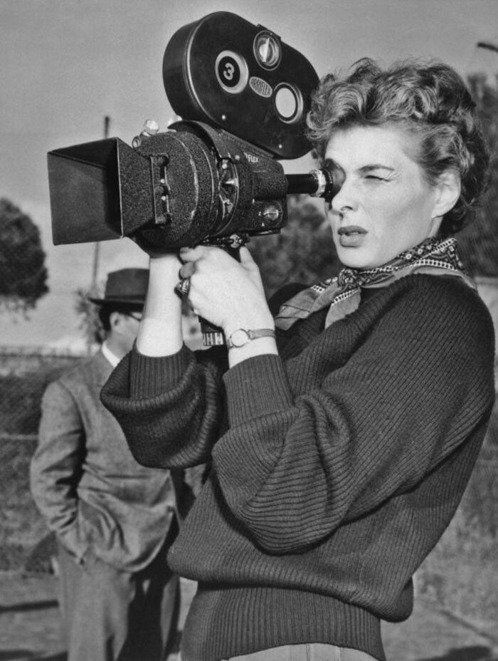
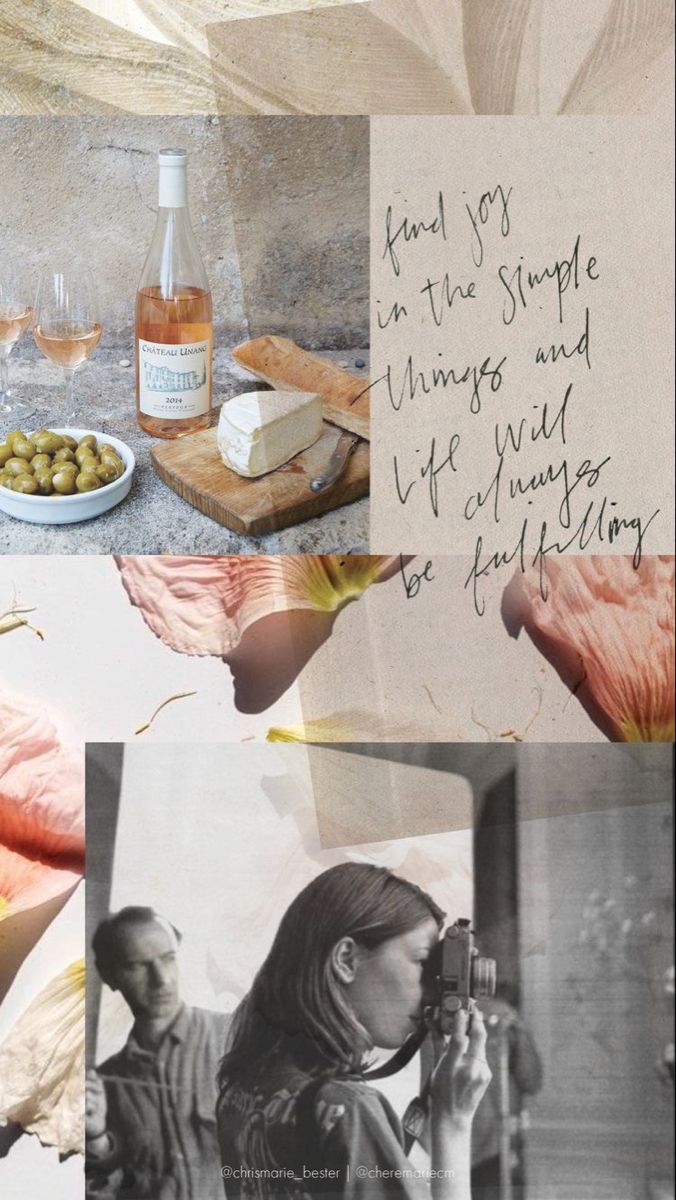
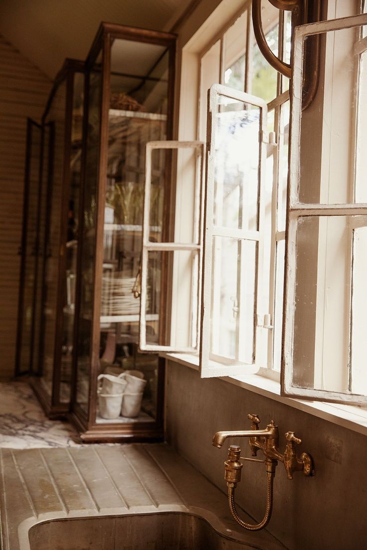
California-cool meets Parisian je ne sais quoi
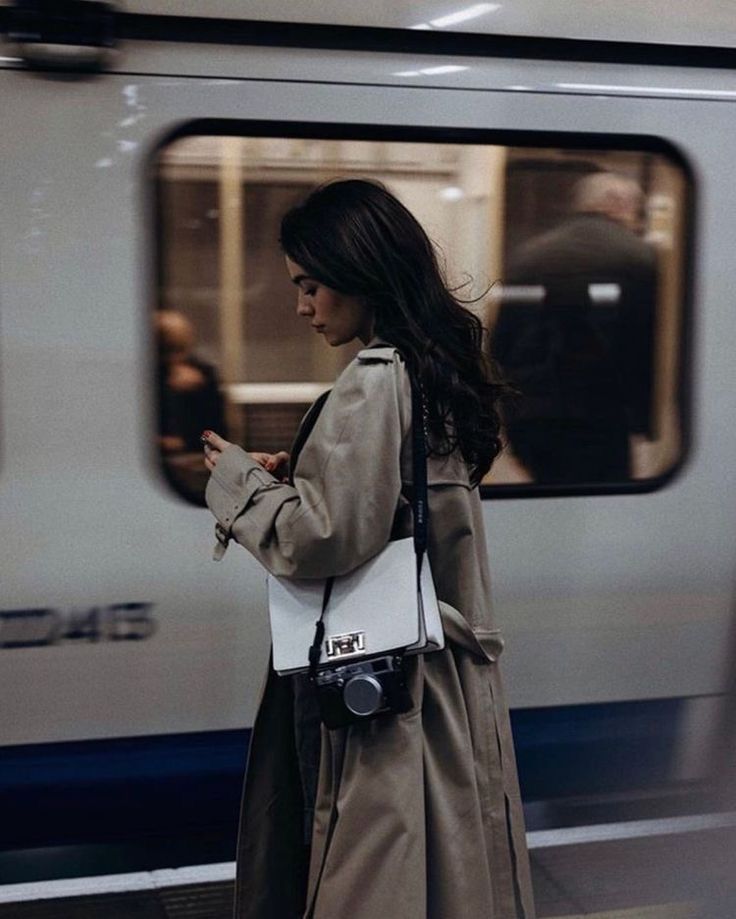
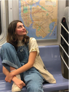
Your friend who always looks put-together but will tell you her shoes were $50. She's not trying to impress anyone — she just knows what works.
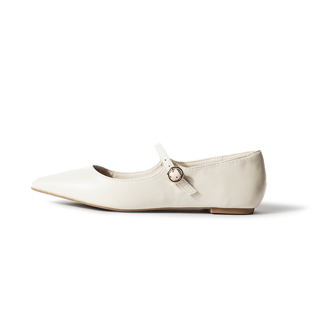
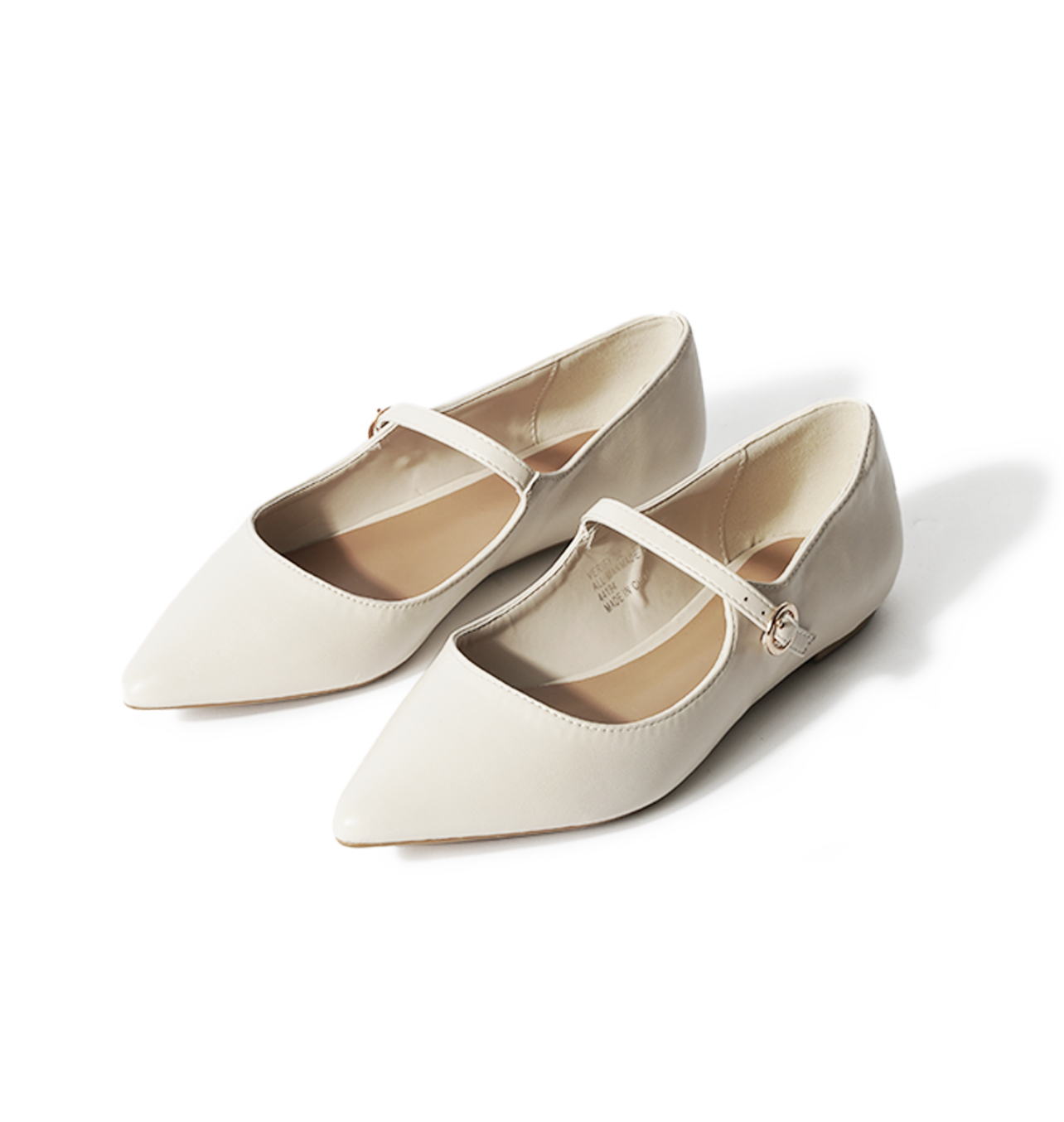
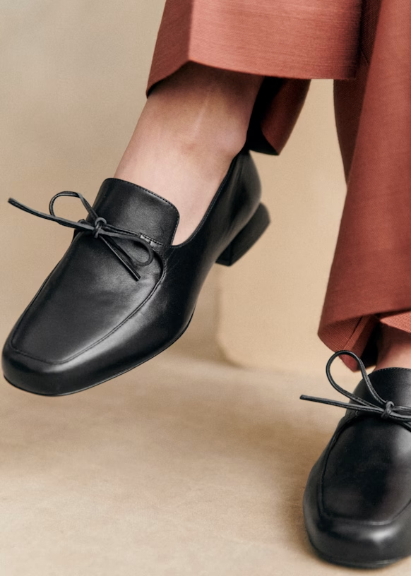
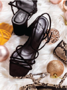
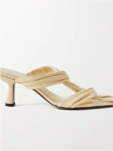
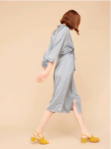
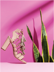
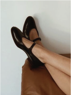
“The Shirley. A block heel Mary Jane in wine vegan leather. Pairs with everything from wide-leg trousers to a weekend dress.”
“Designed to keep up — cushioned insole, stable block heel, all-day comfort without the break-in period.”
Do
“Step into style with our AMAZING Shirley heel! This stunning shoe will elevate any outfit and make you feel like a queen!”
“Experience the ultimate in luxury comfort with our revolutionary cushioning technology!”
Don’t
✓ Don't pretend to be. Own the price point.
✓ Don't race to the bottom. Quality matters.
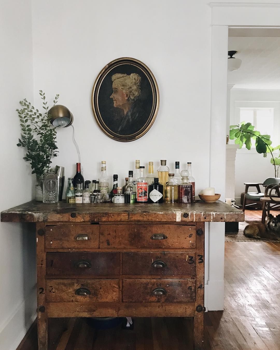
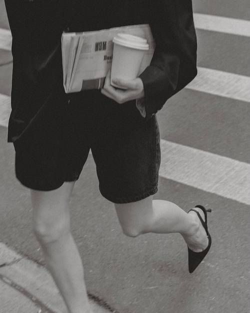
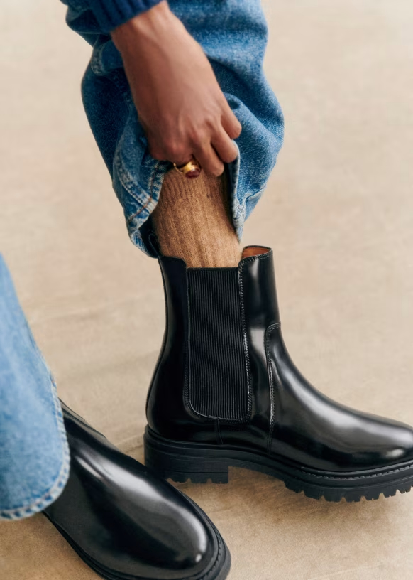
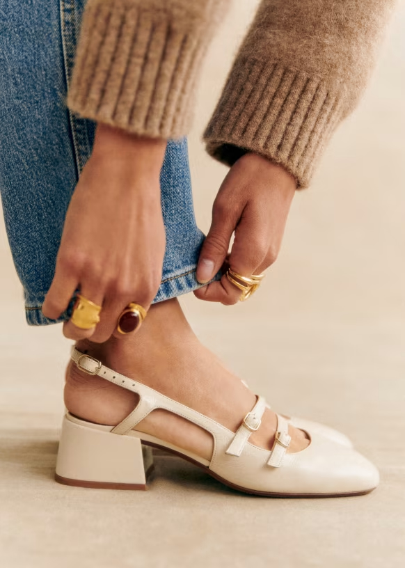
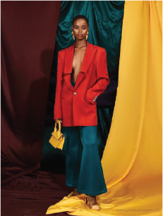
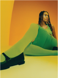
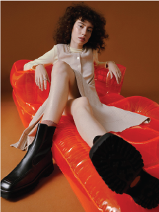
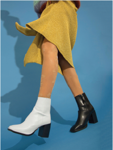
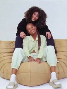
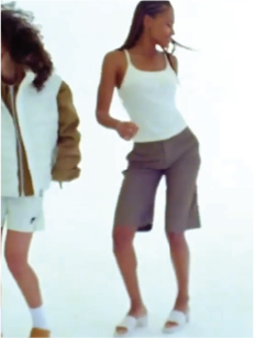
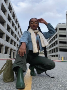
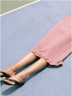
✓ Even sneakers are styled, not sporty.
✓ Shoes that work across seasons.
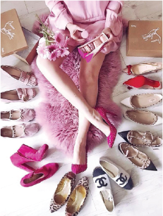
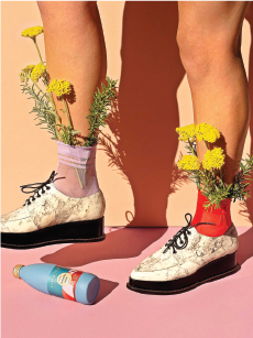
✓ No props, no flat-lays, no aesthetic for its own sake.
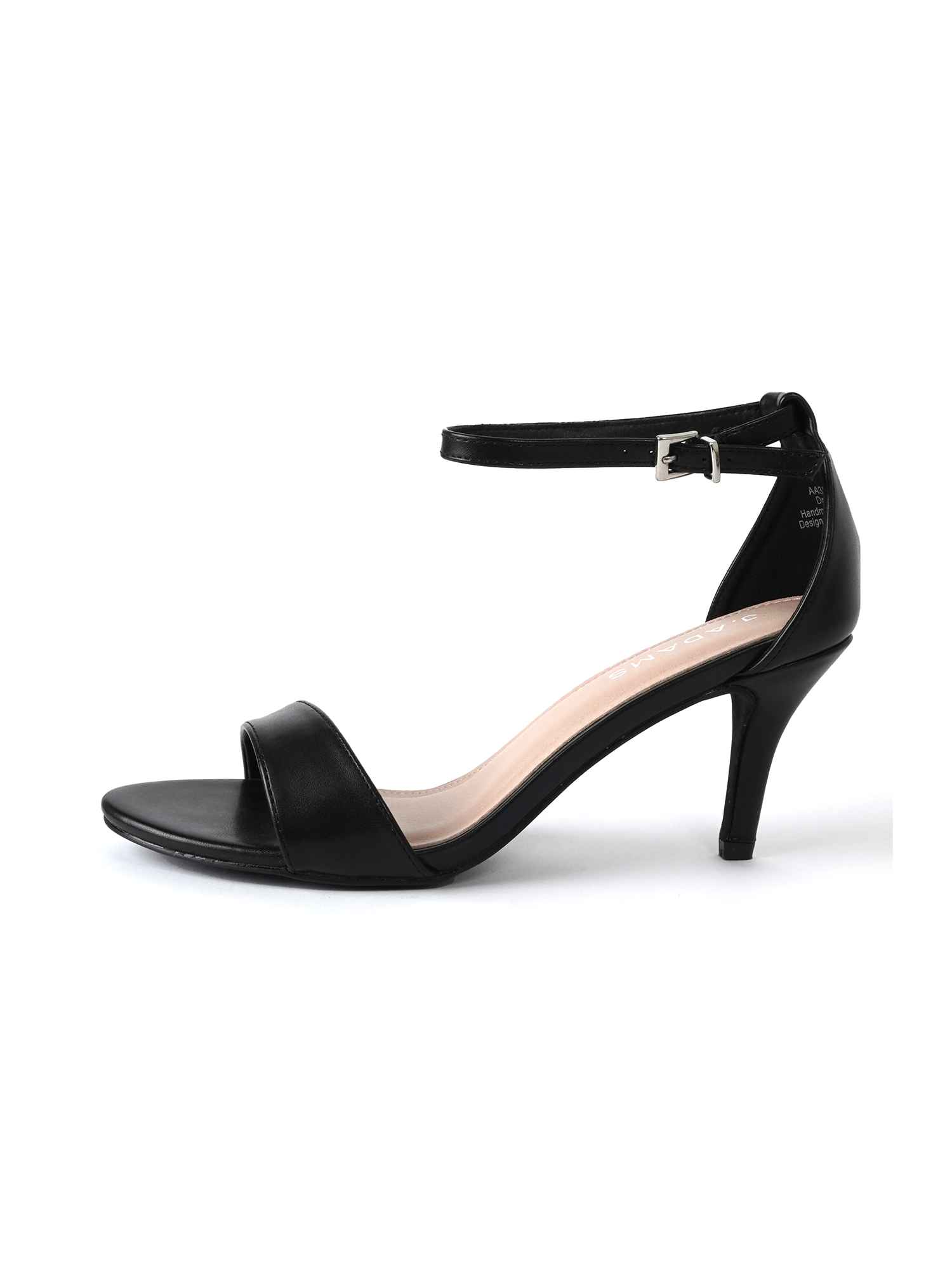
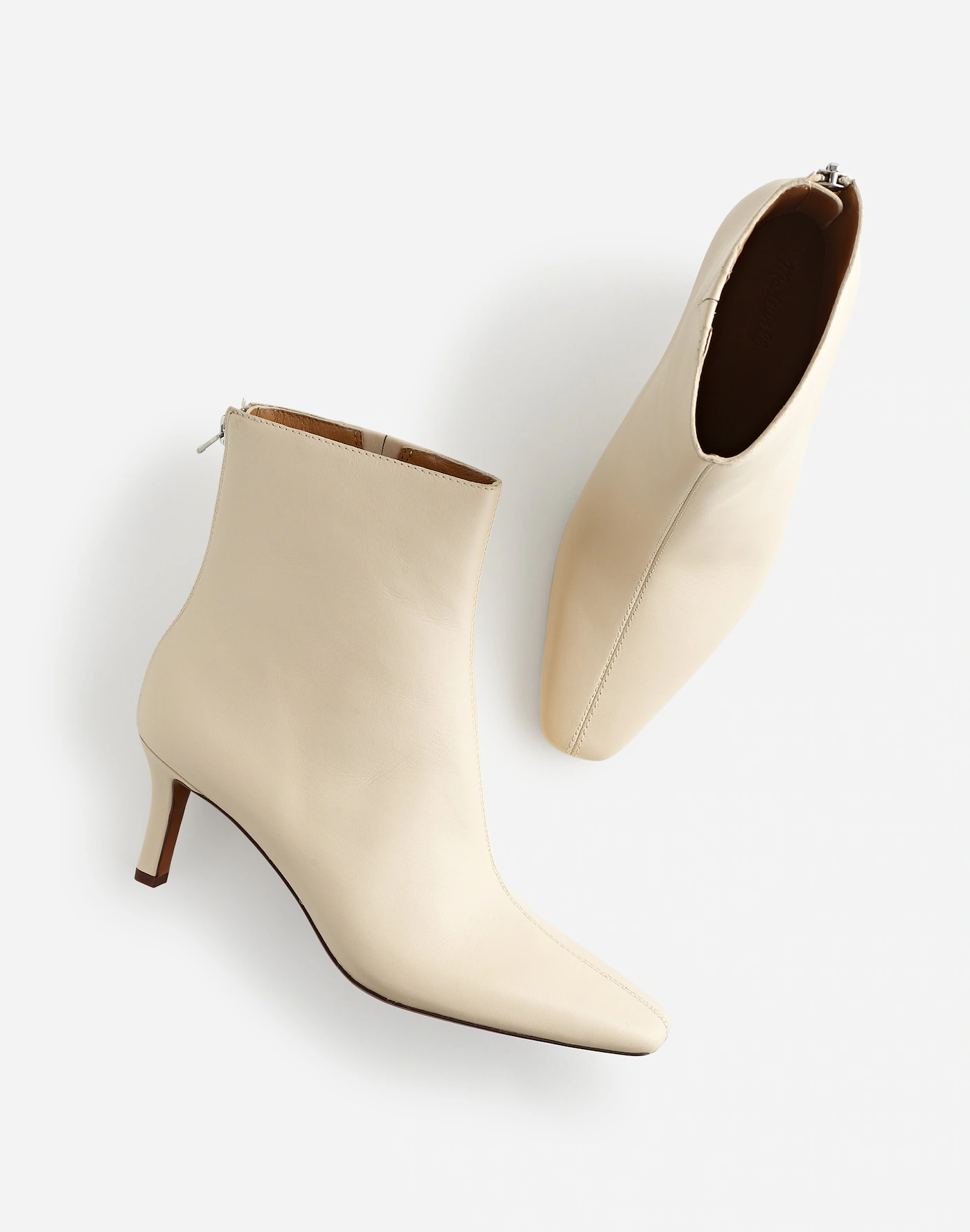
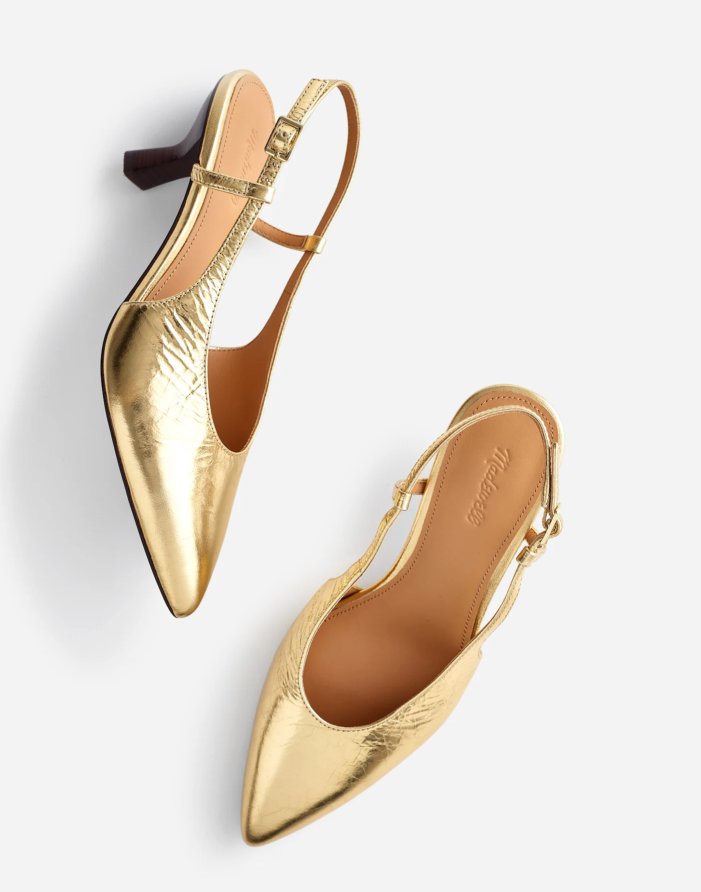
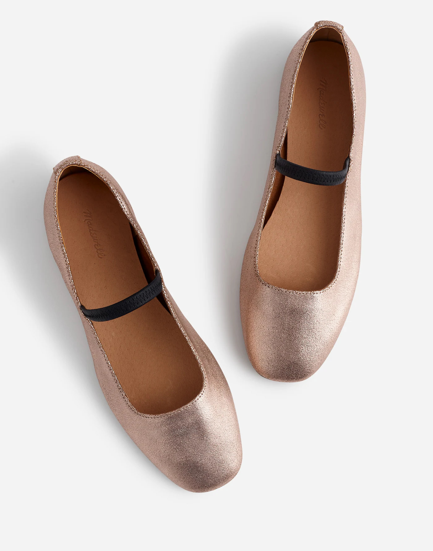
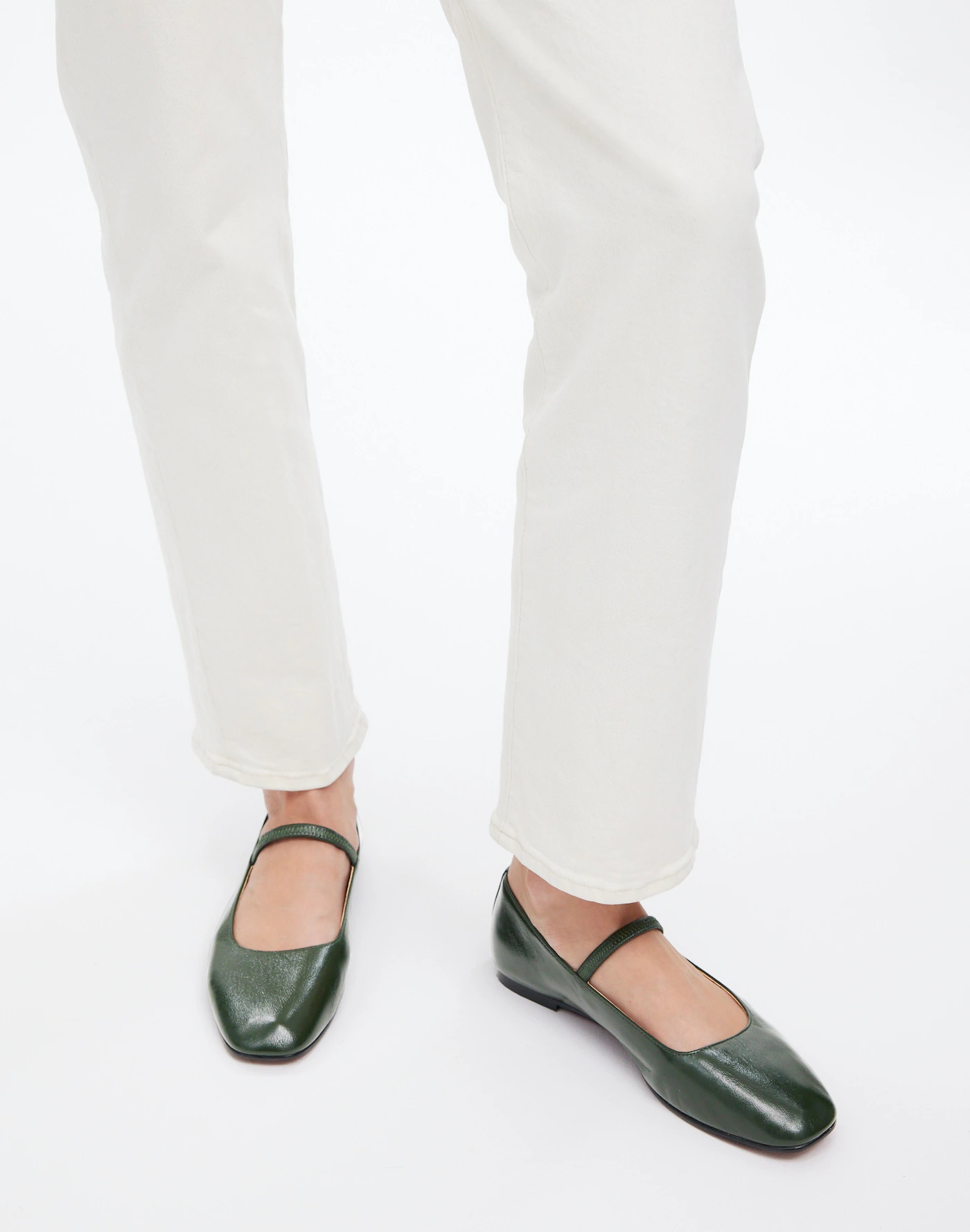
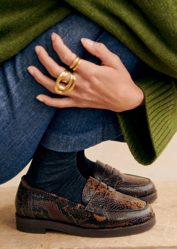
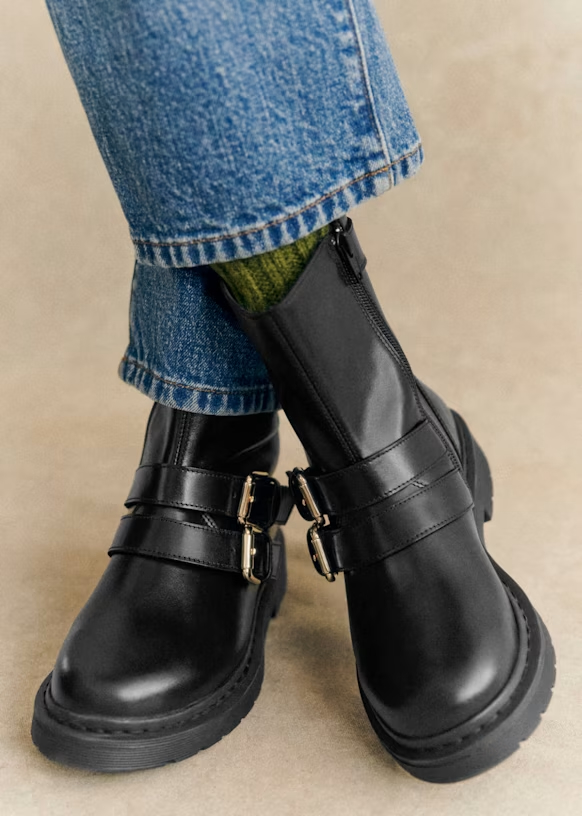
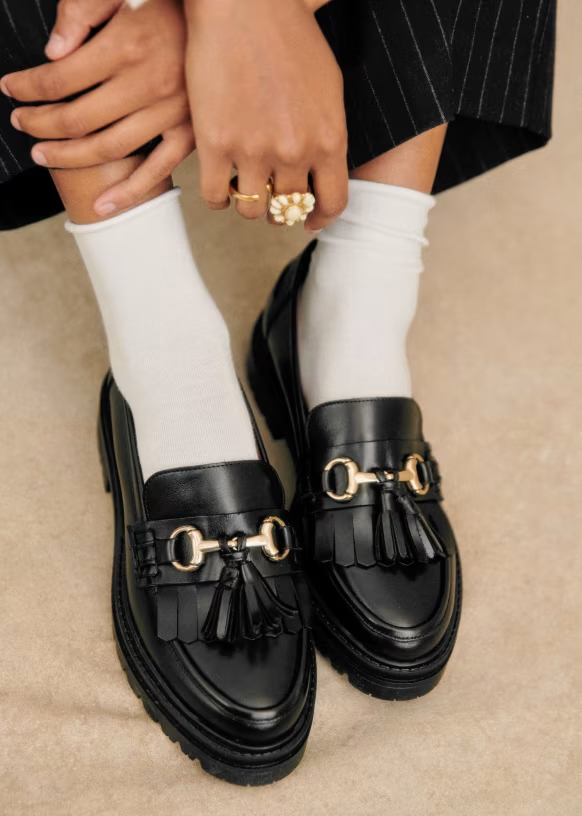
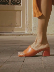
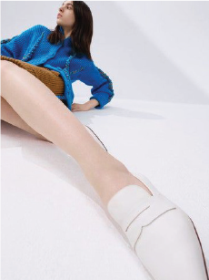
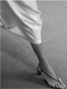
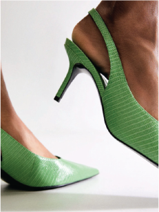
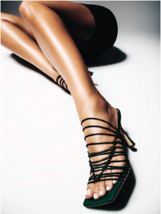
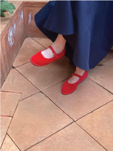
SHOT #1 — Single (wearer’s left) shoe, shot at a slight angle.
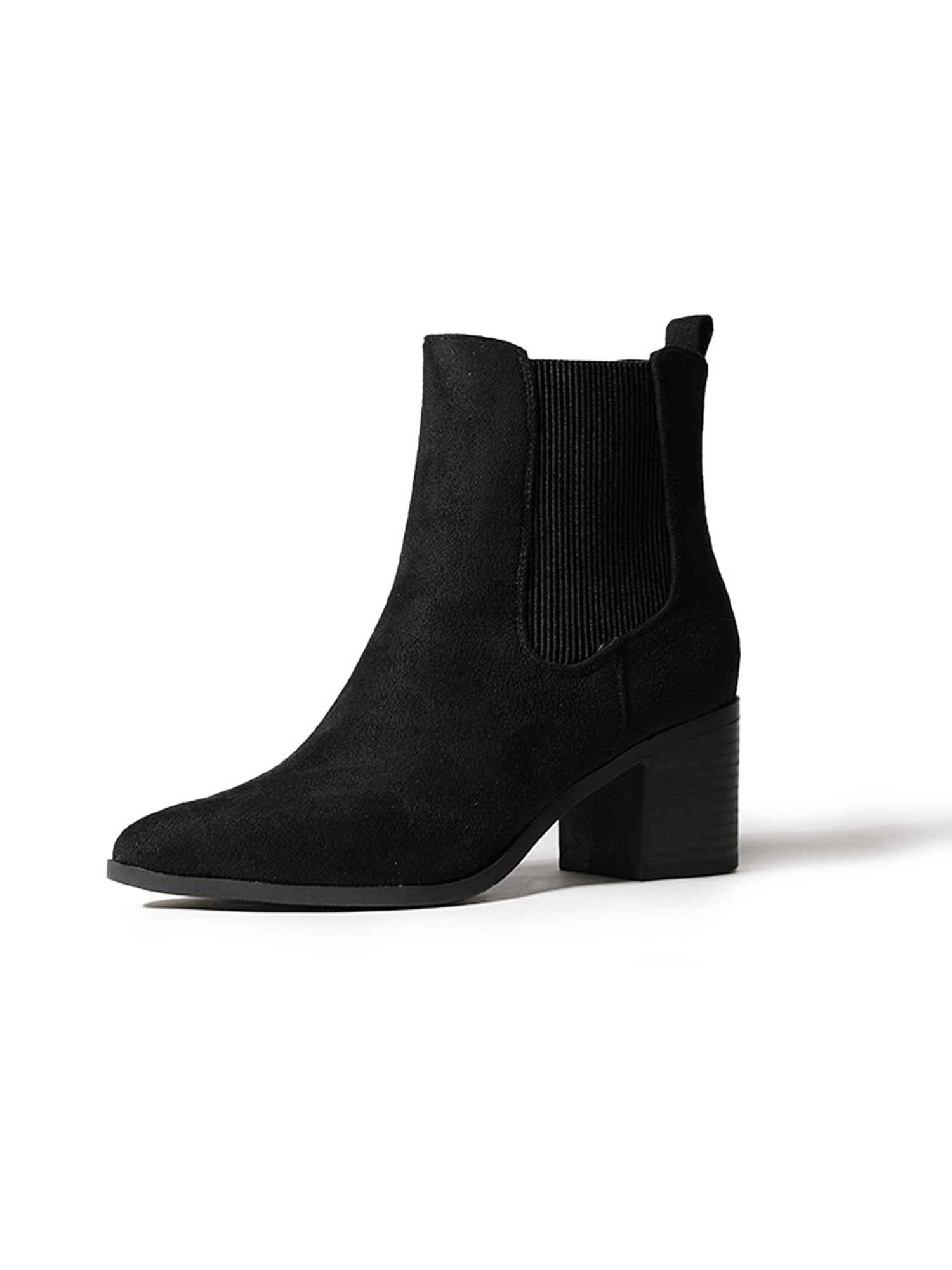
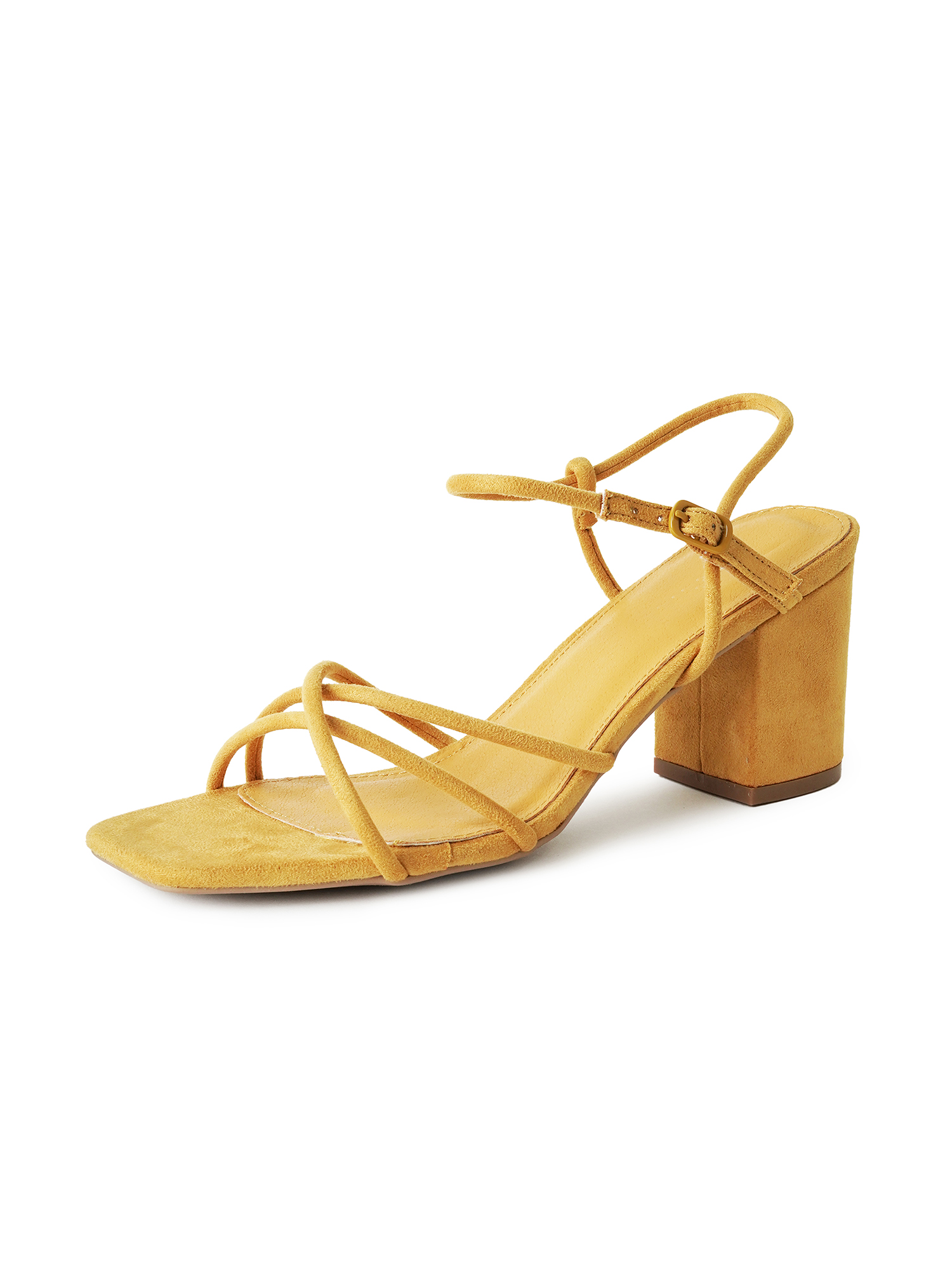
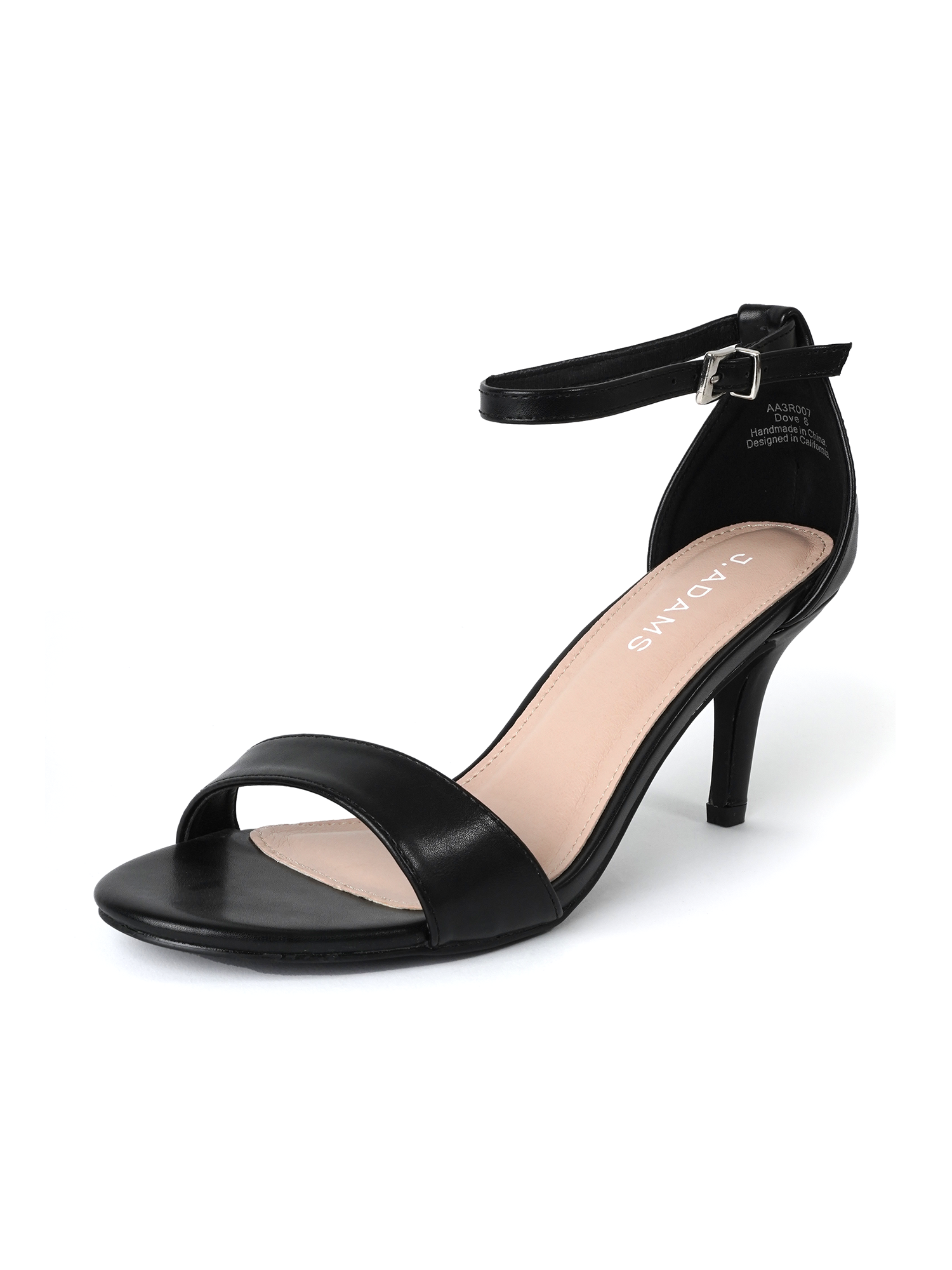
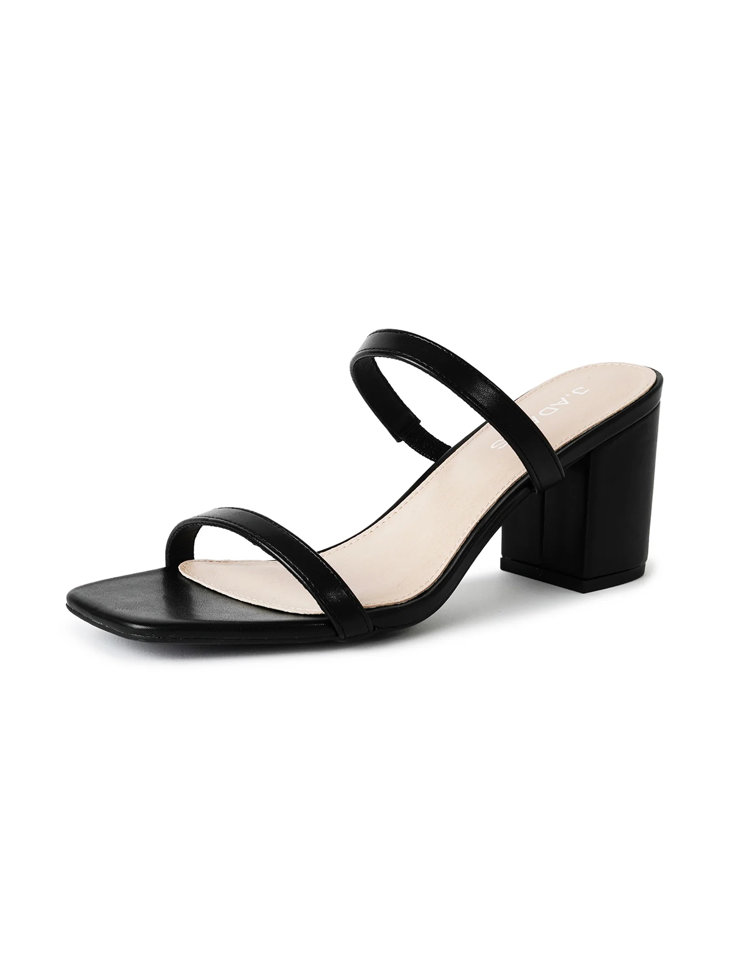
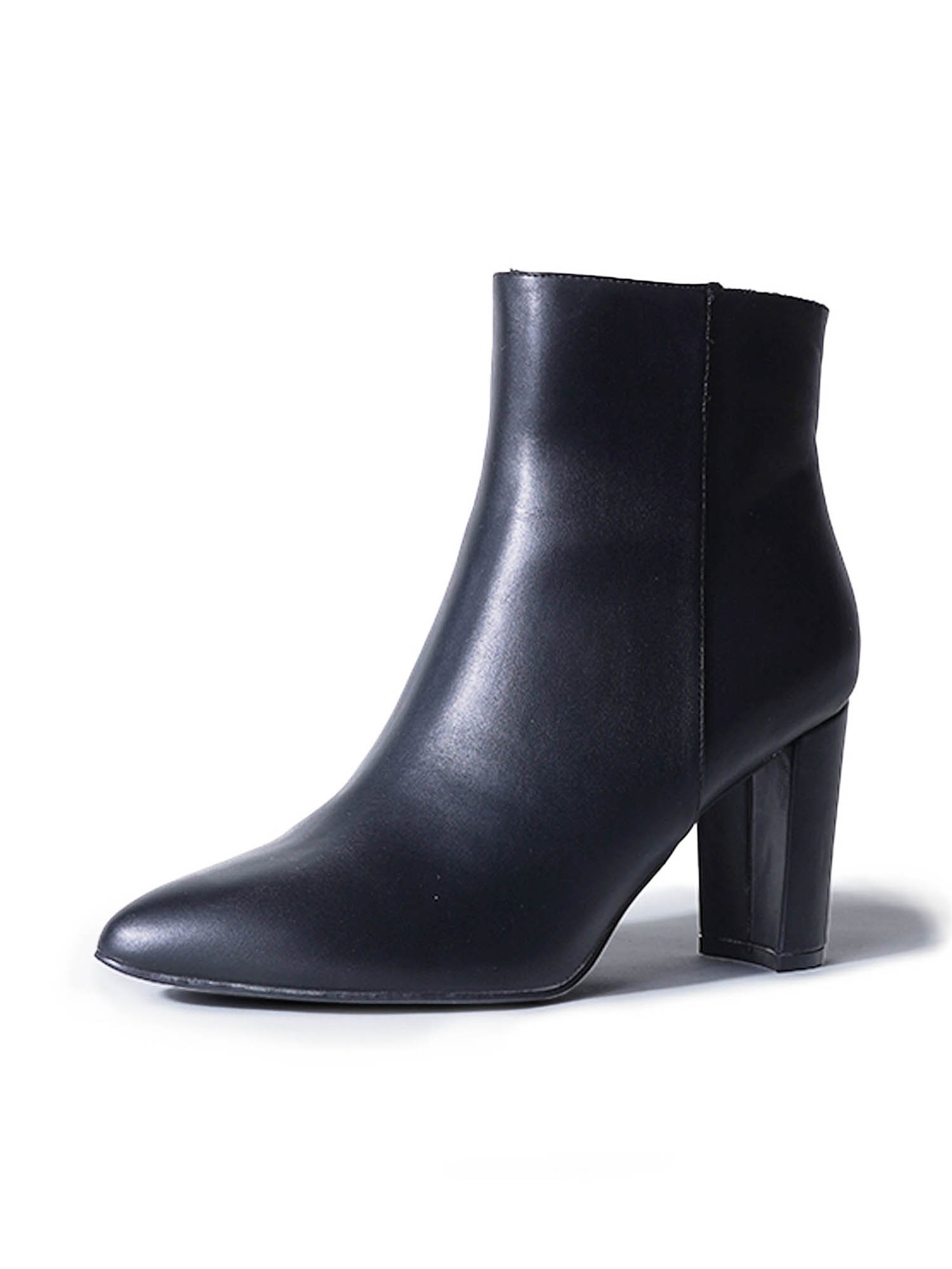
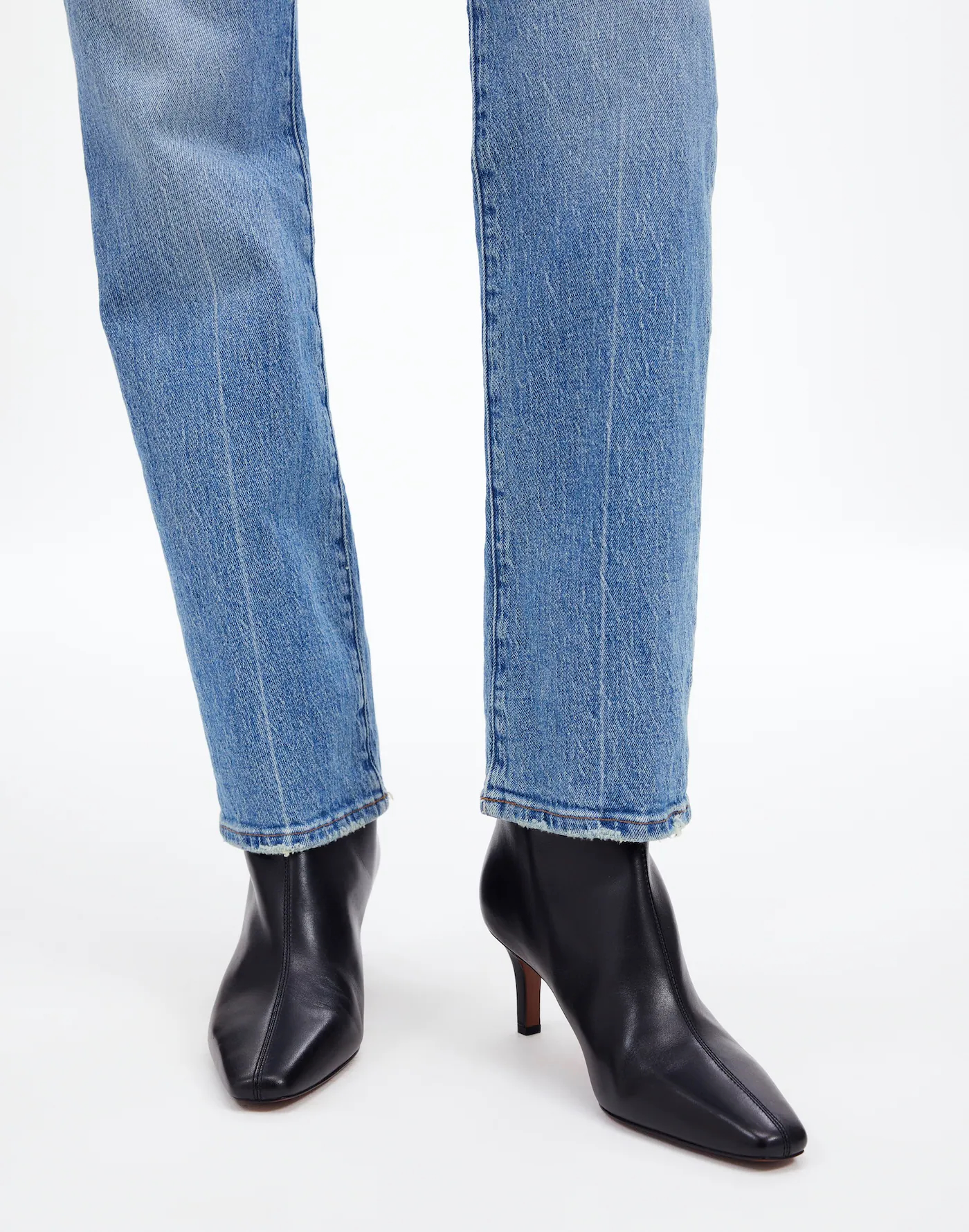
SHOT #2 — Single (wearer’s left) shoe, shot at profile.
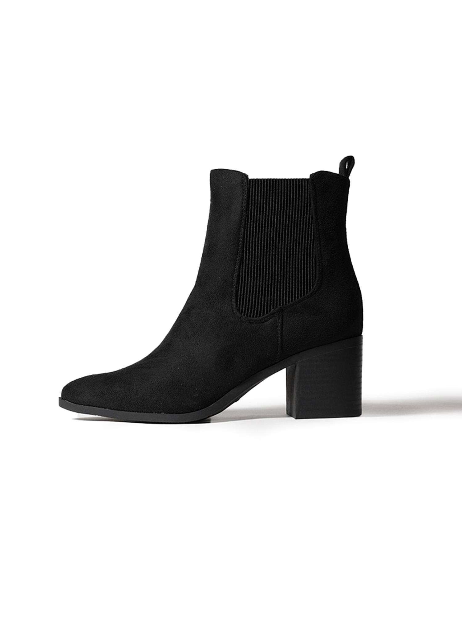
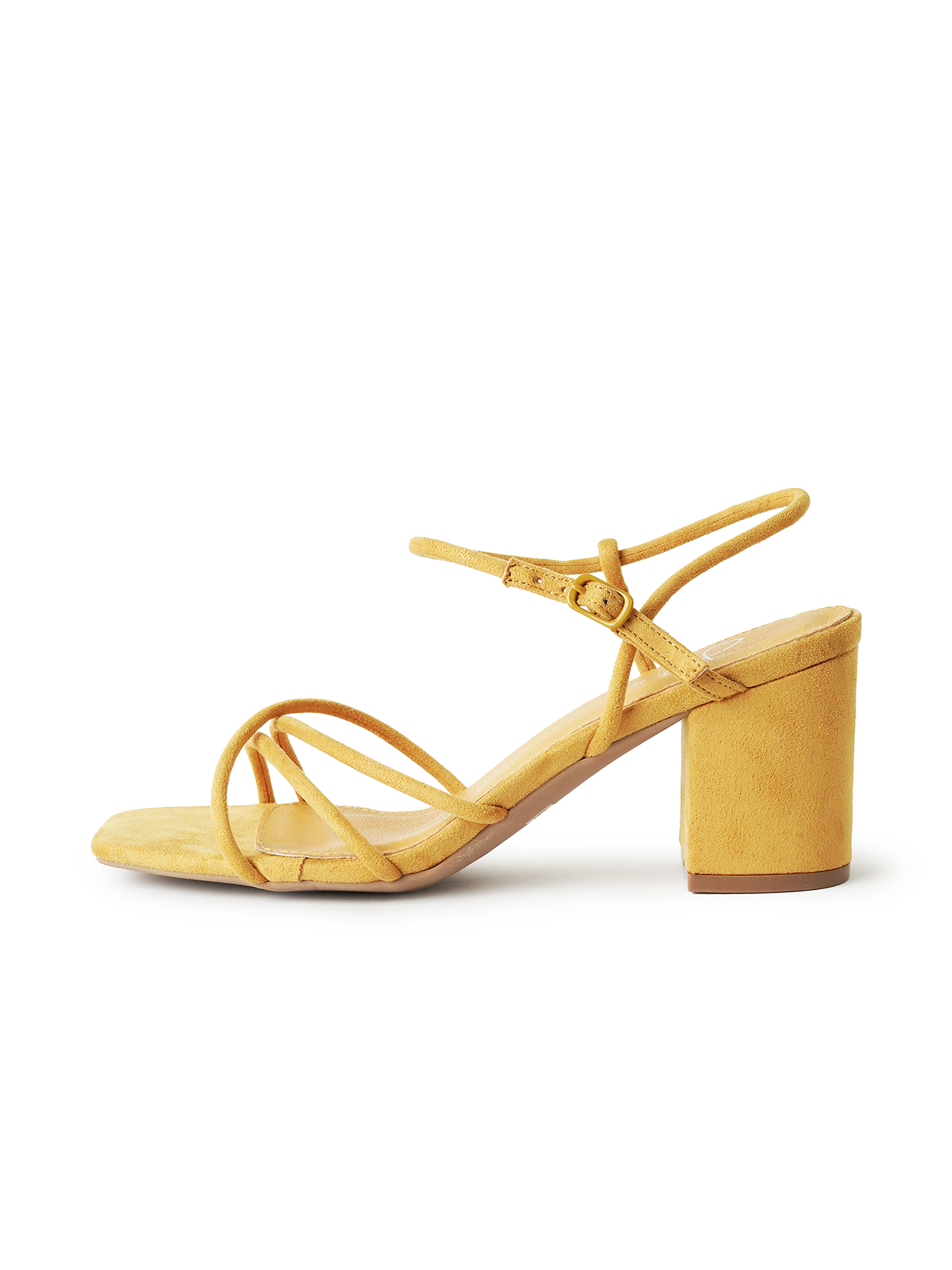
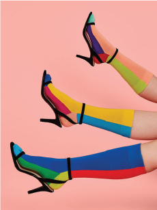
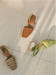
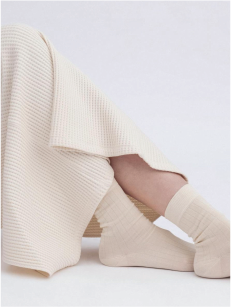
SHOT #3 — Both shoes, shot at an angle, from a bird’s eye view.
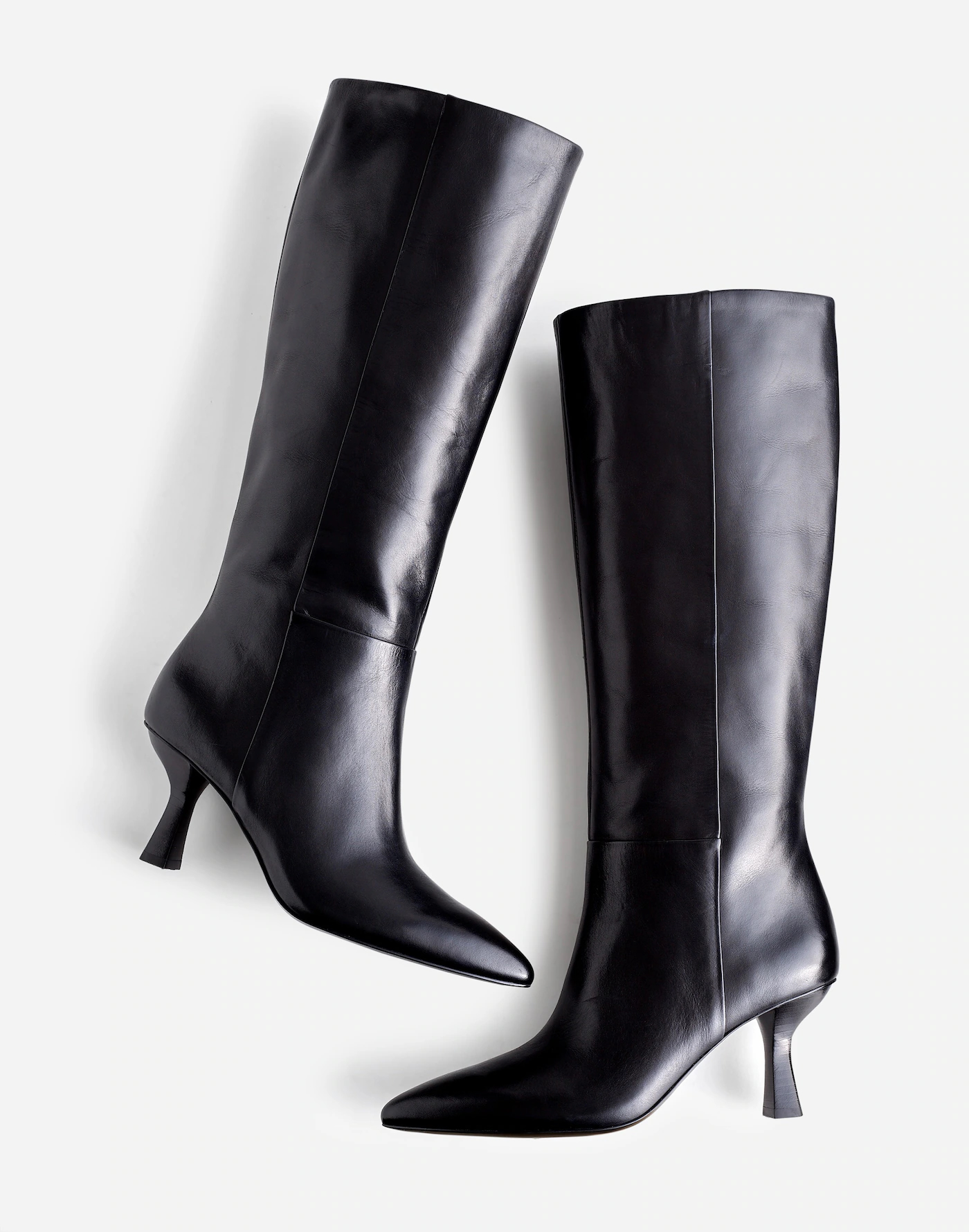
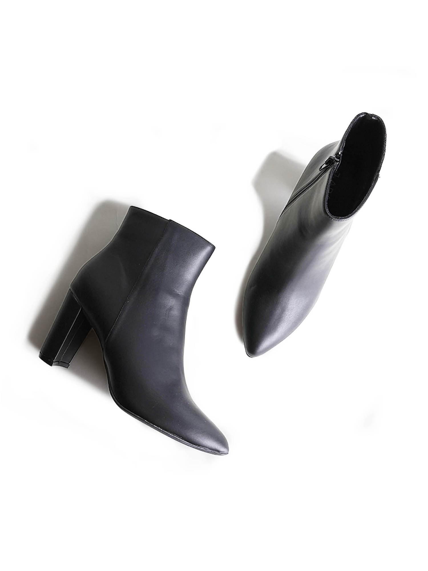
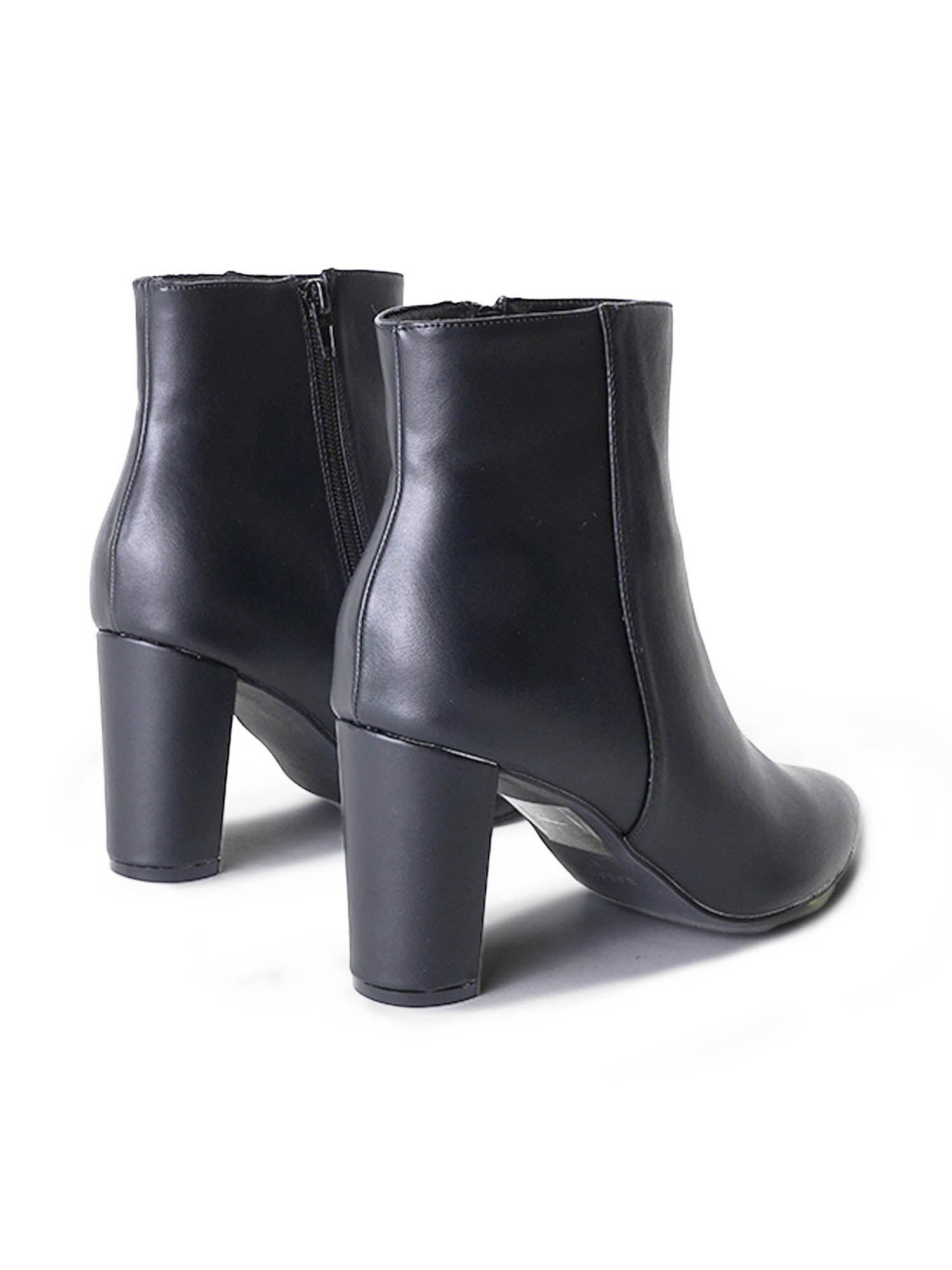
SHOT #4 — Both shoes, shot at an angle.
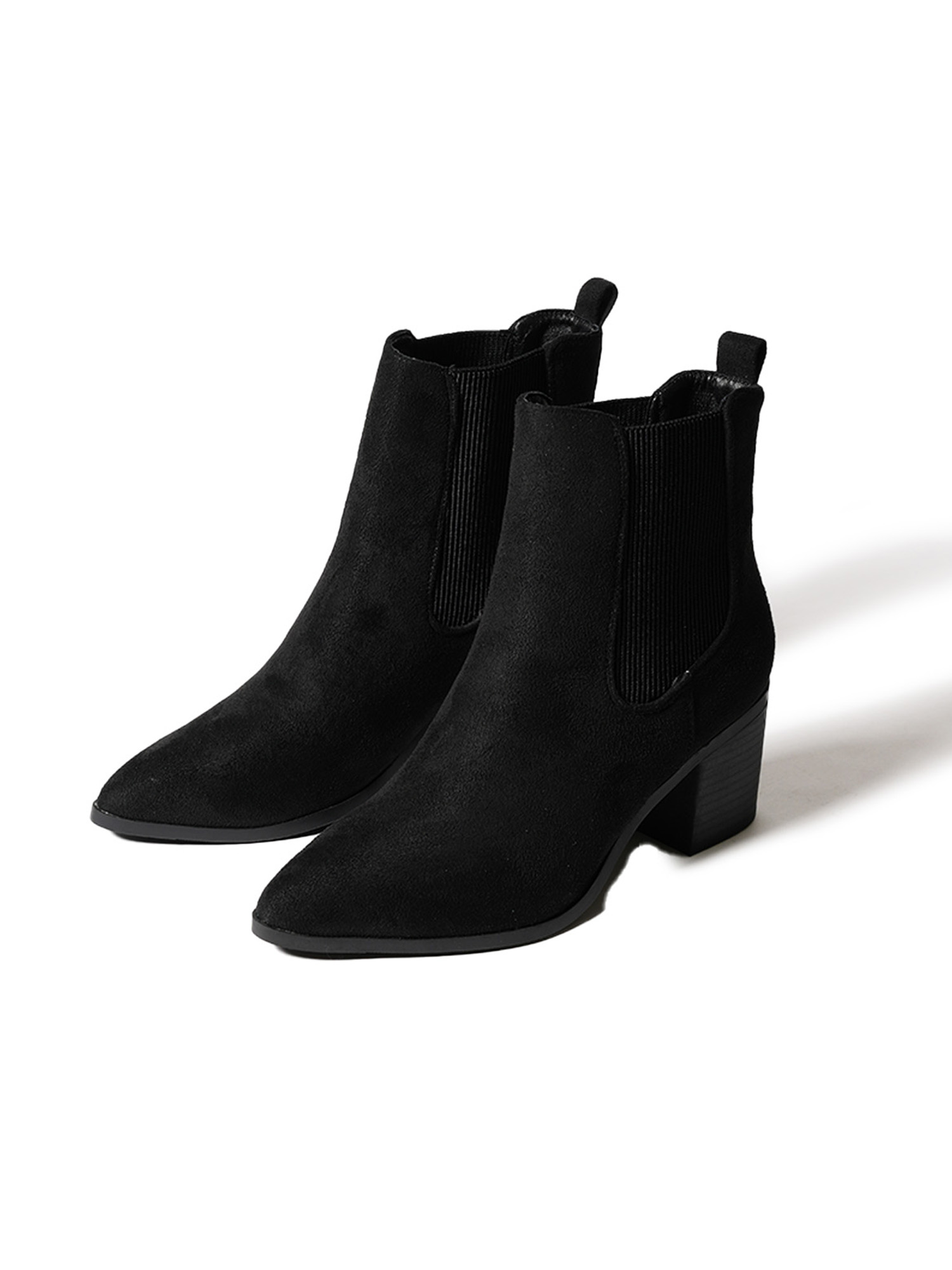
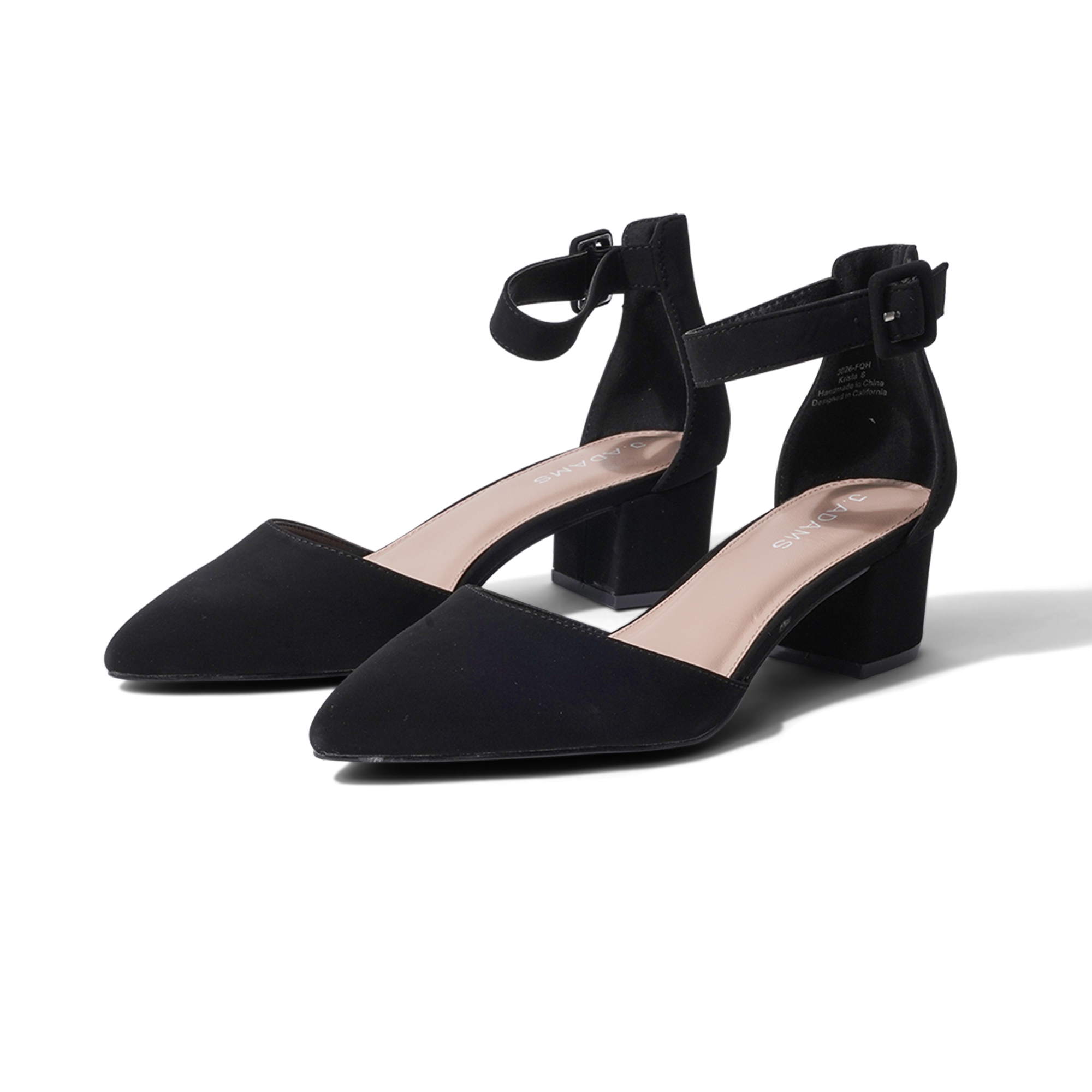
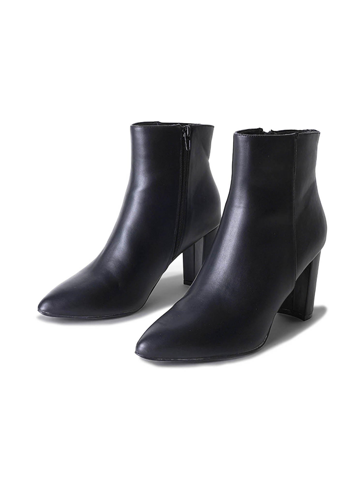
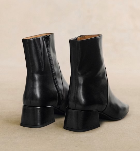
SHOT #5 — Both shoes, shot from behind at eye-level.
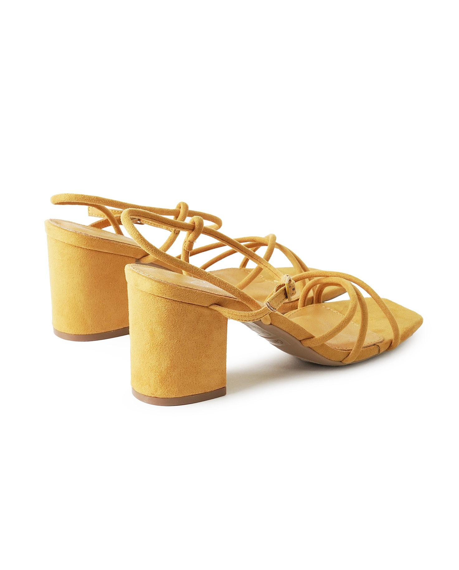
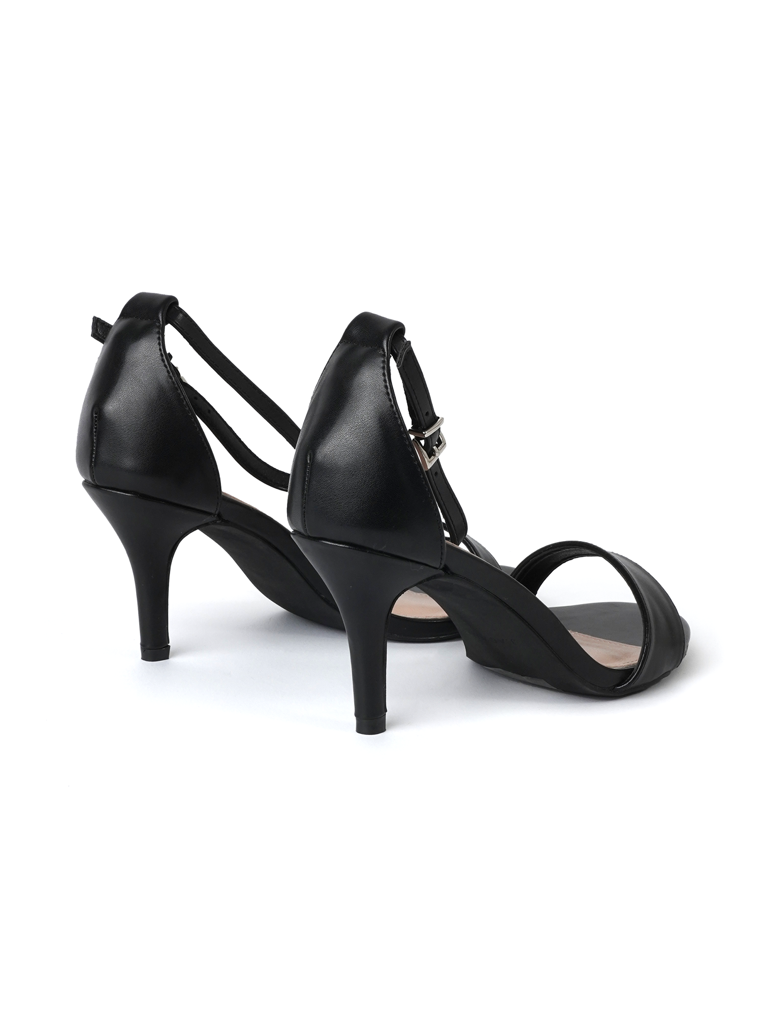
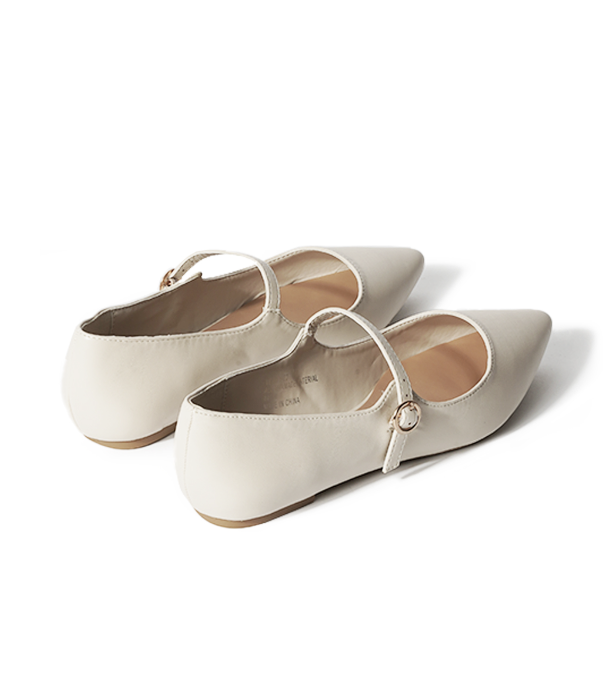
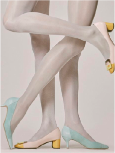
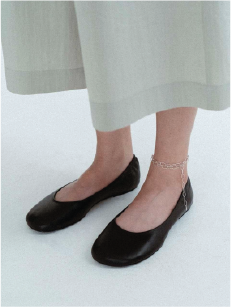
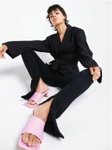
SHOT #6 — Both shoes, styled on a model standing, facing towards the camera.
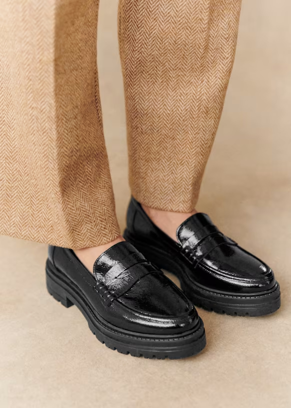
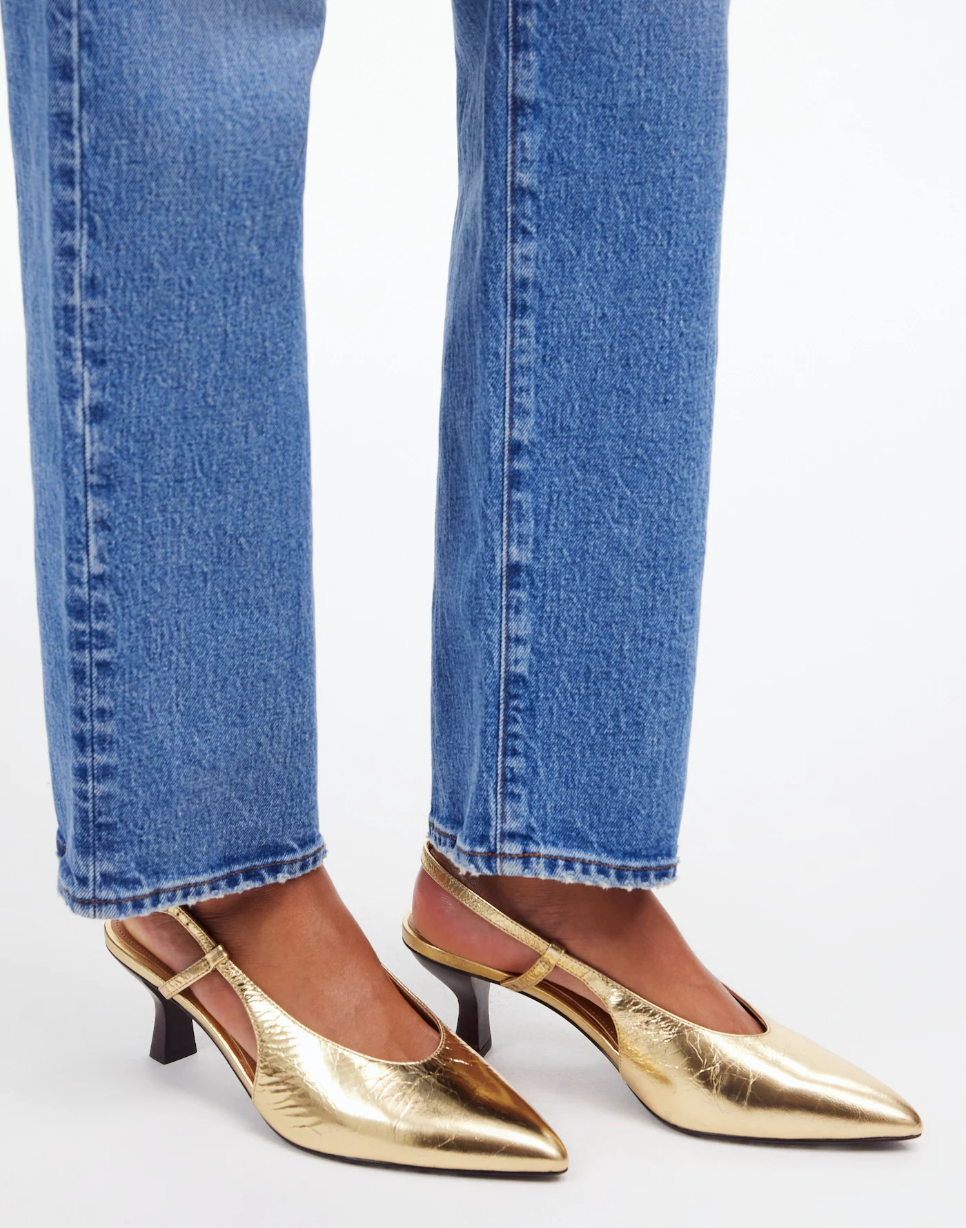
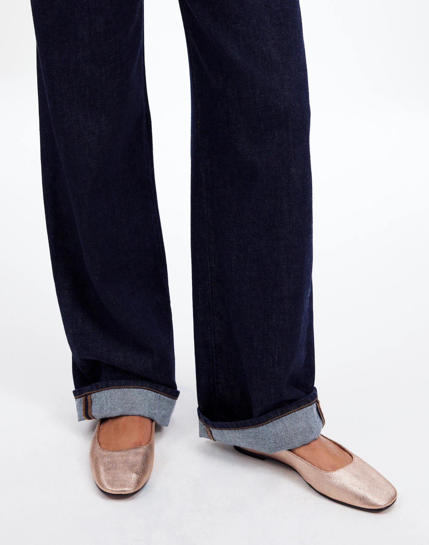
SHOT #7 — Both shoes, styled on a model sitting or standing in a different way.
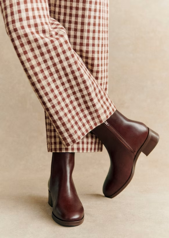
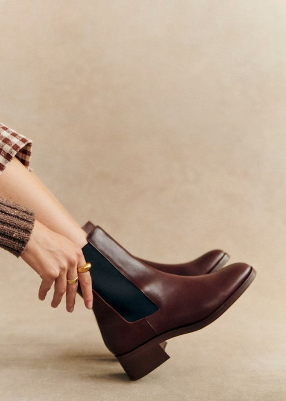
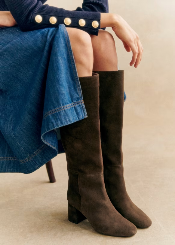
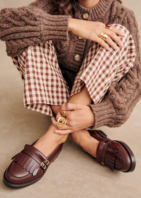
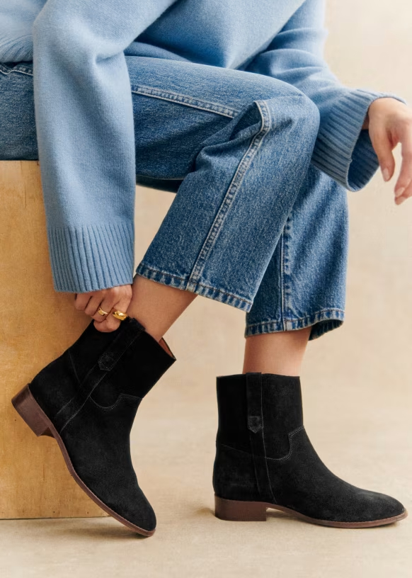
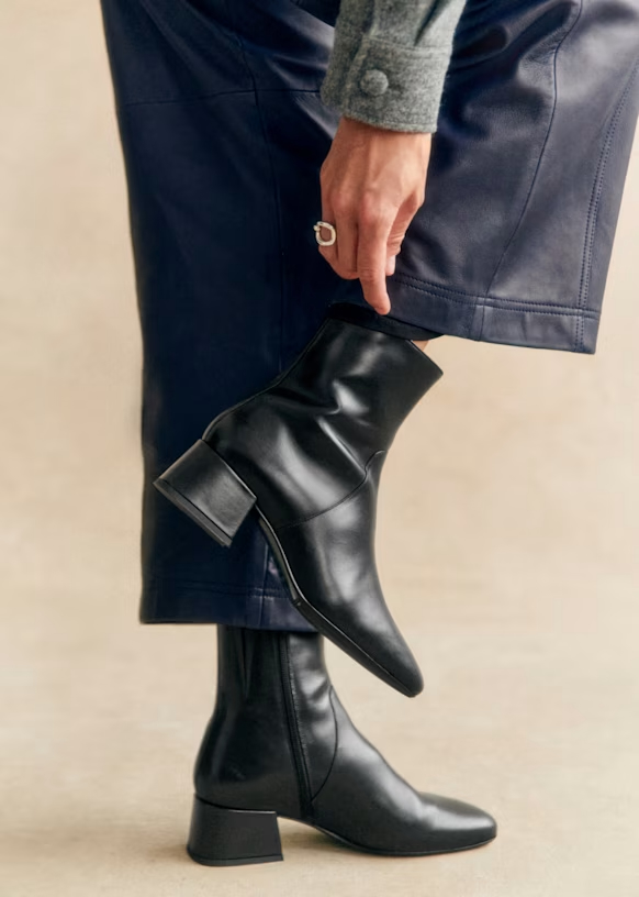
SHOT #8 — Both shoes, styled on a model sitting or standing, shot tighter, with the shoes taking up more space in the frame.
Use of Color
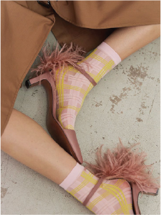
Do
Don’t
Use of Space & Angle
Do
Don’t
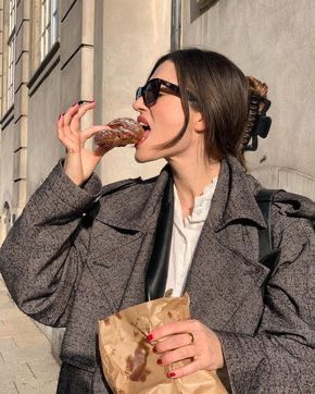
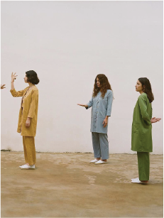
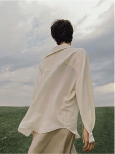
Movement & Personality
Do
Don’t
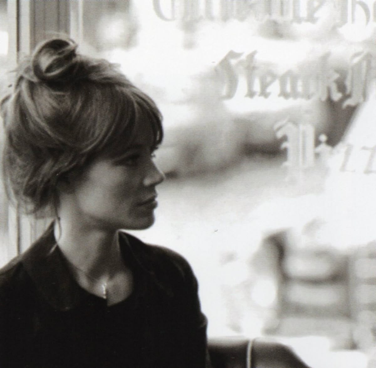
Lighting & Setting
Do
Don’t
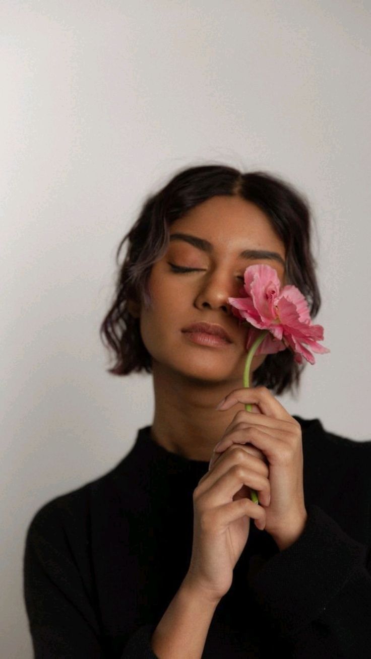
Expression & Character
Do
Don’t
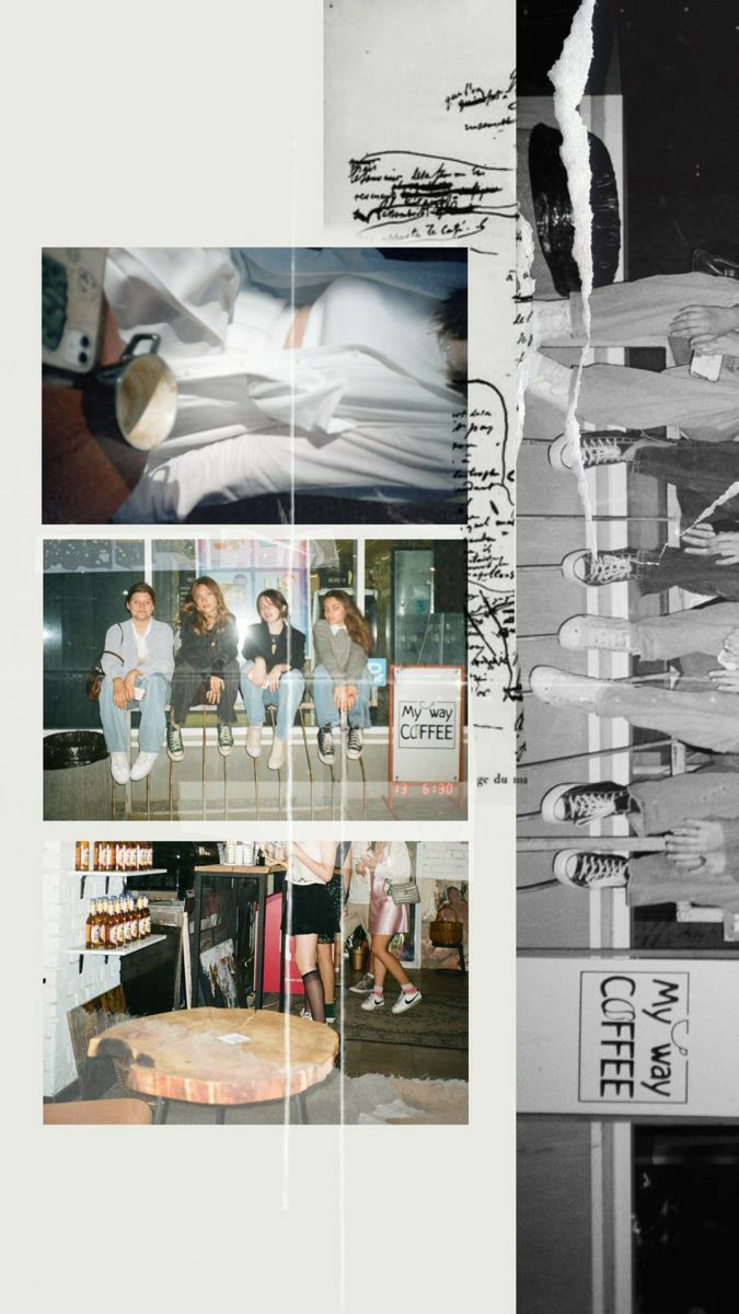
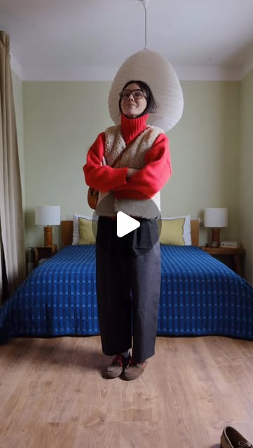
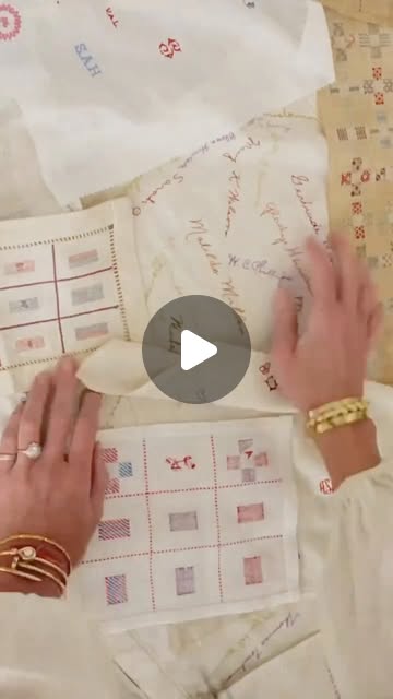
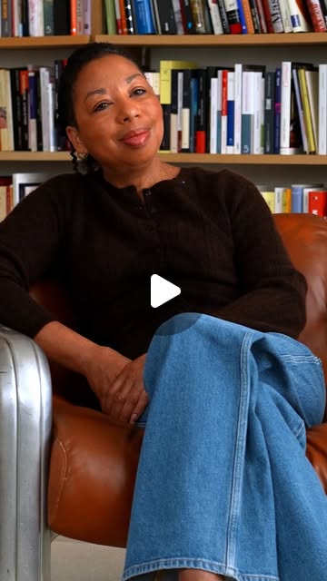
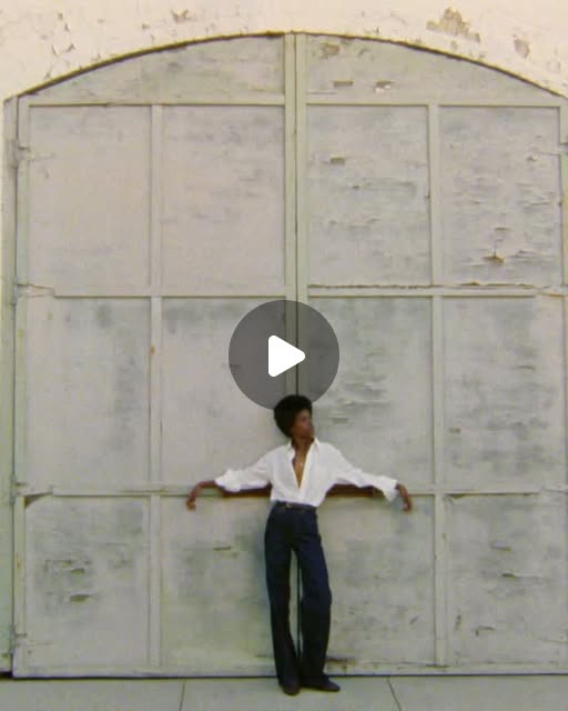
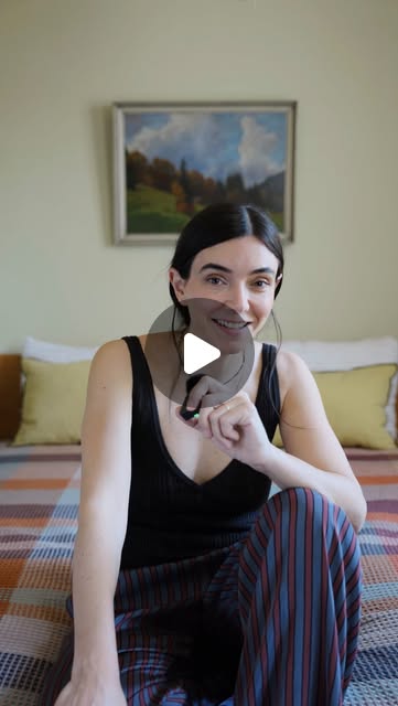
Influencer & People
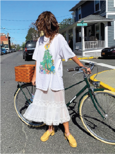
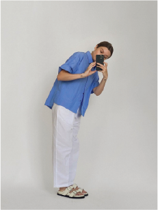
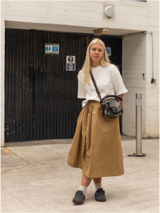
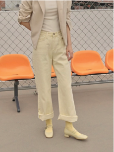
Guidelines
Tone
Do
Don’t
Music
Do
Don’t
Color Grading
Do
Don’t
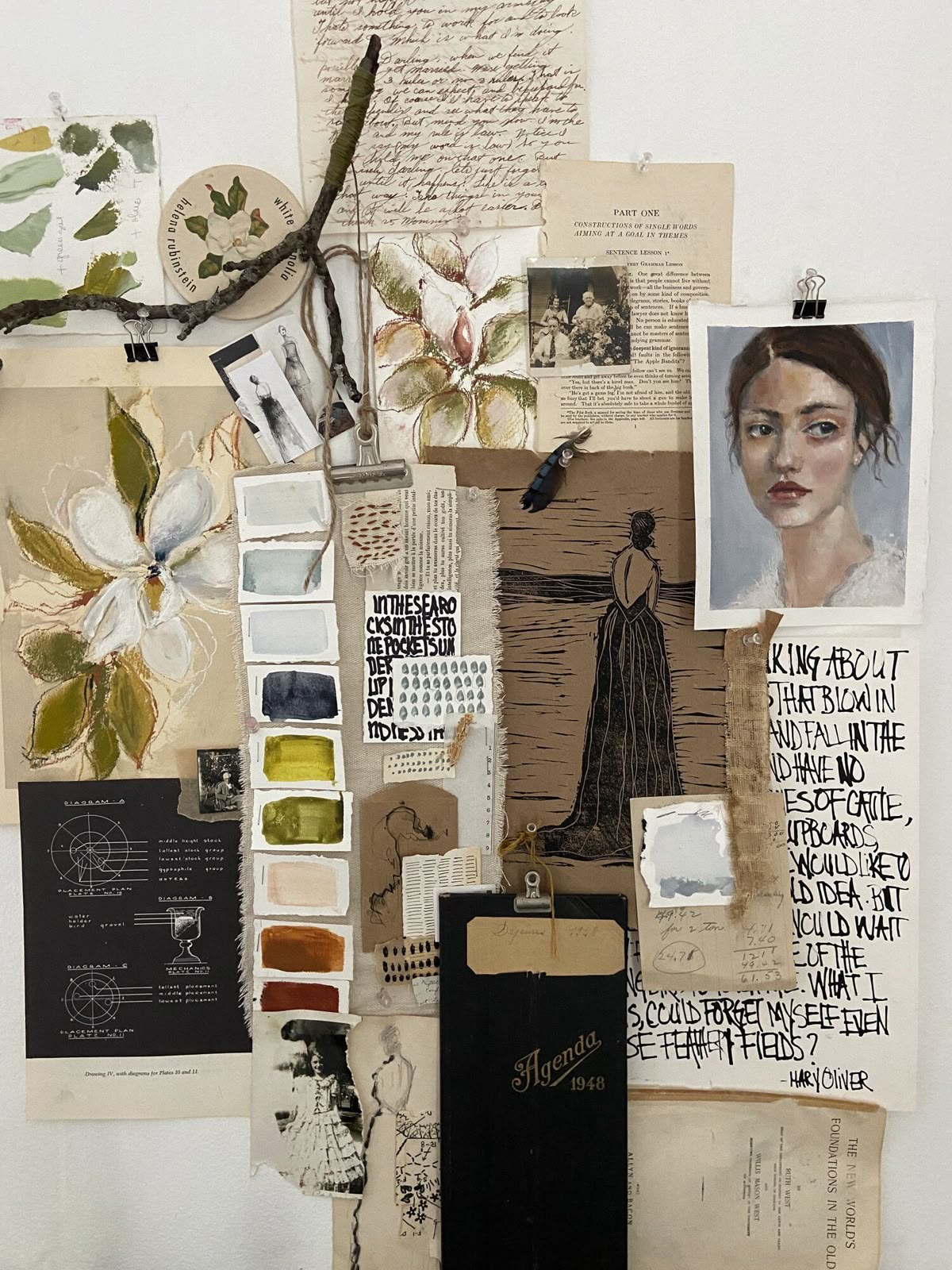
What Ties It Together
Visual Language
Pacing & Mood
Setting & Story
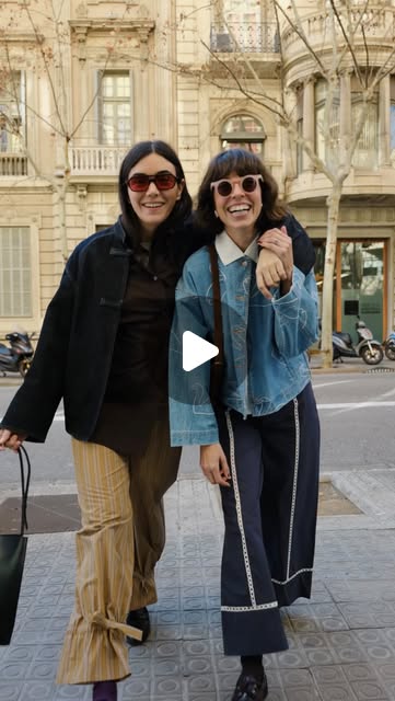
References
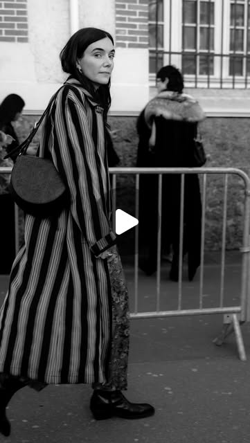
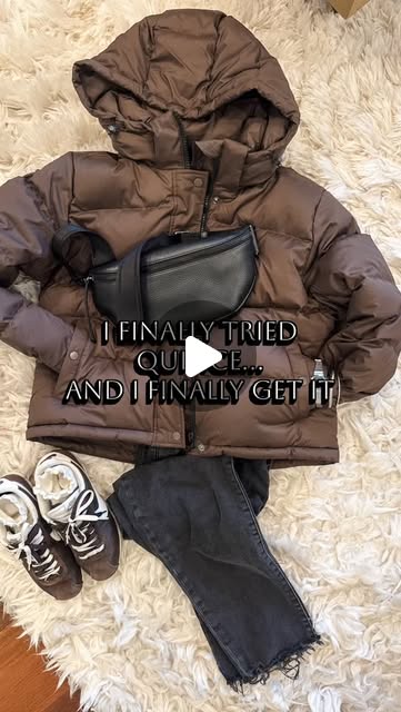
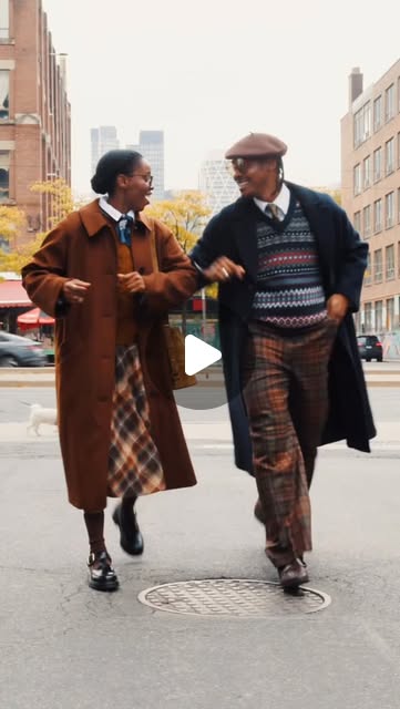
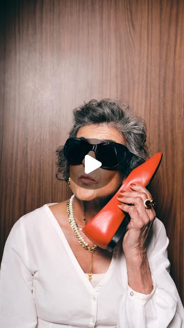
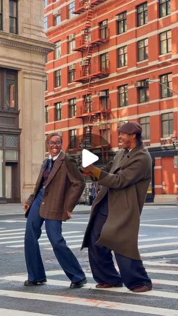
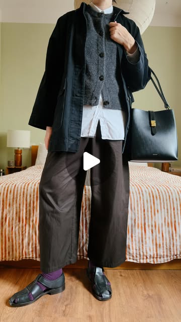
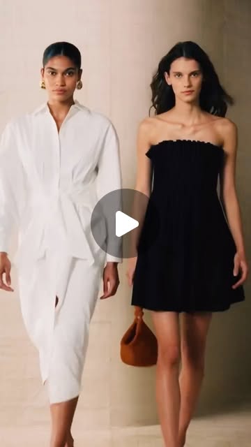
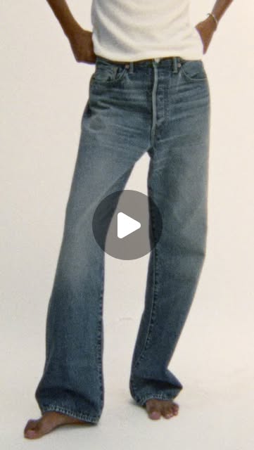
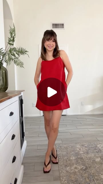
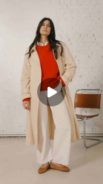
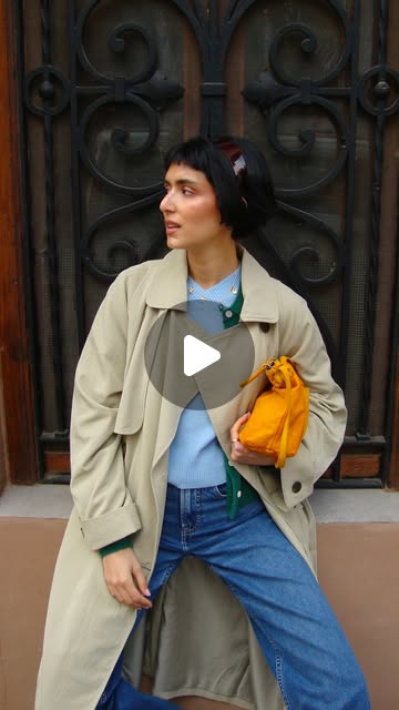
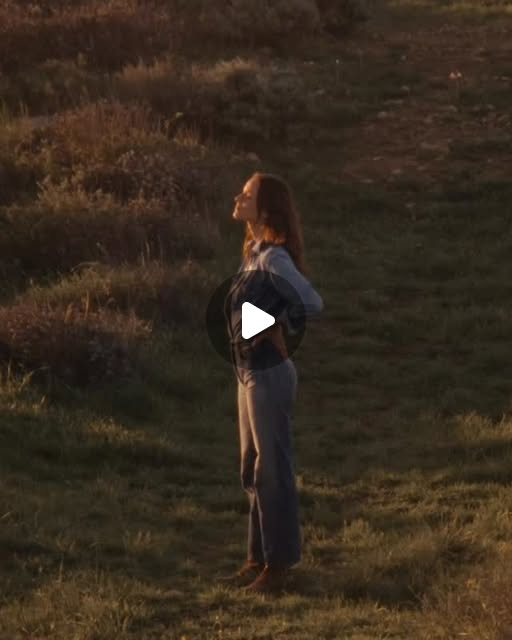
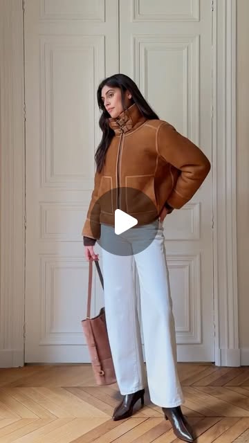
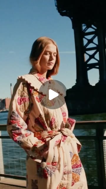
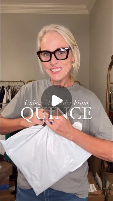
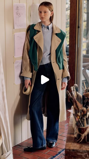
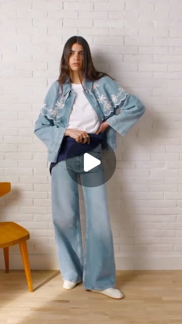
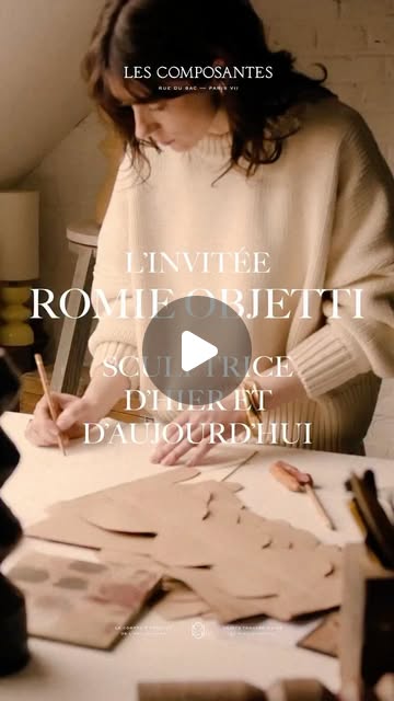
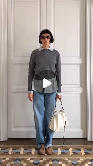
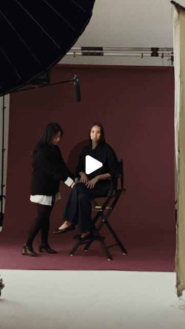
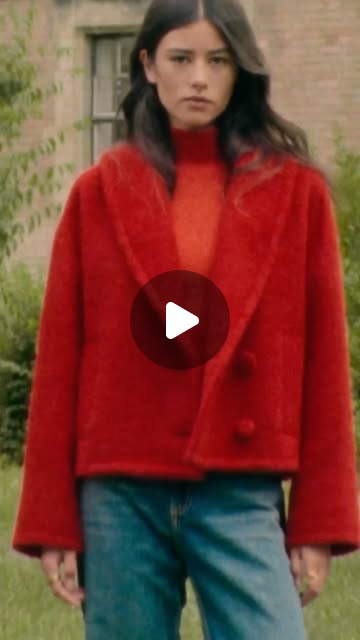
Click any thumbnail to watch the original reel. Sourced from Sézane, Everlane, Bucket List Momma, Clara Ferre, Quince, and Buck Mason.


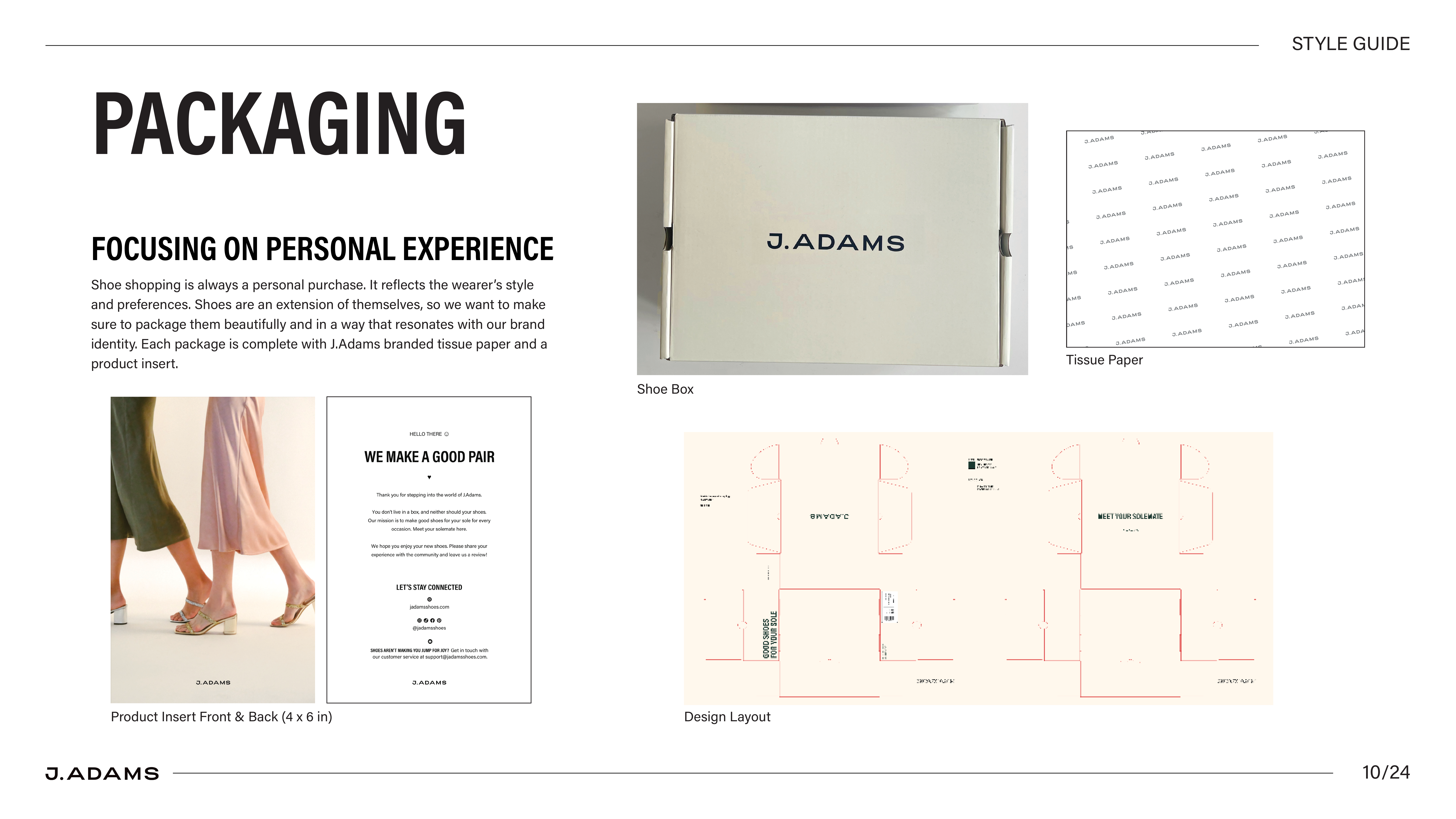
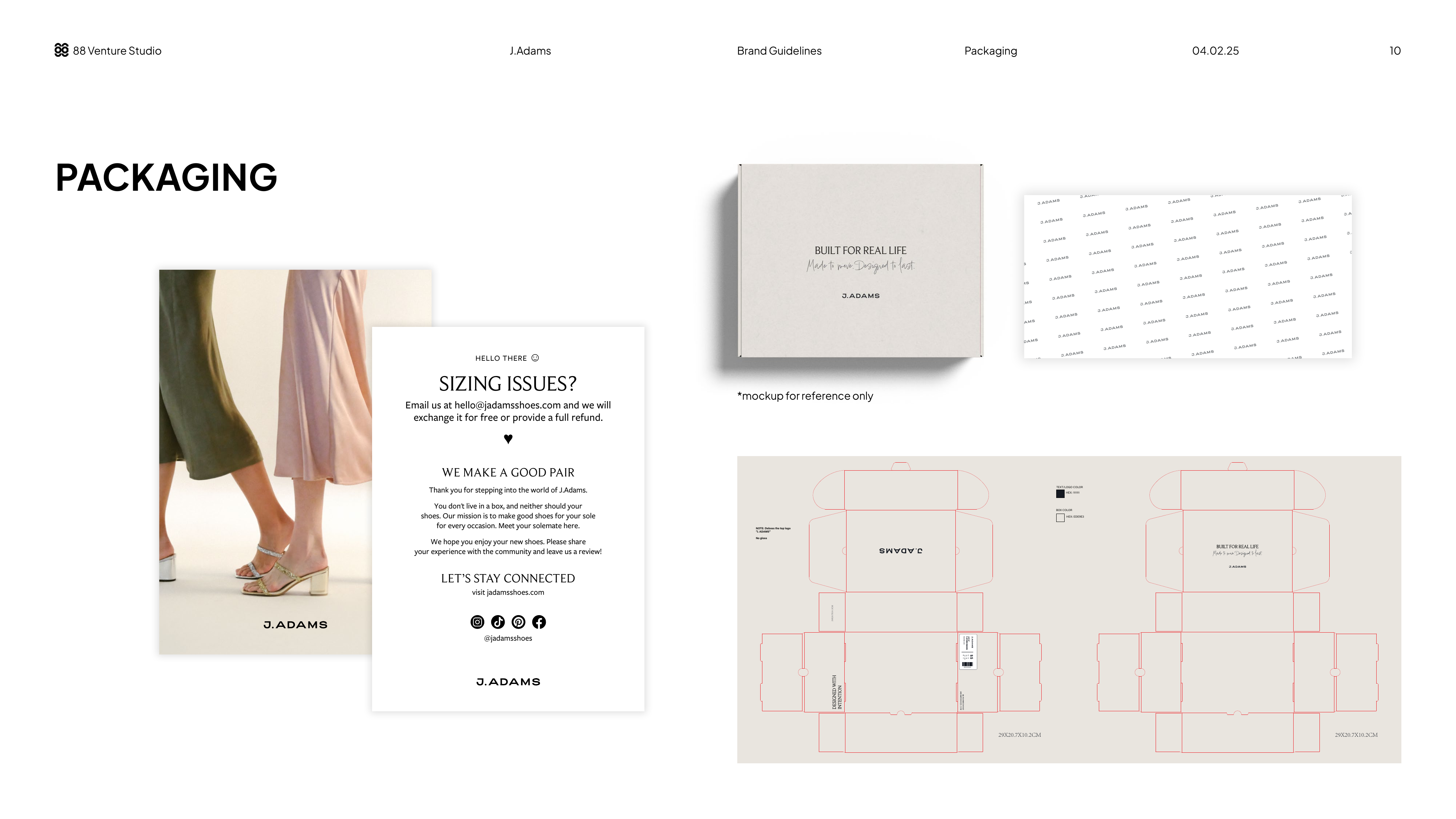
Shoe shopping is always a personal purchase. It reflects the wearer’s style and preferences. Shoes are an extension of themselves, so we want to make sure to package them beautifully and in a way that resonates with our brand identity. Each package is complete with J.Adams branded tissue paper and a product insert.
Includes: shoe box, branded tissue paper, product insert (4×6 in), die-cut layout